
Overview
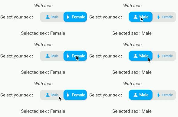
A Flutter package that enables developers to create visually appealing and highly customizable toggle tab widgets. It provides a flexible, easy-to-use interface for implementing segmented controls with smooth animations and responsive behavior across all major platforms. Ideal for filtering content, switching between views, or selecting options in a clean, modern UI. The library supports custom styling, alignment, and dynamic content rendering, making it suitable for both simple and complex use cases.
Use cases
- Filtering data by category
- Switching between app views
- Creating form input selectors
- Implementing theme toggles
- Building navigation tabs
- Customizing segmented controls
Key features
- Highly customizable appearance
- Smooth animation transitions
- Cross-platform compatibility
- Support for dynamic content
- Easy integration with existing widgets
- Responsive design handling
Suitable for
- Developers building modern UIs
- Apps requiring segmented selection
- Designers seeking visual polish
- Projects on multiple platforms
- Teams prioritizing reusable components
Considerations
- Requires understanding of Flutter layout principles
- May need additional styling for complex themes
- Performance impact with large numbers of tabs
- Limited built-in accessibility features
- Not optimized for extremely high-frequency updates