Package selection guidance compiled from public package information, community data, and project usage.
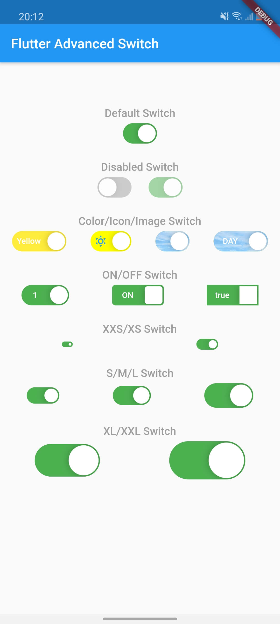
Flutter Advanced Switch is a customizable switch widget that offers a rich API for extensive styling and behavior customization. It enables developers to create visually distinct switches with smooth animations, custom track and thumb designs, and responsive interactions across all major platforms. Ideal for modern UIs requiring unique toggle controls, it enhances user experience with polished, interactive elements. The package supports Android, iOS, Web, macOS, Windows, and Linux, ensuring cross-platform consistency.
Use cases
Custom toggle interfaces
Enhanced user feedback in forms
Modern app UI design
Interactive settings panels
Cross-platform switch components
Visual differentiation in dashboards
Key features
Highly customizable track and thumb
Smooth animation transitions
Cross-platform compatibility
Extensive styling options
Responsive touch feedback
Configurable states and behaviors
Suitable for
UI designers seeking visual flexibility
Developers building modern apps
Teams requiring consistent toggle UX
Apps with complex form interactions
Projects targeting multiple platforms
Considerations
Requires understanding of Flutter widget customization
May increase bundle size slightly
Styling complexity may affect development speed
Limited built-in themes
Not ideal for simple on/off toggles without customization
Original README
Original README snapshot from the linked source repository. Visit the repository for the latest content.
flutter_advanced_switch
A highly customizable switch widget for Flutter with support for custom colors, text, icons, images, and more.
Switch Light
Switch Dark
Features
✅ Fully customizable colors, sizes, and shapes
✅ Support for text labels and icons
✅ Background images for active/inactive states
✅ Custom thumb widget support
✅ Smooth animations
✅ Enabled/disabled states
✅ Controller-based or callback-based state management
✅ Customizable thumb padding
✅ Null-safe
Getting Started
In the pubspec.yaml of your flutter project, add the following dependency:
class_MyWidgetStateextendsState<MyWidget> {
final _controller = ValueNotifier<bool>(false);
@overridevoidinitState() {
super.initState();
_controller.addListener(() {
setState(() {
// React to state changesprint('Switch is now: ${_controller.value}');
});
});
}
@overridevoiddispose() {
_controller.dispose();
super.dispose();
}
@overrideWidgetbuild(BuildContext context) {
returnColumn(
children: [
AdvancedSwitch(controller: _controller),
Text('Switch is ${_controller.value ? "ON" : "OFF"}'),
],
);
}
}
Parameters
Parameter
Description
Type
Default
controller
Controls the state of the switch. If provided, the switch will use this controller to manage its state.
ValueNotifier<bool>?
null
activeColor
The background color when the switch is in the active (on) state.
Color
Color(0xFF4CAF50)
inactiveColor
The background color when the switch is in the inactive (off) state.
Color
Color(0xFF9E9E9E)
activeChild
A widget to display on the left side when the switch is active.
Widget?
null
inactiveChild
A widget to display on the right side when the switch is inactive.
Widget?
null
activeImage
An optional background image to display when the switch is active.
ImageProvider?
null
inactiveImage
An optional background image to display when the switch is inactive.
ImageProvider?
null
decoration
The decoration to apply to the switch container. Typically used to set the border radius and shape.
BoxDecoration
BorderRadius.circular(15)
width
The width of the switch.
double
50.0
height
The height of the switch. The thumb size is automatically calculated based on this value.
double
30.0
enabled
Whether the switch is enabled. If false, the switch will be displayed with reduced opacity and will not respond to user interactions.
bool
true
disabledOpacity
The opacity to apply when the switch is disabled.
double
0.5
thumb
A custom widget to use as the thumb (the sliding part of the switch). If null, a default white rounded rectangle with a shadow will be used.
Widget?
null
thumbPadding
The padding around the thumb. This creates space between the thumb and the switch edges.
double
1.0
initialValue
The initial state of the switch when controller is not provided. This value is only used when controller is null.
bool
false
onChanged
Called when the user toggles the switch. The switch will call this callback with the new value. If null and no controller is provided, the switch will be disabled.