
Overview
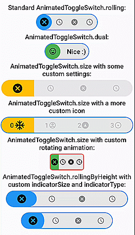
A fully customizable, draggable, and animated toggle switch with support for multiple choices and smooth loading animations. It offers prebuilt constructors for rolling and size transitions, making it ideal for interactive UIs that require visual feedback. The package is designed for cross-platform use, supporting Android, iOS, Web, macOS, Windows, and Linux. With intuitive APIs and seamless integration, it enhances user experience through dynamic, responsive toggles.
Use cases
- Interactive settings panels
- Form controls with visual feedback
- Customizable theme switches
- Dynamic choice selection
- Smooth UI transitions
- Cross-platform toggle components
Key features
- Draggable interface
- Multiple choice support
- Prebuilt rolling and size animations
- Fully customizable design
- Smooth loading transitions
- Cross-platform compatibility
Suitable for
- Developers building interactive forms
- UI designers seeking dynamic switches
- Apps requiring theme or preference toggles
- Cross-platform Flutter applications
- Projects emphasizing visual polish
Considerations
- May impact performance with many instances
- Requires careful styling for optimal appearance
- Limited to toggle-style interactions
- Not suitable for non-interactive elements
- Animation complexity may affect battery life on mobile