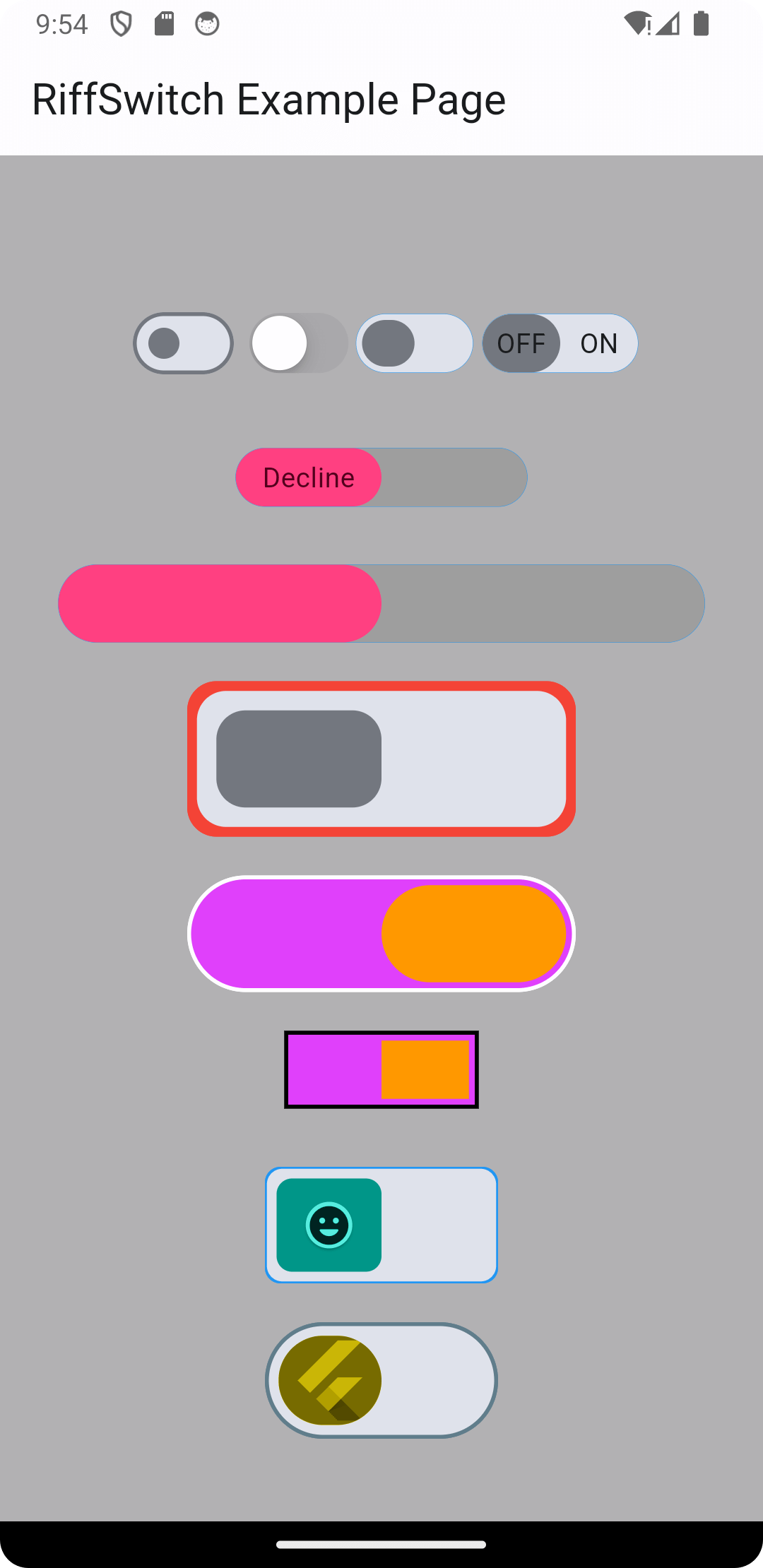
Experience seamless transitions and engaging interactions with RiffSwitch. The switch library that empowers effortless sliding effects and captivating animations.
Package selection guidance compiled from public package information, community data, and project usage.
RiffSwitch is a Flutter package designed to enhance user interfaces with smooth sliding transitions and visually appealing animations for switch components. It enables developers to create engaging, interactive switches with minimal code, ideal for toggles in settings, preferences, or status indicators. The library supports multiple platforms including Android, iOS, Web, macOS, Windows, and Linux, ensuring consistent behavior across devices. With customizable styling and responsive feedback, RiffSwitch improves UX by making interactions feel dynamic and polished.
Use cases
Custom toggle switches
User preference settings
On/off status indicators
Interactive UI elements
Mobile and web app interfaces
Key features
Smooth sliding animations
Cross-platform compatibility
Customizable appearance
Responsive interaction feedback
Minimal setup required
Suitable for
UI designers seeking visual polish
Developers building interactive forms
Apps requiring intuitive toggle controls
Cross-platform Flutter projects
Projects emphasizing user experience
Considerations
May require additional styling for complex themes
Performance impact on large lists of switches
Limited to switch-specific functionality
Not suitable for non-toggle interactive components
Depends on Flutter's animation framework
Original README
Original README snapshot from the linked source repository. Visit the repository for the latest content.
RiffSwitch
Breathe life into your Flutter UI with RiffSwitch, the switch library that empowers effortless sliding effects and captivating animations.
Customize the sliding behavior for a unique user experience, while interactive dragging fosters a sense of control and responsiveness.
Witness smooth state transitions as the switch flips, adding a touch of visual polish to your app.
Whether you prefer simple or decorative switch types, RiffSwitch seamlessly integrates into your UI,
transforming basic interactions into engaging experiences.
Experience seamless transitions and engaging interactions with RiffSwitch.
NOTE: It's important to note that the thumbColor property takes precedence over any color applied directly to the active or inactive thumb,
whether through a container widget or any other means.
This allows for consistent and predictable customization of the thumb's color across different states of the switch,
ensuring a cohesive visual appearance throughout the application.
Screenshots
Screenshot 1
Screenshot 2
Screenshot 3
Screenshot 4
Screenshot 5
Screenshot 6
Screen Record 1
Screen Record 2
Contributing
Contributions are welcome! Feel free to open issues or submit pull requests.
Issues: If you encounter any bugs, have feature requests, or want to suggest improvements, please open an issue on our GitHub repository. Provide as much detail as possible to help us understand the problem or idea better.
Pull Requests: If you'd like to contribute code changes, feel free to submit a pull request. Before doing so, make sure to fork the repository and create a new branch for your changes. Follow the existing coding style and guidelines, and write clear and concise commit messages. Your pull request will undergo review, and we'll work together to ensure the changes align with the project's goals.
Feature Requests: If you have ideas for new features or enhancements, please open an issue to discuss them. We value community feedback and want to ensure that new features align with the project's direction and objectives.
Spread the Word: Help us grow the FontResoft community by sharing the project with others. Whether through social media, blog posts, or word of mouth, spreading the word about FontResoft helps attract more users and contributors.
License
This project is licensed under the BSD 3-Clause License - see the LICENSE file for details.