
 v1.3.0
mobkit_calendar
Mobkit Calendar has built-in basic functionalities for scheduling and representing appointments/events efficiently.
30Likes 8230-day downloads130Pub points
AndroidiOS
Biscozum/mobkit_calendar open-source repository details.

{"sdk":"flutter"}{"sdk":"flutter"}^2.1.8^0.20.2^12.0.3^0.4.0+2{"sdk":"flutter"}^5.0.0English project snapshot. Visit GitHub for the latest content.
Mobkit Calendar has built-in configurable views such as day, week, month and timeline day that provide basic functionalities for scheduling and representing appointments/events efficiently.
Customizable Calendar Views - It allows you to easily achieve the look you want with its multiple views and special options of these views..
Appointments - Appointments contain information about an event or meeting scheduled for a specific time. It has many customizable fields such as Start/End time, event title, event detail and what color it will appear in.
Recurring appointments - Recurring Appointments can recur appointments with daily, weekly and monthly recurrence options. You can add recurrence rules to these options. In this way, you can easily spread your appointments repeatedly over long date ranges.
Time zone - Mobkit Calendar allows you to configure your events according to your desired time zone, regardless of the time on your device.
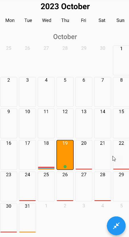
| Fraction View | Full Screen View | Popup View |
|---|---|---|
| https://raw.githubusercontent.com/Biscozum/mobkit_calendar/main/example/assets/images/monthly_view_fraction.png | https://raw.githubusercontent.com/Biscozum/mobkit_calendar/main/example/assets/images/monthly_view_fullscreen.png | https://raw.githubusercontent.com/Biscozum/mobkit_calendar/main/example/assets/images/monthly_view_popup.png |
| https://raw.githubusercontent.com/Biscozum/mobkit_calendar/main/example/assets/videos/monthly_view_fraction_gf.gif | https://raw.githubusercontent.com/Biscozum/mobkit_calendar/main/example/assets/videos/monthly_view_fullscreen_gf.gif | https://raw.githubusercontent.com/Biscozum/mobkit_calendar/main/example/assets/videos/monthly_view_popup_gf.gif |
| All Day Event | Short Event |
|---|---|
| https://raw.githubusercontent.com/Biscozum/mobkit_calendar/main/example/assets/images/weekly_view.png | https://raw.githubusercontent.com/Biscozum/mobkit_calendar/main/example/assets/videos/weekly_view_gf.gif |
| All Day Event | Short Event |
|---|---|
| https://github.com/Biscozum/mobkit_calendar/blob/main/example/assets/images/daily_view_all_day_event.png?raw=true | https://raw.githubusercontent.com/Biscozum/mobkit_calendar/main/example/assets/images/daily_view_short_day_event.png |
| https://raw.githubusercontent.com/Biscozum/mobkit_calendar/main/example/assets/videos/daily_view_gf.gif | |
| Agenda View | |
|---|---|
| https://raw.githubusercontent.com/Biscozum/mobkit_calendar/main/example/assets/images/agenda_view.png | https://raw.githubusercontent.com/Biscozum/mobkit_calendar/main/example/assets/videos/agenda_view_gf.gif |
Mobkit Calendar returns various functions to help you by accessing local calendars available on devices.
Prompts the user for permission to access the local calendar.Returns the list of events in the calendars, thanks to the relevant calendar ids given as parameters.Returns a list of local calendar accounts available on the device.Opens the details of the relevant event in the local calendar.Appointments allow users to define events/appointments with a specific time interval, repetition, and various customizations.
String? nativeEventId If the relevant event is a native event, it returns the id.String title Returns the title of the event.DateTime appointmentStartDate Returns the start time of the event.DateTime appointmentEndDate Returns the end time of the event.Color? color Returns the color of the relevant event (if any).bool isAllDay Returns whether the relevant event occurred all day.String detail Returns the detail of the relevant event.RecurrenceModel? recurrenceModel Returns the recurrence pattern of the relevant event (if any).Object? eventData Returns the object you gave while creating the relevant event.String? title - The title you want to appear at the top of the calendar.
String? locale - It determines in which locale the calendar will work.
bool showAllDays - Whether the calendar will show all days
bool disableOffDays - Turns off all dates of the calendar
bool disableWeekendsDays - Whether to show the bar showing the days of the week above the calendar
List<int>? disableWeekDays - It determines which days of the week to disable
DateTime? disableBefore - The calendar closes before the specified date.
DateTime? disableAfter - The calendar closes after the specified date.
List<DateTime>? disabledDates - Specifies which types the calendar will turn off.
EdgeInsetsGeometry itemSpace - Space inside the cells of the calendar
Duration animationDuration - Animation Duration
Color enabledColor - The color that the active days of the calendar will have
Color disabledColor - The color that the inactive days of the calendar will have
Color selectedColor - The color that the selected days of the calendar will have
Color primaryColor - The main theme color of your calendar
Color gridBorderColor - Determines the grid border color on the calendar
BorderRadiusGeometry borderRadius - If non-null, the corners of this box are rounded.
Color weekDaysBarBorderColor - Determines the border color of the WeekDaysBar.
MobkitCalendarViewType mobkitCalendarViewType - Determines what appearance the calendar will have.
Monthly viewWeekly viewDaily viewAgenda viewbool popupEnable - Determines whether a popup will open when the event is clicked.
CalendarPopupConfigModel calendarPopupConfigModel - It allows you to customize the Popup that will open when the event is clicked.
Popup heightPopup widthPopup decorationPopup OpacityPopup animation durationPopup spacePadding to be applied to the popups that appear on the sides.Determines the spreading rate of the opened carousel relative to the screen.double viewportFraction - It represents the proportion of how much space the first month on the screen will take up.
bool? showEventOffDay - Determines whether events will be shown on double when the view is closed.
bool? monthBetweenPadding - It represents Padding to be applied between two months.
double? agendaDayBetweenPadding - Specifies the gap to be applied between days in the Agenda view.
bool? showEventLineMaxCountText - It determines the appearance of the number of events that cannot be shown in the event line marked in the calendar box.
bool? showEventPointMaxCountText - It determines the appearance of the number of events that cannot be shown in the event point marked in the calendar box.
double? weeklyTopWidgetSize - Determines the size of the widget above in the weekly view.
double? dailyTopWidgetSize - Determines the size of the widget above in the daily view.
CalendarCellConfigModel cellConfig - It allows you to customize the box where the dates are written.
It allows you to give different styles to the box where dates with different statuses are written.It determines the radius of the events shown with a round dot.It provides the space between the events specified by the line.It determines the gap between the events specified with a line and the events specified with a circle dot.It determines the spacing between the events specified with a circle dot.Determines the line heights of events specified with lines.It determines the radius around the edges of the events specified with lines.It determines the maximum number of events specified with a circle dot to be shown.It determines the maximum number of events specified with lines to be displayed.CalendarTopBarConfigModel topBarConfig - It allows you to customize the widgets drawn at the top of the calendar and located in the top bar.
Determines whether the month information section appears in the Top Bar section.Determines whether the year information section appears in the Top Bar section.Determines whether the weekdays information section appears in the Top Bar section.Determines the appearance of the header widget in the Top Bar sectionDetermines the appearance of the title widget in the Top Bar sectionIt determines the spelling styles of the days of the month in the ball bar.It determines the spelling styles of the days of the week in the ball bar.DailyItemsConfigModel dailyItemsConfigModel - It allows you to customize the widgets drawn at the top of the calendar and located in the top bar.
It determines what is written in the status section of all-day events.It determines the style of the text in the status section of all-day events.It determines the style in the section where the time of events is specified in the daily view.It determines Margin between the events that are all day in daily appearance.It allows you to customize all day events in the daily view.
It determines the text style of the entire day or special items in the daily view.It determines the space between all day or special items in the daily view.It determines the border around the entire day or special items in the daily view.It determines the border radius around the edges of the entire day or special items in the daily view.It determines the colors of the whole day or special items in the daily view.Determines the alignment of the entire day or special items in the daily view.Determines the text alignment of the entire day or special items in the daily view.Determines the space between items in the daily view.AgendaViewConfigModel agendaViewConfigModel - Allows you to customize the agenda view.
It determines the starting date in the range from which data will be captured in the agenda view.It determines the ending date in the range from which data will be captured in the agenda view.Determines the writing format of dates in the agenda view.It determines the writing style in the title section of events in the agenda view.It determines the writing style in the detail section of events in the agenda view.It determines the writing style in the date section of events in the agenda view.TextStyle enableStyle - The textstyle that the active days of the calendar will have
TextStyle monthDaysStyle - The textstyle that the days of the month will have in the calendar.
TextStyle weekDaysStyle - The textstyle that the days of the week will have in the calendar
TextStyle disabledStyle - The textstyle that the inactive days of the calendar will have
TextStyle currentStyle - The textstyle that today's date will have
TextStyle selectedStyle - The textstyle that the selected days in the calendar will have.