
 v0.0.8
mobkit_dashed_border
Custom border implementation for dashed lines and curves border.
67Likes 66.2K30-day downloads150Pub points
AndroidiOSWebmacOSWindowsLinux
Biscozum/mobkit_dashed_border open-source repository details.

{"sdk":"flutter"}{"sdk":"flutter"}^2.0.0English project snapshot. Visit GitHub for the latest content.
The Mobkit Dashed Border is a border that provide dashed lines. Same time that package provides use different properties with rounded corner unlike border class.
flutter pub add -d mobkit_dashed_border
import 'package:mobkit_dashed_border/mobkit_dashed_border.dart';
You can use this package like border class. Below you can see the different types of codes and their outputs.
Sample code:
Container(
    height: 75,
    decoration: const BoxDecoration(
        border:
            DashedBorder.fromBorderSide(dashLength: 10, side: BorderSide(color: Colors.black, width: 1),
        ),
    ),
    child: const Center(
        child: Text(
            'Same color and width',
        ),
    ),
),
Output of this code:
selectionScrollSample code:
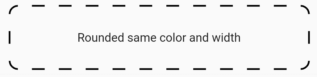
Container(
    height: 75,
    decoration: const BoxDecoration(
        border: DashedBorder.fromBorderSide(
            dashLength: 15, side: BorderSide(color: Colors.black, width: 2)),
        borderRadius: BorderRadius.all(Radius.circular(10))),
    child: const Center(
        child: Text(
            'Rounded same color and width',
        ),
    ),
),
Output of this code:
selectionScrollSample code:
Container(
    height: 75,
    decoration: const BoxDecoration(
    border: DashedBorder(
        dashLength: 15,
        left: BorderSide(color: Colors.black, width: 2),
        top: BorderSide(color: Colors.red, width: 2),
        right: BorderSide(color: Colors.orange, width: 2),
        bottom: BorderSide(color: Colors.blue, width: 2),
    ),
    borderRadius: BorderRadius.only(
        topLeft: Radius.circular(0),
        topRight: Radius.circular(20),
        bottomLeft: Radius.circular(20),
        bottomRight: Radius.circular(0),
    ),
    ),
    child: const Center(
        child: Text(
            'Different rounded and color',
        ),
    ),
),
Output of this code:
selectionScrollSample code:
   Container(
    height: 90,
    decoration: BoxDecoration(
    border: DashedBorder.all(
        color: Colors.black,
        dashLength: 40,
        width: 2,
        isOnlyCorner: true,
        strokeAlign: BorderSide.strokeAlignInside,
        strokeCap: StrokeCap.round,
    ),
    borderRadius: BorderRadius.circular(20),
    ),
    child: const Center(
        child: Text(
        'Is only corner',
        ),
    ),
),
Output of this code:
selectionScroll