Search packages, repositories and app categories

mobkit_dashed_border cover
Package detailsv0.0.8

mobkit_dashed_border

Custom border implementation for dashed lines and curves border.

AndroidiOSWebmacOSWindowsLinux
30-day downloads
25.3K
Likes
68
Pub points
150

Install package

flutter pub add mobkit_dashed_border

Package Overview

Package selection guidance compiled from public package information, community data, and project usage.

A Flutter package that enables custom dashed borders with support for curved lines and smooth transitions. It extends Flutter's decoration system to allow developers to apply dashed outlines to widgets with precise control over dash length, gap size, and border curvature. Ideal for UI elements requiring stylized borders, such as cards, buttons, or containers with a modern aesthetic. The package is compatible across all major platforms including Android, iOS, Web, macOS, Windows, and Linux.

Use cases

  • Styling cards with dashed outlines
  • Creating decorative button borders
  • Designing custom container frames
  • Enhancing UI with visual hierarchy
  • Building responsive layout components

Key features

  • Support for curved dashed borders
  • Customizable dash and gap lengths
  • Smooth rendering on all platforms
  • Extends Flutter's BoxDecoration
  • Easy integration via pub add

Suitable for

  • UI designers seeking visual flair
  • Developers building cross-platform apps
  • Projects requiring unique border styles
  • Apps with modern or minimalist design
  • Prototyping interactive interfaces

Considerations

  • May impact performance with complex shapes
  • Requires careful tuning for optimal appearance
  • Limited to border decoration only
  • Not suitable for high-frequency animations
  • Best used with lightweight widgets

Original README

Original README snapshot from the linked source repository. Visit the repository for the latest content.

Mobkit Dashed Border

The Mobkit Dashed Border is a border that provide dashed lines. Same time that package provides use different properties with rounded corner unlike border class.

Getting started

Import the following package.
flutter pub add -d mobkit_dashed_border
import 'package:mobkit_dashed_border/mobkit_dashed_border.dart';

Usage

You can use this package like border class. Below you can see the different types of codes and their outputs.

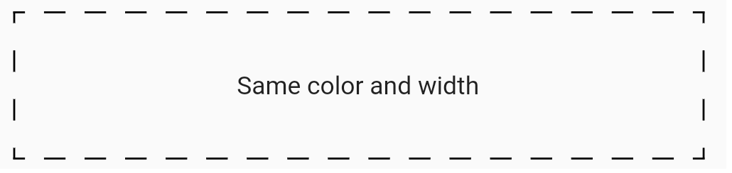
This sample shows border that has same color ,width and non radius corner

Sample code:

Container(
    height: 75,
    decoration: const BoxDecoration(
        border:
            DashedBorder.fromBorderSide(dashLength: 10, side: BorderSide(color: Colors.black, width: 1),
        ),
    ),
    child: const Center(
        child: Text(
            'Same color and width',
        ),
    ),
),

Output of this code:

selectionScroll
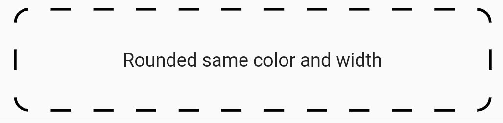
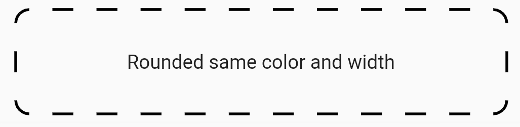
This sample shows border that has same color ,width and radius corner

Sample code:

Container(
    height: 75,
    decoration: const BoxDecoration(
        border: DashedBorder.fromBorderSide(
            dashLength: 15, side: BorderSide(color: Colors.black, width: 2)),
        borderRadius: BorderRadius.all(Radius.circular(10))),
    child: const Center(
        child: Text(
            'Rounded same color and width',
        ),
    ),
),

Output of this code:

selectionScroll
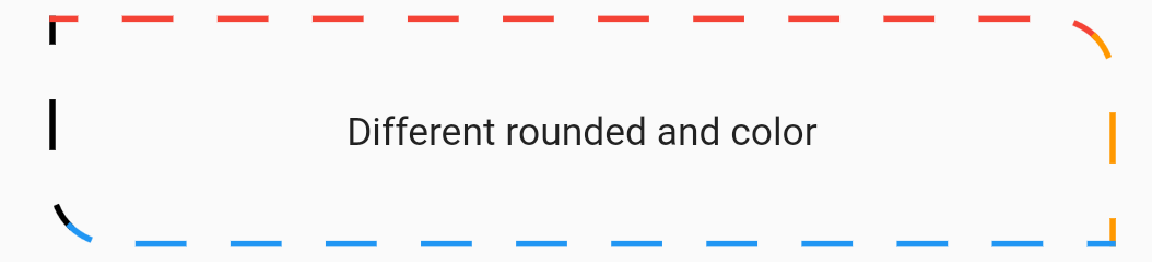
This sample shows border that has different color ,width and radius corner

Sample code:

Container(
    height: 75,
    decoration: const BoxDecoration(
    border: DashedBorder(
        dashLength: 15,
        left: BorderSide(color: Colors.black, width: 2),
        top: BorderSide(color: Colors.red, width: 2),
        right: BorderSide(color: Colors.orange, width: 2),
        bottom: BorderSide(color: Colors.blue, width: 2),
    ),
    borderRadius: BorderRadius.only(
        topLeft: Radius.circular(0),
        topRight: Radius.circular(20),
        bottomLeft: Radius.circular(20),
        bottomRight: Radius.circular(0),
    ),
    ),
    child: const Center(
        child: Text(
            'Different rounded and color',
        ),
    ),
),

Output of this code:

selectionScroll
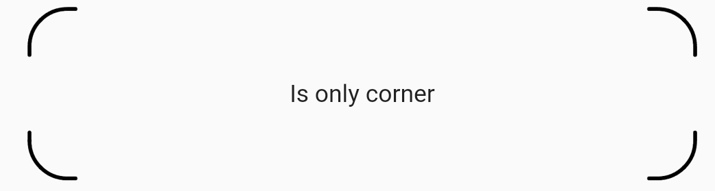
This sample shows a border drawn only on the corners.

Sample code:

   Container(
    height: 90,
    decoration: BoxDecoration(
    border: DashedBorder.all(
        color: Colors.black,
        dashLength: 40,
        width: 2,
        isOnlyCorner: true,
        strokeAlign: BorderSide.strokeAlignInside,
        strokeCap: StrokeCap.round,
    ),
    borderRadius: BorderRadius.circular(20),
    ),
    child: const Center(
        child: Text(
        'Is only corner',
        ),
    ),
),

Output of this code:

selectionScroll

Categories

Source repository

Projects using this package