
 v0.3.2
figma_layout_grid
Visual aid grid system that supports Figma's layout grid features
32Likes 9130-day downloads160Pub points
AndroidiOSWebmacOSWindowsLinux
Iteo/figma_layout_grid open-source repository details.

{"sdk":"flutter"}{"sdk":"flutter"}^2.0.1English project snapshot. Visit GitHub for the latest content.
figma_layout_grid is a Flutter package which imitates Figma's layout grid and all its functionalities. It helps you determine whether your UI components match the design file and align properly.
Wrap a widget with LayoutGrid in order to render a layout grid on top of it.
LayoutGrid(
    ...
    builder: (context) => Scaffold(),
)
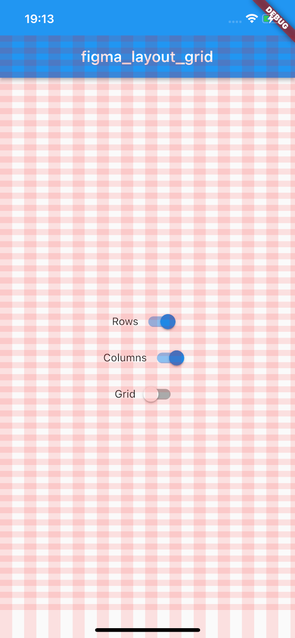
This package supports three types of layout overlays - rows, columns and pixel grid.
Horizontal stripes with specified height, gutter, margin, offset, arrangement and color.
There is a possibility for fixed rows count with passing desired number in a count parameter, otherwise rows are rendered dynamically due to the screen limits.
Example usage
LayoutGrid(
  ...
  rowsParams: const RowsParams(
    offset: 32.0,
    height: 16.0,
    gutter: 16.0,
  ),
  builder: (context) => Scaffold(),
),
Vertical stripes with specified height, gutter, margin, offset, arrangement and color.
There is a possibility for fixed columns count with passing desired number in a count parameter, otherwise columns are rendered dynamically due to the screen limits.
Example usage
LayoutGrid(
  ...
  columnsParams: const ColumnsParams(
    count: 4,
    width: 64.0,
    margin: 32.0,
  ),
  builder: (context) => Scaffold(),
),
Square pixel grid with fixed spacing and color. The thickness of a grid is set to 1.
Example usage
LayoutGrid(
  ...
  gridParams: const GridParams(
    size: 50.0,
    color: Colors.black26,
  ),
  builder: (context) => Scaffold(),
),
By default all of the layouts are disabled. In order to manage layout grid state you may use LayoutGrid methods which are accessible via builder context.
void LayoutGrid.of(context).showRows() - shows row layout
void LayoutGrid.of(context).hideRows() - hides row layout
void LayoutGrid.of(context).toggleRows() - toggles row layout visibility
bool LayoutGrid.of(context).visibleRows - returns current row layout visibility state
void LayoutGrid.of(context).showColumns() - shows column layout
void LayoutGrid.of(context).hideColumns() - hides column layout
void LayoutGrid.of(context).toggleColumns() - toggles column layout visibility
bool LayoutGrid.of(context).visibleColumns - returns current column layout visibility state
void LayoutGrid.of(context).showGrid() - shows grid layout
void LayoutGrid.of(context).hideGrid() - hides grid layout
void LayoutGrid.of(context).toggleGrid() - toggles grid layout visibility
bool LayoutGrid.of(context).visibleGrid - returns current grid layout visibility state
As this package mimics Figma's layout grid features you can directly transfer desired outcome into corresponding parameters. The following example shows columns grid set with count = 10, height = 12, gutter = 12, offset = 24, bottom alignment and some custom color.
figma layout configurationWhich translates to this piece of code
LayoutGrid(
  ...
  rowsParams: RowsParams(
    count: 10,
    height: 12.0,
    gutter: 12.0,
    offset: 24.0,
    arrangement: RowsArragement.bottom,
    color: const Color(0xFF757975).withOpacity(0.15),
  ),
  builder: (context) => Scaffold(),
),
And finally to the following UI.
custom configThere is also a possibility to enable SafeArea for a specific layout.
Each of the three layers has optional SafeAreaParams within you can pass what SafeArea parts should be handled.
The available options are top, bottom, left and right which correspond to SafeArea's parameters with the same names.
By default SafeArea feature is disabled.
LayoutGrid(
    ...
    rowsParams: const RowsParams(
      safeAreaParams: SafeAreaParams(
        bottom: true,
        top: true,
      ),
    ),
    columnsParams: const ColumnsParams(
      safeAreaParams: SafeAreaParams(
        right: true,
        left: true,
        top: true,
      ),
    ),
    builder: (context) => Scaffold(),
)
The above snippet will make the grid overlays avoid the device's intrusions.
safe area configTry out the example app.