
Overview
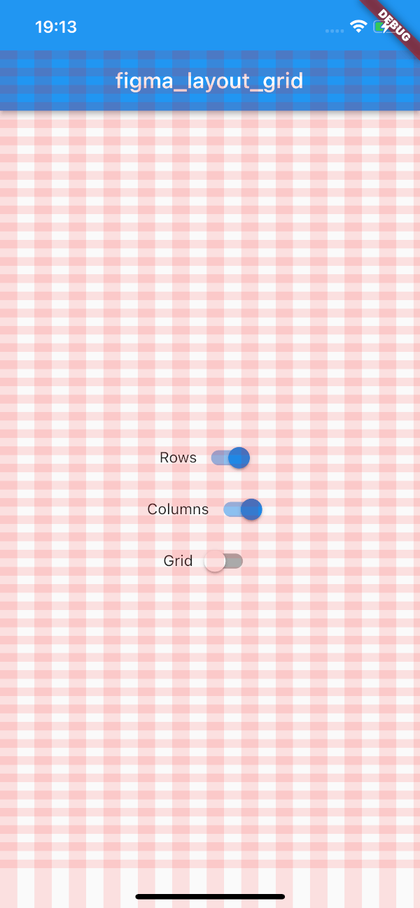
A Flutter package that implements Figma's layout grid system as a visual aid, helping developers align UI elements consistently with design specifications. It supports Figma's grid features such as column count, gutter size, and offset, enabling precise layout matching between design and implementation. The grid is rendered as an overlay on the screen, making it ideal for prototyping and development. Compatible across all major platforms, it enhances collaboration between designers and developers by bridging the gap between Figma designs and live Flutter apps.
Use cases
- Matching Figma designs in Flutter apps
- Prototyping with visual grid alignment
- Collaborating between designers and developers
- Ensuring consistent spacing in UI layouts
- Visual debugging of layout constraints
Key features
- Figma-inspired grid system
- Real-time visual grid overlay
- Supports columns, gutters, and offsets
- Cross-platform compatibility
- Easy integration via pub add
- Customizable grid appearance
Suitable for
- Designers working with Flutter
- Flutter developers following Figma designs
- Teams using Figma for UI/UX workflows
- Projects requiring pixel-perfect layout alignment
- Frontend teams focused on design consistency
Considerations
- Grid is for visual aid only, not layout logic
- Not intended for production UI rendering
- May impact performance if used excessively
- Should be disabled in release builds
- Requires manual configuration for different screens