
 v1.0.0+1
modals
Modals, a Flutter package to simplify all your overlay needs!
49Likes 15830-day downloads140Pub points
AndroidiOSWebmacOSWindowsLinux
KlausJokisuo/modals open-source repository details.

{"sdk":"flutter"}^2.0.1{"sdk":"flutter"}English project snapshot. Visit GitHub for the latest content.
Working with Flutter overlays is quite cumbersome. Adding a simple context menu next to your button should not be hard.
Say hello 👋 to Modals, a package to simplify all your overlay needs!
showModal is used to show modals. Function accepts a ModalEntry as parameter.
ModalEntry has 3 options ModalEntry.positioned, ModalEntry.aligned and ModalEntry.anchored
class PositionedModalExample extends StatelessWidget {
  const PositionedModalExample({Key? key}) : super(key: key);

  @override
  Widget build(BuildContext context) {
    return Center(
      child: ElevatedButton(
        onPressed: () {
          showModal(ModalEntry.positioned(context,
              tag: 'containerModal',
              left: 200,
              top: 200,
              child: Container(
                color: Colors.red,
                width: 50,
                height: 50,
              )));
        },
        child: const Text('Show Modal'),
      ),
    );
  }
}
Above example positions your widget to absolute position of left: 200 and top 200.
class AlignmentModalExample extends StatelessWidget {
  const AlignmentModalExample({Key? key}) : super(key: key);

  @override
  Widget build(BuildContext context) {
    return Center(
      child: ElevatedButton(
        onPressed: () {
          showModal(ModalEntry.aligned(context,
              tag: 'containerModal',
              alignment: Alignment.center,
              child: Container(
                color: Colors.red,
                width: 50,
                height: 50,
              )));
        },
        child: const Text('Show Modal'),
      ),
    );
  }
}
Above example aligns your widget to center of the screen.
class AnchoredModalExample extends StatelessWidget {
  const AnchoredModalExample({Key? key}) : super(key: key);

  @override
  Widget build(BuildContext context) {
    return Center(
      child: Column(
        children: [
          const ModalAnchor(
              tag: 'anchor',
              child: Card(
                color: Colors.grey,
                child: Padding(
                  padding: EdgeInsets.all(8.0),
                  child: Icon(Icons.anchor),
                ),
              )),
          Column(
            mainAxisSize: MainAxisSize.min,
            children: [
              ElevatedButton(
                onPressed: () {
                  showModal(ModalEntry.anchored(context,
                      tag: 'anchoredModal',
                      anchorTag: 'anchor',
                      modalAlignment: Alignment.centerLeft,
                      anchorAlignment: Alignment.centerRight,
                      child: Container(
                        color: Colors.red,
                        width: 50,
                        height: 50,
                      )));
                },
                child: const Text('Show Modal'),
              ),
            ],
          ),
        ],
      ),
    );
  }
}
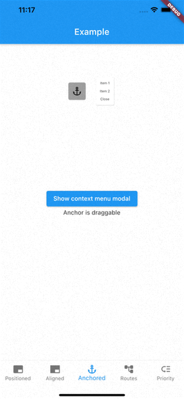
Above example positions widget at next to ModalAnchor widget.
To make widget act as an anchor, wrap widget with ModalAnchor widget.
To prioritise modals, use aboveTag and belowTag parameters.
aboveTag
aboveTagbelowTag
belowTagYou have 4 options to remove modals
removeModal(String id) removes modal by the given id
removeAllModals() removes all modals
Below parameters are configured in ModalEntry.
Tapping modal barrier
barrierDismissible when true (defaults to false) removes modal when tapping the barrierbarrierColor change barrier color (defaults to Colors.transparent)Observing route changes
removeOnPop
removeOnPushNext
To enable observing route changes, add navigator observer to root widget.
class MyApp extends StatelessWidget {
  const MyApp({Key? key}) : super(key: key);

  @override
  Widget build(BuildContext context) {
    return MaterialApp(
      title: 'AppModals',
      navigatorObservers: [modalsRouteObserver], // <- This line here. Imported from modals
      theme: ThemeData(
        primarySwatch: Colors.blue,
      ),
      home: const _Home(),
    );
  }
}
| https://raw.githubusercontent.com/KlausJokisuo/modals/master/assets/gifs/positioned_example.gif | https://raw.githubusercontent.com/KlausJokisuo/modals/master/assets/gifs/aligned_example.gif | https://raw.githubusercontent.com/KlausJokisuo/modals/master/assets/gifs/anchored_example.gif |
| https://raw.githubusercontent.com/KlausJokisuo/modals/master/assets/gifs/routes_example.gif | https://raw.githubusercontent.com/KlausJokisuo/modals/master/assets/gifs/priority_example.gif |
See the Examples for more information