Search packages, repositories and app categories

modals cover
Package detailsv1.0.0+1

modals

Modals, a Flutter package to simplify all your overlay needs!

AndroidiOSWebmacOSWindowsLinux
30-day downloads
337
Likes
49
Pub points
140

Install package

flutter pub add modals

Package Overview

Package selection guidance compiled from public package information, community data, and project usage.

Modals is a Flutter package designed to simplify the creation and management of overlays, such as dialogs, bottom sheets, and custom popups. It provides a clean, consistent API for displaying and handling modals across all platforms, reducing boilerplate code and improving developer experience. With built-in support for animations, dismissibility, and responsive layouts, it streamlines common overlay patterns in Flutter apps. The package is ideal for developers seeking a lightweight, reliable solution for managing UI overlays without complex setup.

Use cases

  • Displaying dialogs and alerts
  • Creating custom overlay screens
  • Managing bottom sheet interactions
  • Implementing guided user flows
  • Handling modal navigation
  • Simplifying popup logic

Key features

  • Unified modal API
  • Cross-platform compatibility
  • Built-in animations
  • Easy dismissal handling
  • Responsive design support
  • Minimal boilerplate

Suitable for

  • Flutter beginners
  • UI-heavy applications
  • Apps with frequent overlays
  • Developers wanting consistency
  • Teams prioritizing maintainability
  • Projects requiring rapid prototyping

Considerations

  • Limited to overlay-specific functionality
  • No built-in state management
  • Requires manual integration with existing state solutions
  • Not suitable for complex navigation stacks
  • Depends on Flutter's rendering pipeline
  • May need additional styling for advanced designs

Original README

Original README snapshot from the linked source repository. Visit the repository for the latest content.

Modals

Modals

Flutter overlays simplified!

Pub

Motivation

Working with Flutter overlays is quite cumbersome. Adding a simple context menu next to your button should not be hard.

Say hello 👋  to Modals, a package to simplify all your overlay needs!

Features

  • Show modals easily
    • Position modals using absolute position
    • Position modals using alignment
    • Position modals based on another widget position
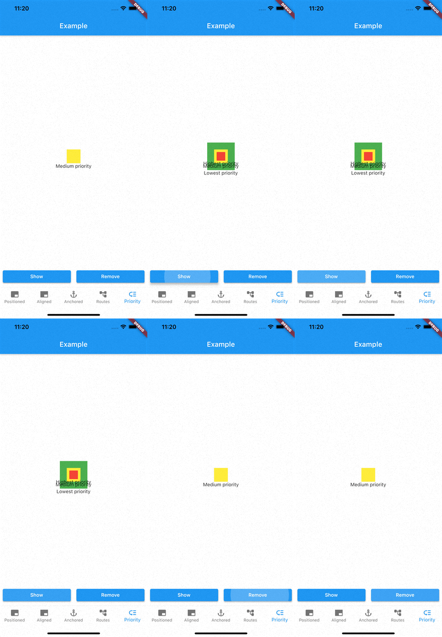
  • Prioritise modal visibility
  • Remove modals easily
    • Remove modal by id
    • Remove all modals at once
    • Remove modal by tapping modal barrier
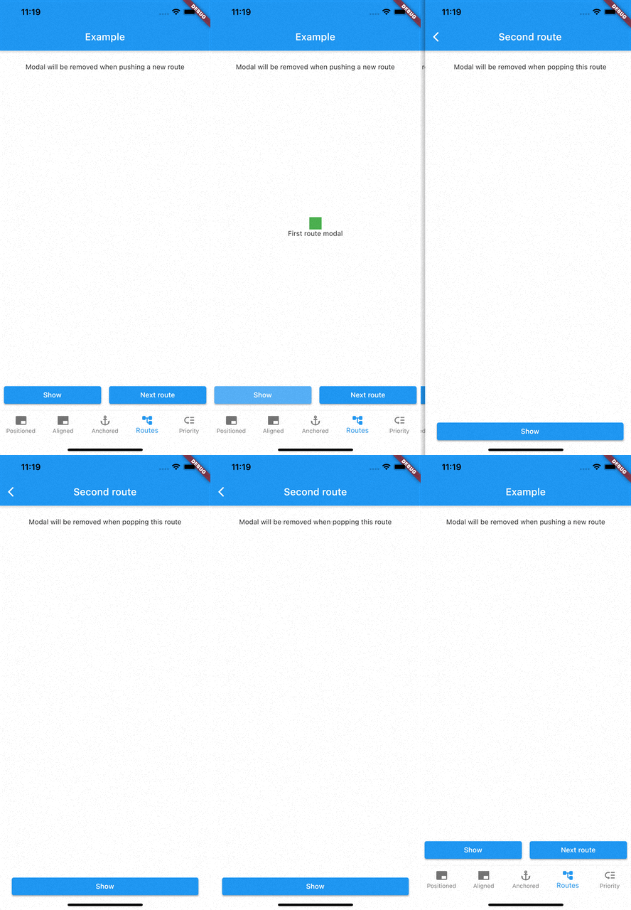
    • Remove modals on route changes

How to use

Showing modals

showModal is used to show modals. Function accepts a ModalEntry as parameter. ModalEntry has 3 options ModalEntry.positioned, ModalEntry.aligned and ModalEntry.anchored

Positioned
class PositionedModalExample extends StatelessWidget {
  const PositionedModalExample({Key? key}) : super(key: key);

  @override
  Widget build(BuildContext context) {
    return Center(
      child: ElevatedButton(
        onPressed: () {
          showModal(ModalEntry.positioned(context,
              tag: 'containerModal',
              left: 200,
              top: 200,
              child: Container(
                color: Colors.red,
                width: 50,
                height: 50,
              )));
        },
        child: const Text('Show Modal'),
      ),
    );
  }
}

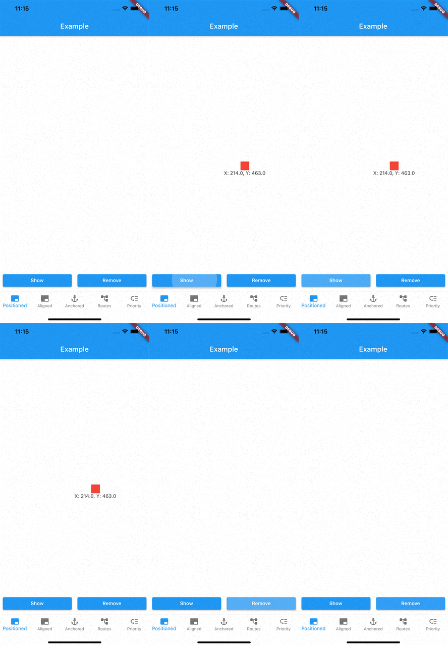
Above example positions your widget to absolute position of left: 200 and top 200.

Aligned
class AlignmentModalExample extends StatelessWidget {
  const AlignmentModalExample({Key? key}) : super(key: key);

  @override
  Widget build(BuildContext context) {
    return Center(
      child: ElevatedButton(
        onPressed: () {
          showModal(ModalEntry.aligned(context,
              tag: 'containerModal',
              alignment: Alignment.center,
              child: Container(
                color: Colors.red,
                width: 50,
                height: 50,
              )));
        },
        child: const Text('Show Modal'),
      ),
    );
  }
}

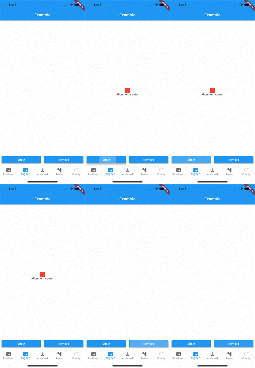
Above example aligns your widget to center of the screen.

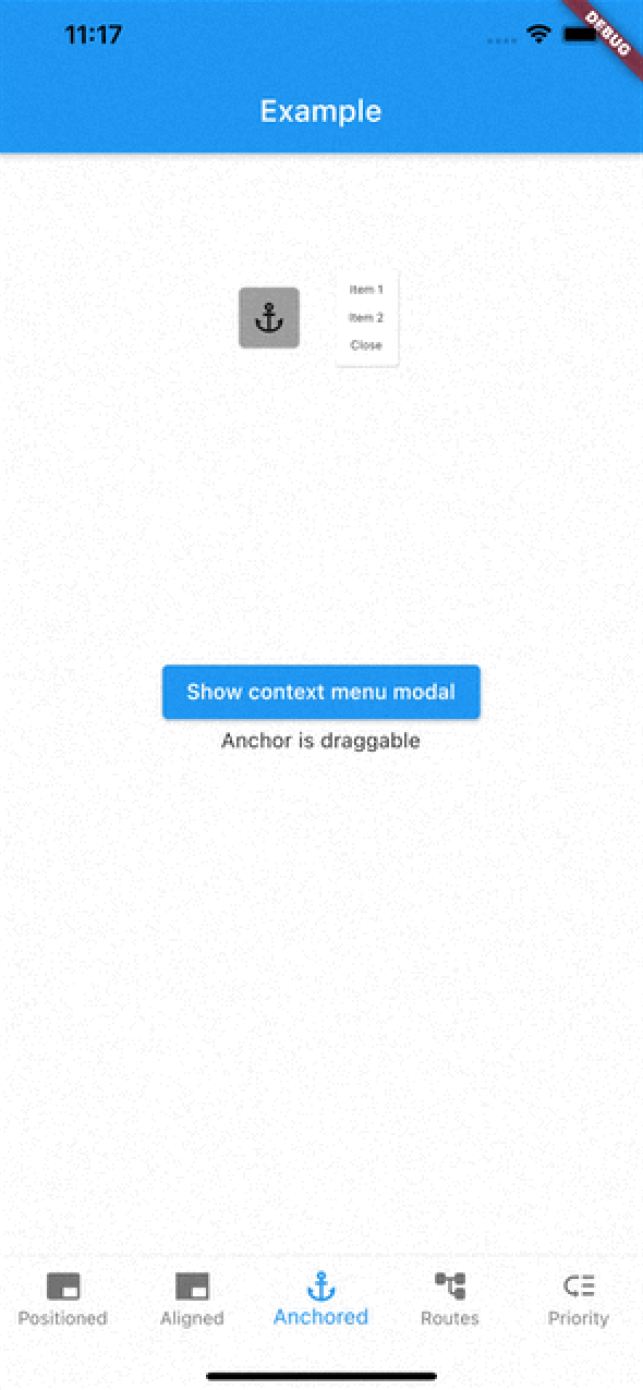
Anchored

class AnchoredModalExample extends StatelessWidget {
  const AnchoredModalExample({Key? key}) : super(key: key);

  @override
  Widget build(BuildContext context) {
    return Center(
      child: Column(
        children: [
          const ModalAnchor(
              tag: 'anchor',
              child: Card(
                color: Colors.grey,
                child: Padding(
                  padding: EdgeInsets.all(8.0),
                  child: Icon(Icons.anchor),
                ),
              )),
          Column(
            mainAxisSize: MainAxisSize.min,
            children: [
              ElevatedButton(
                onPressed: () {
                  showModal(ModalEntry.anchored(context,
                      tag: 'anchoredModal',
                      anchorTag: 'anchor',
                      modalAlignment: Alignment.centerLeft,
                      anchorAlignment: Alignment.centerRight,
                      child: Container(
                        color: Colors.red,
                        width: 50,
                        height: 50,
                      )));
                },
                child: const Text('Show Modal'),
              ),
            ],
          ),
        ],
      ),
    );
  }
}

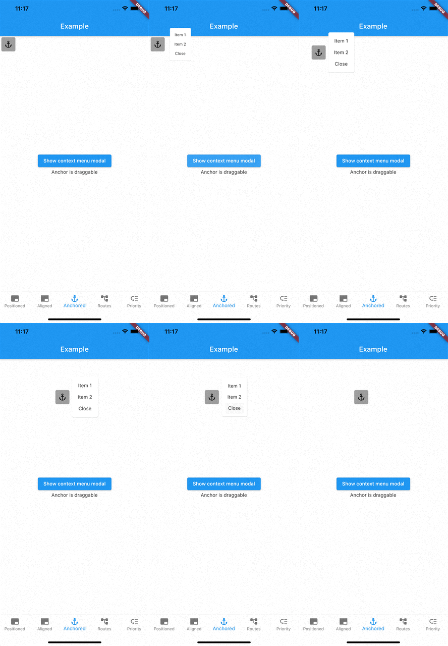
Above example positions widget at next to ModalAnchor widget.

To make widget act as an anchor, wrap widget with ModalAnchor widget.

Prioritising modals

To prioritise modals, use aboveTag and belowTag parameters.

  • aboveTag

    • Modal will be positioned just above given aboveTag
  • belowTag

    • Modal will be positioned just above given belowTag
Removing modals

You have 4 options to remove modals

removeModal(String id) removes modal by the given id

removeAllModals() removes all modals

Below parameters are configured in ModalEntry.

  • Tapping modal barrier

    • barrierDismissible when true (defaults to false) removes modal when tapping the barrier
    • barrierColor change barrier color (defaults to Colors.transparent)
  • Observing route changes

    • removeOnPop
      • The modal is removed when route is popped where the modal exists
    • removeOnPushNext
      • The modal is removed when new route is pushed on top of the route where the modal exists

To enable observing route changes, add navigator observer to root widget.

class MyApp extends StatelessWidget {
  const MyApp({Key? key}) : super(key: key);

  @override
  Widget build(BuildContext context) {
    return MaterialApp(
      title: 'AppModals',
      navigatorObservers: [modalsRouteObserver], // <- This line here. Imported from modals
      theme: ThemeData(
        primarySwatch: Colors.blue,
      ),
      home: const _Home(),
    );
  }
}

Gallery

See the Examples for more information

Categories

Source repository

Projects using this package

No data available yet.