

 v3.0.1
hidden_drawer_menu
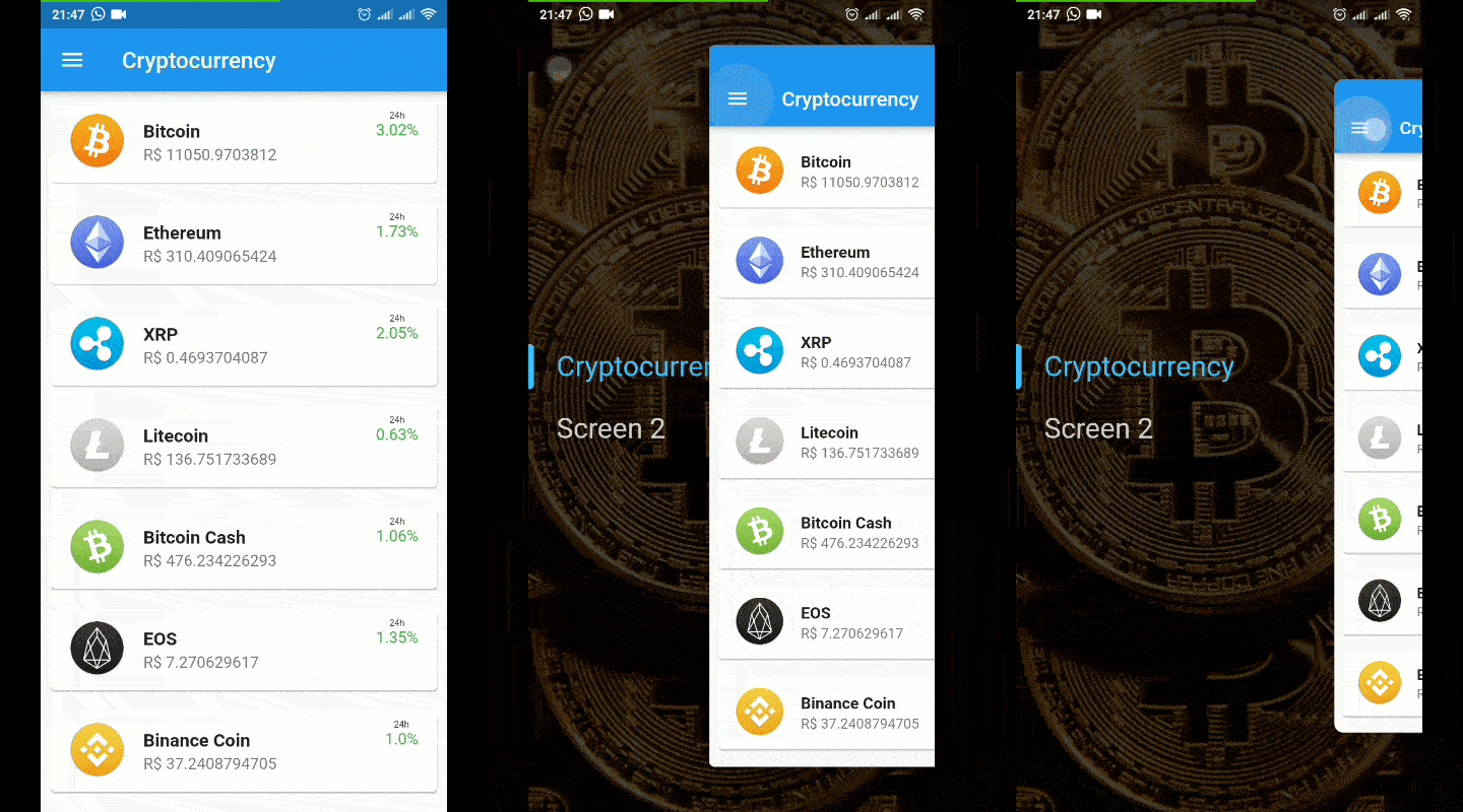
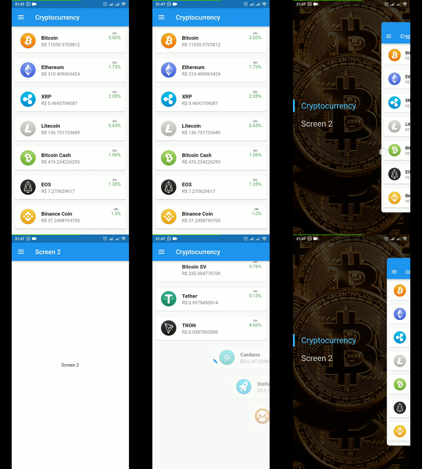
Hidden Drawer Menu is a library for adding a beautiful drawer mode menu feature with perspective animation
241Likes 75030-day downloads140Pub points
AndroidiOSWebmacOSWindowsLinux
Hidden Drawer Menu is a library for adding a beautiful drawer mode menu feature with perspective animation.

English project snapshot. Visit GitHub for the latest content.


Hidden Drawer Menu is a library for adding a beautiful drawer mode menu feature with perspective animation.
You can use a pre-defined menu or make a fully customized menu.
import 'package:hidden_drawer_menu/model/hidden_drawer_menu.dart';

void main() => runApp(MyApp());

class MyApp extends StatelessWidget {
  @override
  Widget build(BuildContext context) {
    return MaterialApp(
      theme: ThemeData(
        primarySwatch: Colors.blue,
      ),
      home: MyHomePage(),
    );
  }
}

class MyHomePage extends StatefulWidget {
  MyHomePage({Key key}) : super(key: key);

  @override
  _MyHomePageState createState() => _MyHomePageState();
}

class _MyHomePageState extends State<MyHomePage> {
  List<ScreenHiddenDrawer> itens = new List();

  @override
  void initState() {
    itens.add(new ScreenHiddenDrawer(
        new ItemHiddenMenu(
          name: "Screen 1",
          baseStyle: TextStyle( color: Colors.white.withOpacity(0.8), fontSize: 28.0 ),
          colorLineSelected: Colors.teal,
        ),
        FirstSreen()));

    itens.add(new ScreenHiddenDrawer(
        new ItemHiddenMenu(
          name: "Screen 2",
          baseStyle: TextStyle( color: Colors.white.withOpacity(0.8), fontSize: 28.0 ),
          colorLineSelected: Colors.orange,
        ),
        SecondSreen()));

    super.initState();
  }

  @override
  Widget build(BuildContext context) {

    return HiddenDrawerMenu(
      backgroundColorMenu: Colors.blueGrey,
      backgroundColorAppBar: Colors.cyan,
      screens: itens,
        //    typeOpen: TypeOpen.FROM_RIGHT,
        //    disableAppBarDefault: false,
        //    enableScaleAnimin: true,
        //    enableCornerAnimin: true,
        //    slidePercent: 80.0,
        //    verticalScalePercent: 80.0,
        //    contentCornerRadius: 10.0,
        //    iconMenuAppBar: Icon(Icons.menu),
        //    backgroundContent: DecorationImage((image: ExactAssetImage('assets/bg_news.jpg'),fit: BoxFit.cover),
        //    whithAutoTittleName: true,
        //    styleAutoTittleName: TextStyle(color: Colors.red),
        //    actionsAppBar: <Widget>[],
        //    backgroundColorContent: Colors.blue,
        //    elevationAppBar: 4.0,
        //    tittleAppBar: Center(child: Icon(Icons.ac_unit),),
        //    enableShadowItensMenu: true,
        //    backgroundMenu: DecorationImage(image: ExactAssetImage('assets/bg_news.jpg'),fit: BoxFit.cover),
    );

  }
}
import 'package:hidden_drawer_menu/model/hidden_drawer_menu.dart';

void main() => runApp(MyApp());

class MyApp extends StatelessWidget {
  // This widget is the root of your application.
  @override
  Widget build(BuildContext context) {
    return MaterialApp(
      theme: ThemeData(
        primarySwatch: Colors.blue,
      ),
      home: SimpleHiddenDrawer(
        menu: Menu(),
        screenSelectedBuilder: (position,controller) {

          Widget screenCurrent;

          switch(position){
            case 0 : screenCurrent = Screen1(); break;
            case 1 : screenCurrent = Screen2(); break;
            case 2 : screenCurrent = Screen3(); break;
          }

          return Scaffold(
            backgroundColor: backgroundColorContent,
            appBar: AppBar(
              leading: IconButton(
                  icon: Icon(Icons.menu),
                  onPressed: () {
                    controller.toggle();
                  }),
            ),
            body: screenCurrent,
          );

        },
      ),
    );
  }
}

class Menu extends StatefulWidget {
  @override
  _SecondSreenState createState() => _MenuState();
}

class _MenuState extends State<SecondSreen> {

  SimpleHiddenDrawerController controller;

  @override
  void didChangeDependencies() {
    controller = SimpleHiddenDrawerController.of(context);
    super.didChangeDependencies();
  }

  @override
  Widget build(BuildContext context) {
    return Container(
      width: double.maxFinite,
      height: double.maxFinite,
      color: Colors.cyan,
      padding: const EdgeInsets.all(8.0),
      child: Center(
        child: Column(
          mainAxisSize: MainAxisSize.min,
          children: <Widget>[
            RaisedButton(
              onPressed: () {
                controller.setSelectedMenuPosition(0);
              },
              child: Text("Menu 1"),
            ),
            RaisedButton(
              onPressed: () {
                controller.setSelectedMenuPosition(1);
              },
              child: Text("Menu 2"),
            )
          ],
        ),
      ),
    );
  }
}
This actions is only accessible by the children of HiddenDrawerMenu or SimpleHiddenDrawer.
SimpleHiddenDrawerController.of(context).setSelectedMenuPosition(0);
SimpleHiddenDrawerController.of(context).toggle();
SimpleHiddenDrawerController.of(context).open();
SimpleHiddenDrawerController.of(context).close();
final controller = SimpleHiddenDrawerController.of(context);
controller.addListener((){
  print(controller.position);
});
final controller = SimpleHiddenDrawerController.of(context);
controller.addListener((){
  print(controller.state);
});
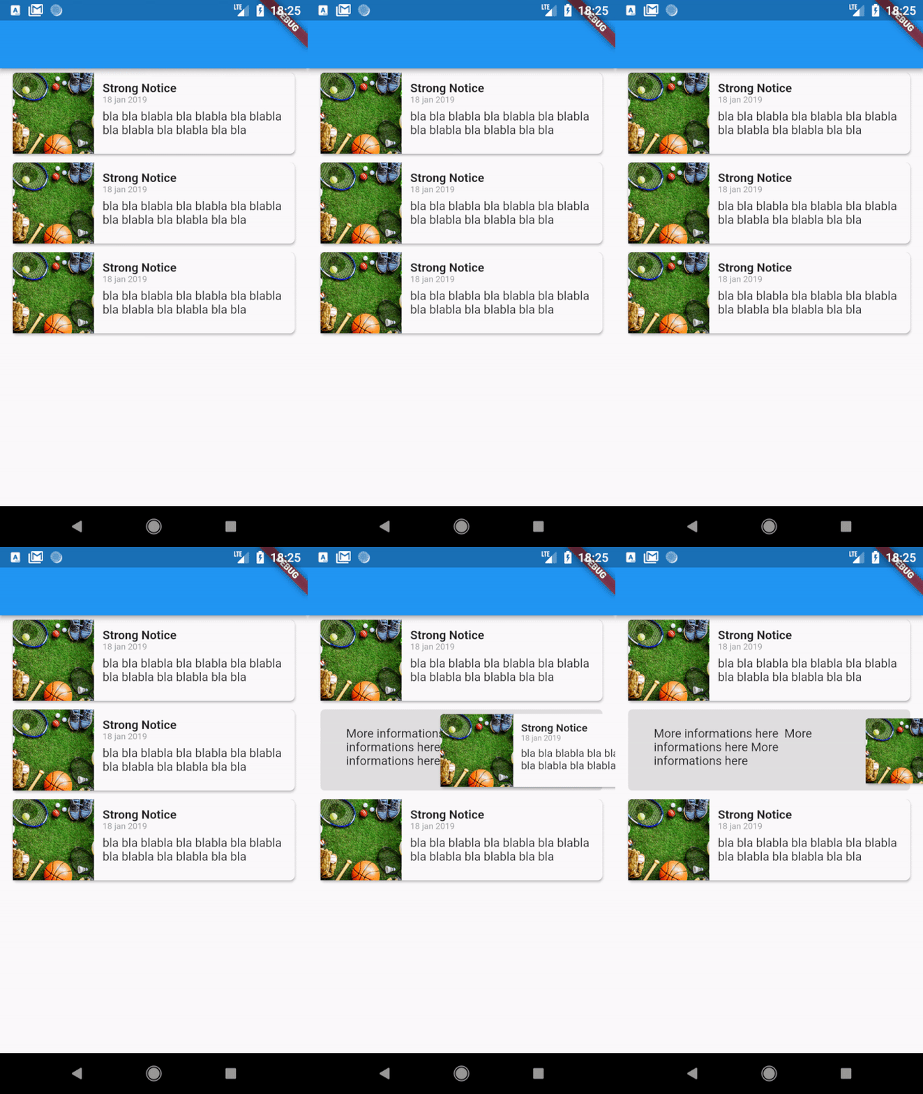
AnimatedDrawerController controller = AnimatedDrawerController(
  vsync: this,
  animationCurve:Curves.decelerate,
  duration:const Duration(milliseconds: 350,
);

return AnimatedDrawerContent(
  controller: controller,
  whithPaddingTop: false, //(optional) default = false // Add padding top in de gesture equals Heigth of the AppBar
  whithShadow: false, //(optional) default = false
  isDraggable: true, //(optional) default = true
  child: Screen(),
);
You can control actions by controller such as:
controller.toggle() // Open or Close
controller.open()
controller.close()
controller.move(percent) // moves to a specific position from 0 to 1 (0 = fully enclosed, 1 = fully opened)
Dependency list 2 items
{"sdk":"flutter"}{"sdk":"flutter"}Start with your use case, compare repository activity, and check the original project before adopting it.
“A repository is the most basic element of GitHub.”
GitHub Docs — About repositories ↗