Package selection guidance compiled from public package information, community data, and project usage.
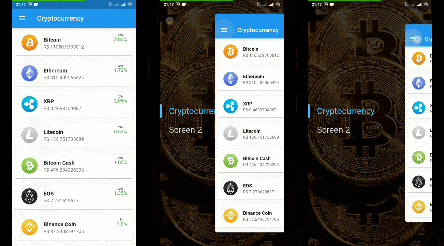
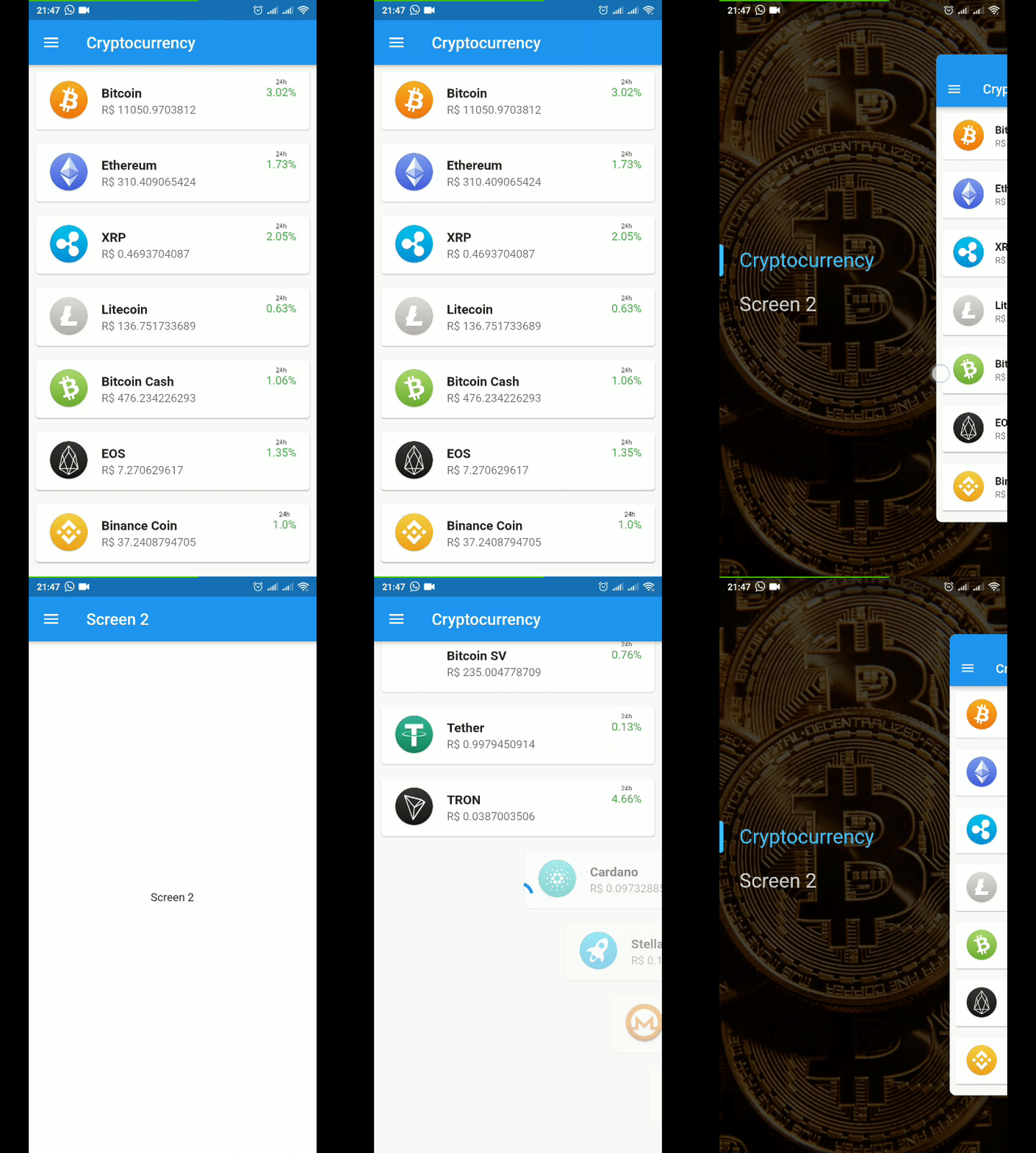
Hidden Drawer Menu is a Flutter package that enables developers to implement a visually appealing drawer navigation with smooth perspective animations. Designed for modern UIs, it offers a sleek sliding drawer that reveals content with depth and motion, enhancing user experience across platforms. The library supports multiple platforms including Android, iOS, Web, macOS, Windows, and Linux, making it ideal for cross-platform applications. With minimal setup via the pub command, it integrates seamlessly into existing projects. Its focus on animation quality and usability makes it suitable for apps requiring elegant navigation patterns.
Use cases
Mobile app navigation
Cross-platform UI design
Interactive dashboard layouts
Enhanced user onboarding flows
Modern interface prototyping
Key features
Perspective-based animation
Cross-platform compatibility
Easy integration with pub
Customizable drawer appearance
Smooth sliding transitions
Suitable for
Developers seeking animated navigation
Design-focused Flutter projects
Apps with complex navigation needs
Teams prioritizing visual polish
Multi-platform application builders
Considerations
May require performance tuning on older devices
Limited customization for advanced gestures
Depends on Flutter's rendering pipeline
Not ideal for simple static menus
Animation may distract in accessibility contexts
Original README
Original README snapshot from the linked source repository. Visit the repository for the latest content.
Hidden Drawer Menu
Hidden Drawer Menu is a library for adding a beautiful drawer mode menu feature with perspective animation.
You can use a pre-defined menu or make a fully customized menu.
final controller = SimpleHiddenDrawerController.of(context);
controller.addListener((){
  print(controller.position);
});
Listen to menu status (closed,opening,open,closing)
final controller = SimpleHiddenDrawerController.of(context);
controller.addListener((){
  print(controller.state);
});
If you want to use only the widget responsible for the animation, it is now available as AnimatedDrawerContent
AnimatedDrawerController controller = AnimatedDrawerController(
vsync: this,
animationCurve:Curves.decelerate,
duration:constDuration(milliseconds: 350,
);
returnAnimatedDrawerContent(
controller: controller,
whithPaddingTop: false, //(optional) default = false // Add padding top in de gesture equals Heigth of the AppBar
whithShadow: false, //(optional) default = false
isDraggable: true, //(optional) default = true
child: Screen(),
);
You can control actions by controller such as:
controller.toggle() // Open or Close
controller.open()
controller.close()
controller.move(percent) // moves to a specific position from 0 to 1 (0 = fully enclosed, 1 = fully opened)