Search packages, repositories and app categories

GitHub repositorySilentCatD/flutter_pannable_rating_bar

flutter_pannable_rating_bar

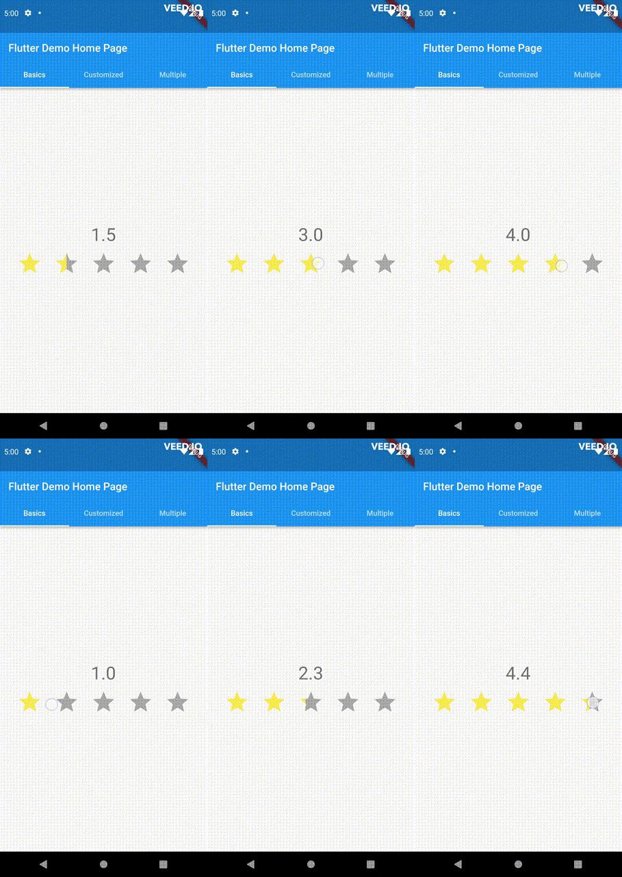
Introducing a new and improved rating bar for Flutter, offering versatility and full customization. Unlike other rating bars, this one allows for any value to be selected, not just full or half ratings when interacted. Both tap and drag gestures are seamlessly supported, providing a smooth user experience.

flutter_pannable_rating_bar project cover
Stars
6
Forks
0
Last push (UTC)
Mar 10, 2023
Project status
Active

Original README

English project snapshot. Visit GitHub for the latest content.

pub package

PannableRatingBar

Introducing a new and improved rating bar for Flutter, offering versatility and full customization. Unlike other rating bars, this one allows for any value to be selected, not just full or half ratings when interacted. Tap, drag and hover gestures are seamlessly supported, providing a smooth user experience.

Features

  • Offers fractional values for rating
  • High degree of customization for the rating widgets, which can be of different sizes, shapes, and colors.
  • Precise hit testing, as the child widget's render object is utilized to determine the results.
  • Allows for filtering gestures with either tapOnly, dragOnly or tapAndDrag options.
  • Rating reports on cursor hovering supported.
  • Built on Flutter's Wrap widget, offering a variety of supported layouts, including consideration of Wrap properties such as textDirection and verticalDirection when painting the indicators.

Getting started

First import the widget

import 'package:flutter_pannable_rating_bar/flutter_pannable_rating_bar.dart';

Usage

This widget is stateless and highly flexible, allowing you to easily manipulate values and customize the display of the PannableRatingBar. Simply rebuild the widget with the value provided in the onChanged callback or onHover callback and the widget will automatically adjust the rating distribution across each rating widget.

double rating = 0.0;

PannableRatingBar(
  rate: rating,
  items: List.generate(5, (index) =>
    const RatingWidget(
      selectedColor: Colors.yellow,
      unSelectedColor: Colors.grey,
      child: Icon(
        Icons.star,
        size: 48,
      ),
    )),
  onChanged: (value) { // the rating value is updated on tap or drag.
    setState(() {
      rating = value;
    });
  },
)

The widget also supports getting the rate value by hovering with the onHover callback. It works best on devices that support a mouse cursor, including desktop web browsers.

double rating = 0.0;

PannableRatingBar(
  rate: rating,
  items: List.generate(5, (index) =>
    const RatingWidget(
      selectedColor: Colors.yellow,
      unSelectedColor: Colors.grey,
      child: Icon(
        Icons.star,
        size: 48,
      ),
    )),
  onHover: (value) { // the rating value is updated every time the cursor moves over a new item.
    setState(() {
      rating = value;
    });
  },
)

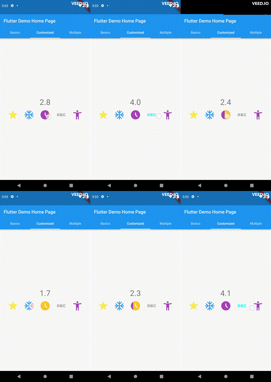
Utilize your own custom widgets as the rating indicators. With complete customization freedom, they don't have to be uniform in size, color, or any other aspect.

double rating = 0.0;

PannableRatingBar(
  rate: rating,
  onChanged: (value) {
    setState(() {
      rating = value;
    });
  },
  items: const [
    RatingWidget(
      selectedColor: Colors.yellow,
      unSelectedColor: Colors.grey,
      child: Icon(
        Icons.star,
        size: 48,
      ),
    ),
    RatingWidget(
      selectedColor: Colors.blue,
      unSelectedColor: Colors.red,
      child: Icon(
        Icons.ac_unit,
        size: 48,
      ),
    ),
    RatingWidget(
      selectedColor: Colors.purple,
      unSelectedColor: Colors.amber,
      child: Icon(
        Icons.access_time_filled,
        size: 48,
      ),
    ),
    RatingWidget(
      selectedColor: Colors.cyanAccent,
      unSelectedColor: Colors.grey,
      child: Icon(
        Icons.abc,
        size: 48,
      ),
    ),
    RatingWidget(
      selectedColor: Colors.tealAccent,
      unSelectedColor: Colors.purple,
      child: Icon(
        Icons.accessibility_new_sharp,
        size: 48,
      ),
    ),
  ],
)
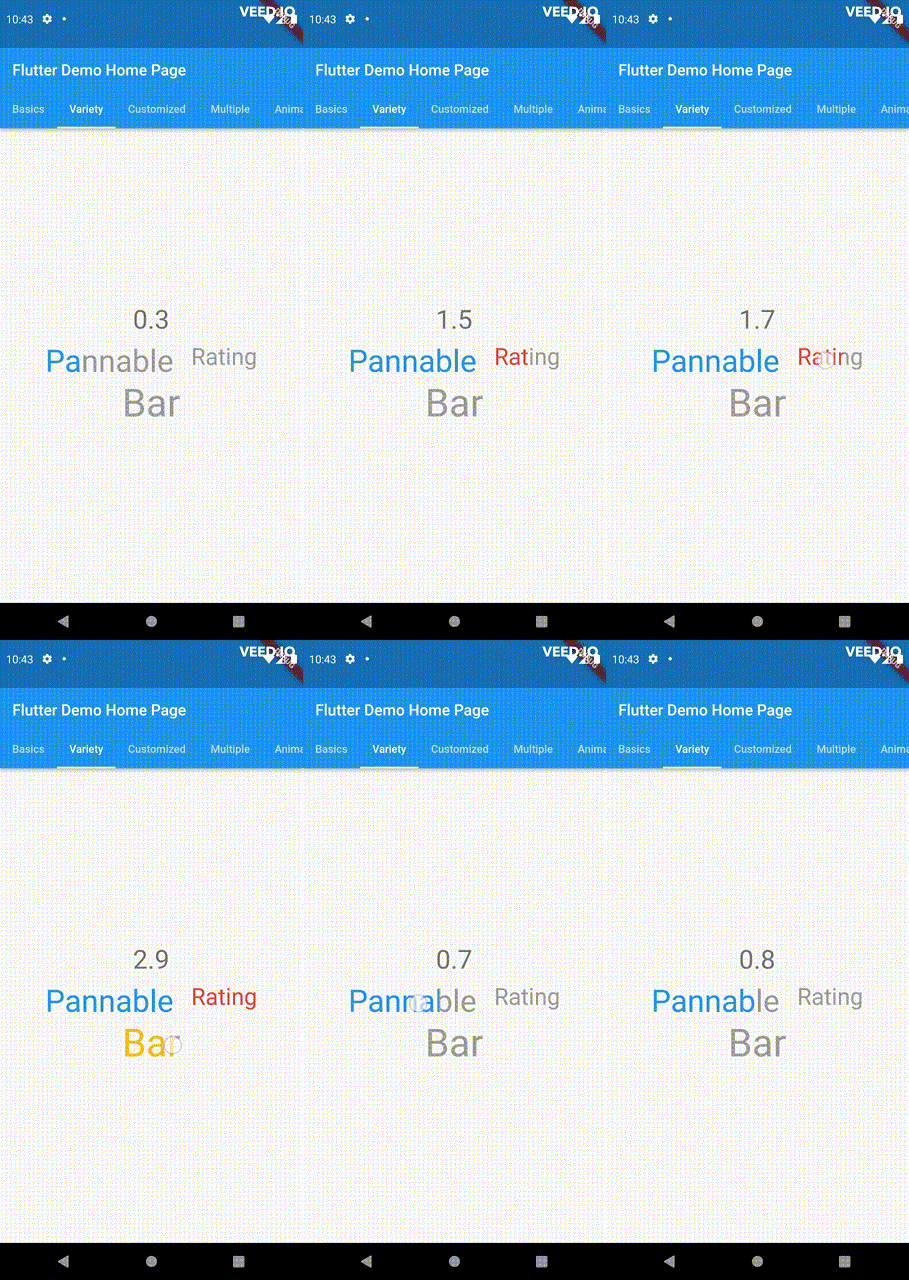
double rating = 0;
PannableRatingBar(
  rate: rating,
  onChanged: (value){
    setState((){
      rating = value;
    });
  },
  spacing: 20,
  items: const [
    RatingWidget(
      selectedColor: Colors.blue,
      child: Text(
        "Pannable",
        style: TextStyle(color: Colors.grey, fontSize: 40),
      ),
    ),
    RatingWidget(
      selectedColor: Colors.red,
      child: Text(
        "Rating",
        style: TextStyle(color: Colors.grey, fontSize: 30),
      ),
    ),
    RatingWidget(
      selectedColor: Colors.amber,
      child: Text(
        "Bar",
        style: TextStyle(color: Colors.grey, fontSize: 50),
      ),
    ),
  ],
),

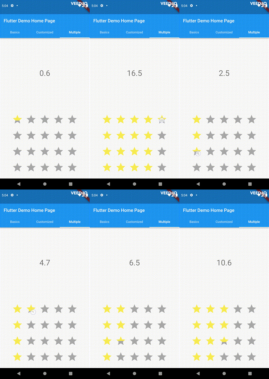
This widget utilizes the layout capabilities of Flutter's built-in Wrap widget, allowing for a wide range of possible layouts to be achieved. The properties of the Wrap widget, such as textDirection and verticalDirection, are also considered when painting the indicators, giving you even greater control over the final look and feel of the rating bar.

double rating = 0.0;

PannableRatingBar.builder(
  rate: rating,
  alignment: WrapAlignment.center,
  spacing: 20,
  runSpacing: 10,
  itemCount: 20,
  direction: Axis.vertical,
  itemBuilder: (context, index) {
    return const RatingWidget(
      selectedColor: Colors.yellow,
      unSelectedColor: Colors.grey,
      child: Icon(
        Icons.star,
        size: 48,
      ),
    );
  },
  onChanged: (value) {
    setState(() {
      rating = value;
    });
  },
)

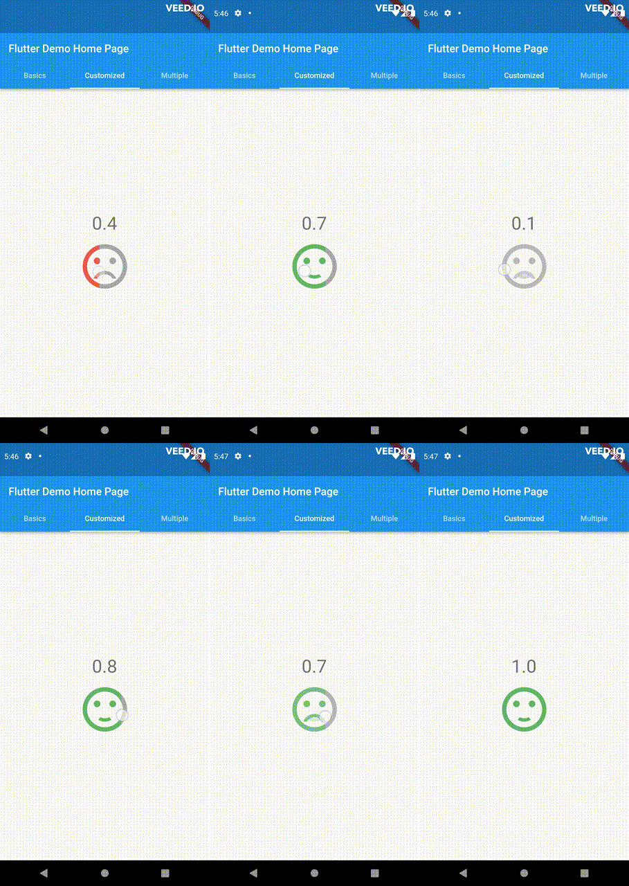
Customize the appearance of the rating indicators based on their values.

double rating = 0;

PannableRatingBar(
    rate: rating,
    spacing: 20,
    onChanged: (value){
      setState((){
        rating = value;
      });
    },
    items: [
      RatingWidget(
        selectedColor: rating <= 0.5 ? Colors.red : Colors.green,
        unSelectedColor: Colors.grey,
        child: AnimatedSwitcher(
          duration: const Duration(milliseconds: 300),
          child: rating <= 0.5
              ? const Icon(
                  Icons.sentiment_very_dissatisfied,
                  key: ValueKey("sad"),
                  size: 100,
                )
              : const Icon(
                  Icons.sentiment_satisfied,
                  key: ValueKey("happy"),
                  size: 100,
                ),
        ),
      ),
    ],
),

For ease of transforming / mutating rating values, the library support using functions to do as such, used as a parameter in PannableRatingBar.

Return null from this will cause the current rating value skipped in all callbacks.

typedef RatingValueTransformer = double? Function(double value);

Some of the pre-built RatingValueTransformers available are:

// Rounding to nearest single fractional digit. This is also the default one that 
// `PannableRatingBar` used.
double singleFractionalValueTransformer(double value);
// Rounding to nearest .5.
double halfFractionalValueTransformer(double value);
// Leave the rating as is.
double rawValueTransformer(double value);

Additional information

For more, checkout and play with the example file. If you have any suggestions for improvement, simply create an issue in the repository!

SilentCatDev GitHub avatar
GitHub author

SilentCatDev ↗

MIT Licensed packages developer @ HCMUS ngocphuocnguyen312@gmail.com

Ho Chi Minh City, Viet Nam
LanguagesDart

Categories

Packages published by this repository

Dependencies used

Dependency list 1 items

How do I choose a repository?

Start with your use case, compare repository activity, and check the original project before adopting it.

  1. Search by repository name, owner or description, then narrow the results by topic.
  2. Compare stars, forks and recent pushes. Stars show community interest, not a guarantee of quality.
  3. Read the README, license and issues on GitHub before using a project.

Sources and maintenance

“A repository is the most basic element of GitHub.”

GitHub Docs — About repositories ↗