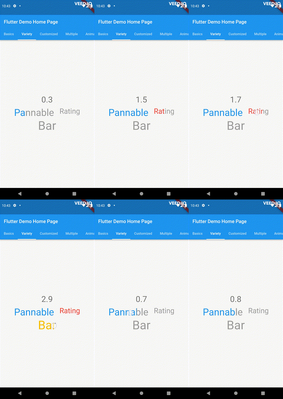
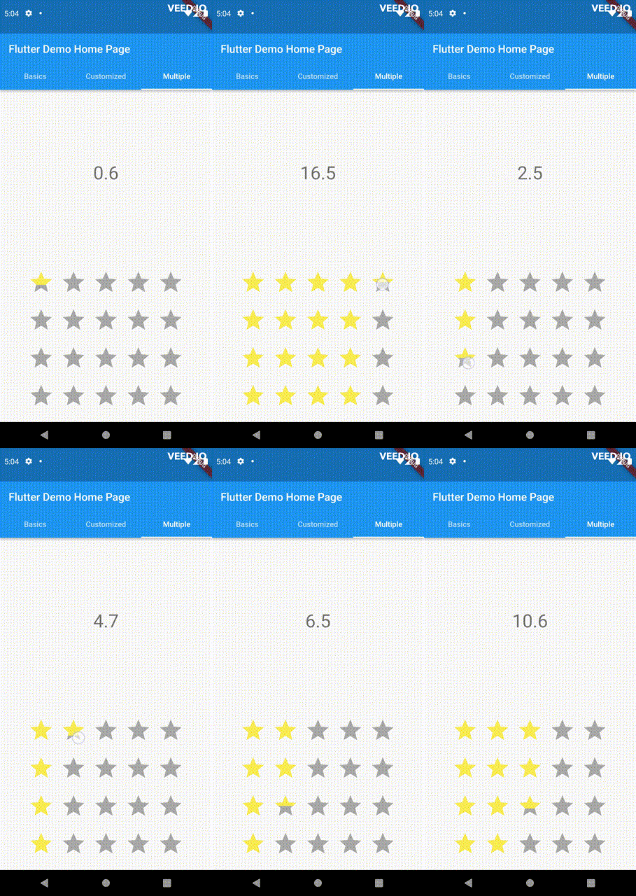
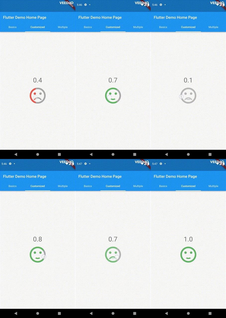
A versatile and customizable rating bar for Flutter. This bar stands out from others with its ability to select any fractional values. Drag, tap and hover event are all supported.
Package selection guidance compiled from public package information, community data, and project usage.
A highly customizable rating bar for Flutter that supports selecting any fractional rating values. Unlike traditional rating bars, it enables smooth interaction through drag, tap, and hover events, offering a responsive and intuitive user experience across devices. Ideal for applications requiring precise feedback input, such as reviews or surveys. The package is compatible with all major platforms including Android, iOS, Web, macOS, Windows, and Linux.
Use cases
User reviews with fine-grained ratings
Interactive survey interfaces
Feedback collection in apps
Real-time rating adjustments
Touch-friendly UI components
Key features
Supports fractional ratings
Drag, tap, and hover interactions
Highly customizable design
Cross-platform compatibility
Smooth animation transitions
Configurable step size
Suitable for
Developers building interactive feedback systems
Apps needing precise rating inputs
Designers wanting touch-optimized UIs
Projects targeting multiple platforms
Prototypes requiring dynamic rating controls
Considerations
May require additional styling for complex themes
Performance impact on large lists of rating bars
Needs careful handling of gesture conflicts
Limited documentation beyond basic usage
Not optimized for very high-frequency updates
Original README
Original README snapshot from the linked source repository. Visit the repository for the latest content.
PannableRatingBar
Introducing a new and improved rating bar for Flutter, offering versatility and full customization.
Unlike other rating bars, this one allows for any value to be selected, not just full or half
ratings when interacted. Tap, drag and hover gestures are seamlessly supported, providing a smooth
user experience.
Features
Offers fractional values for rating
High degree of customization for the rating widgets, which can be of different sizes, shapes, and colors.
Precise hit testing, as the child widget's render object is utilized to determine the results.
Allows for filtering gestures with either tapOnly, dragOnly or tapAndDrag options.
Rating reports on cursor hovering supported.
Built on Flutter's Wrap widget, offering a variety of supported layouts, including consideration
of Wrap properties such as textDirection and verticalDirection when painting the indicators.
This widget is stateless and highly flexible, allowing you to easily manipulate values and
customize the display of the PannableRatingBar. Simply rebuild the widget with the value provided
in the onChanged callback or onHover callback and the widget will automatically adjust the
rating distribution across each rating widget.
double rating = 0.0;
PannableRatingBar(
rate: rating,
items: List.generate(5, (index) =>
constRatingWidget(
selectedColor: Colors.yellow,
unSelectedColor: Colors.grey,
child: Icon(
Icons.star,
size: 48,
),
)),
onChanged: (value) { // the rating value is updated on tap or drag.setState(() {
rating = value;
});
},
)
The widget also supports getting the rate value by hovering with the onHover callback. It works
best on devices that support a mouse cursor, including desktop web browsers.
double rating = 0.0;
PannableRatingBar(
rate: rating,
items: List.generate(5, (index) =>
constRatingWidget(
selectedColor: Colors.yellow,
unSelectedColor: Colors.grey,
child: Icon(
Icons.star,
size: 48,
),
)),
onHover: (value) { // the rating value is updated every time the cursor moves over a new item.setState(() {
rating = value;
});
},
)
Utilize your own custom widgets as the rating indicators. With complete customization freedom, they
don't have to be uniform in size, color, or any other aspect.
This widget utilizes the layout capabilities of Flutter's built-in Wrap widget, allowing for a wide
range of possible layouts to be achieved. The properties of the Wrap widget, such as textDirection
and verticalDirection, are also considered when painting the indicators, giving you even greater
control over the final look and feel of the rating bar.
Some of the pre-built RatingValueTransformers available are:
// Rounding to nearest single fractional digit. This is also the default one that // `PannableRatingBar` used.doublesingleFractionalValueTransformer(double value);
// Rounding to nearest .5.doublehalfFractionalValueTransformer(double value);
// Leave the rating as is.doublerawValueTransformer(double value);
Additional information
For more, checkout and play with the example file.
If you have any suggestions for improvement, simply create an issue in the repository!