
 v1.0.1
iconify_design
A Flutter package that allows you to use icons from the iconify.design API with ease.
21Likes 36130-day downloads160Pub points
AndroidiOSWebmacOSWindowsLinux
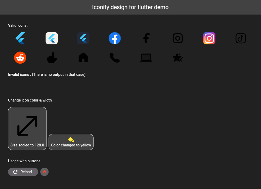
A Flutter package that allows you to use icons from the Iconify.design API with ease. This package provides a widget called IconifyIcon that takes an icon string and optionally allows you to specify the size and color of the icon.

^2.2.3^0.10.1^2.0.10+1^5.5.0+1{"sdk":"flutter"}{"sdk":"flutter"}^2.0.0English project snapshot. Visit GitHub for the latest content.
A Flutter package that allows you to use icons from the Iconify.design API with ease. This package provides a widget called IconifyIcon that takes an icon string and optionally allows you to specify the size, color, placeholder, and error widget of the icon.
iconify-design
Add the following to your pubspec.yaml file:
dependencies:
  iconify_design: ^1.0.2
Then run:
flutter pub get
import 'package:iconify_design/iconify_design.dart';
import 'package:flutter/material.dart';
Here is an example of how to use the IconifyIcon widget:
import 'package:flutter/material.dart';
import 'package:iconify_design/iconify_design.dart';

void main() {
  runApp(MyApp());
}

class MyApp extends StatelessWidget {
  @override
  Widget build(BuildContext context) {
    return MaterialApp(
      home: Scaffold(
        appBar: AppBar(
          title: Text('Iconify Flutter Example'),
        ),
        body: Center(
          child: IconifyIcon(
            icon: 'mdi:home',
            size: 48.0,
            color: Colors.blue,
            placeholder: CircularProgressIndicator(),
            errorWidget: Icon(
              Icons.error_outline,
              color: Colors.red,
            ),
          ),
        ),
      ),
    );
  }
}
The IconifyIcon widget has the following parameters:
null also falls back to Black.You can customize the loading and error states:
IconifyIcon(
  icon: 'mdi:home',
  placeholder: const SizedBox(
    width: 24,
    height: 24,
    child: CircularProgressIndicator(strokeWidth: 2),
  ),
  errorWidget: const Icon(
    Icons.error_outline,
    color: Colors.red,
  ),
)
Feel free to open issues or submit pull requests to help improve this package.
This project is licensed under the MIT License - see the LICENSE file for details.
Don't forget to support (if you can).