Search packages, repositories and app categories

iconify_design cover
Package detailsv1.0.2

iconify_design

A Flutter package that allows you to use icons from the iconify.design API with ease.

AndroidiOSWebmacOSWindowsLinux
30-day downloads
1.3K
Likes
22
Pub points
160

Install package

flutter pub add iconify_design

Package Overview

Package selection guidance compiled from public package information, community data, and project usage.

Iconify Design is a Flutter package that simplifies the integration of icons from the iconify.design API into Flutter applications. It enables developers to easily search, load, and display thousands of scalable vector icons across multiple platforms. The package supports dynamic icon fetching, theme-aware rendering, and efficient caching for optimal performance. With minimal setup, it enhances UI design flexibility without bloating the app size.

Use cases

  • Integrating scalable icons in cross-platform apps
  • Reducing asset bundle size with on-demand icons
  • Enhancing UI with a vast icon library
  • Supporting dark/light mode icon variants
  • Building responsive and accessible interfaces

Key features

  • Direct integration with iconify.design API
  • Dynamic icon loading and caching
  • Cross-platform support (Android, iOS, Web, macOS, Windows, Linux)
  • Lightweight and modular design
  • Automatic theme-based icon switching
  • Searchable icon catalog

Suitable for

  • Developers seeking a large icon library
  • Projects requiring scalable vector graphics
  • Apps targeting multiple platforms
  • UI designers wanting flexible icon management
  • Teams prioritizing performance and maintainability

Considerations

  • Requires internet connection for initial icon fetch
  • May impact startup time if many icons are loaded upfront
  • Depends on external API availability
  • Limited customization options compared to local assets
  • Potential latency when fetching icons over slow networks

Original README

Original README snapshot from the linked source repository. Visit the repository for the latest content.

Iconify Design

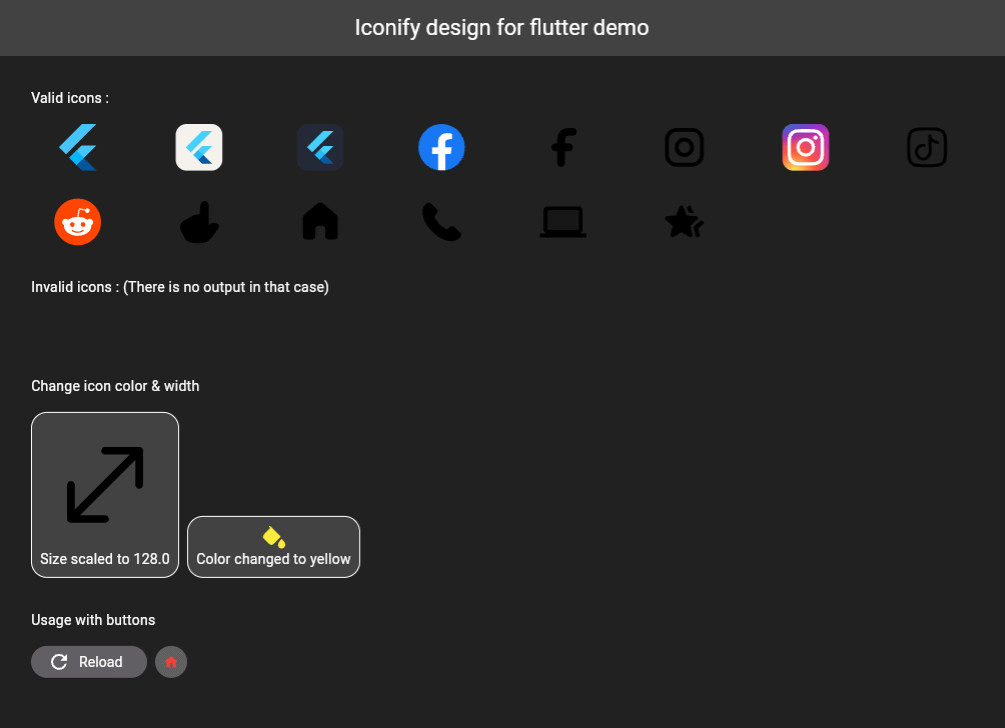
A Flutter package that allows you to use icons from the Iconify.design API with ease. This package provides a widget called IconifyIcon that takes an icon string and optionally allows you to specify the size, color, placeholder, and error widget of the icon.

iconify-design

Installation

Add the following to your pubspec.yaml file:

dependencies:
  iconify_design: ^1.0.2

Then run:

flutter pub get
Usage
import 'package:iconify_design/iconify_design.dart';
import 'package:flutter/material.dart';
Example

Here is an example of how to use the IconifyIcon widget:

import 'package:flutter/material.dart';
import 'package:iconify_design/iconify_design.dart';

void main() {
  runApp(MyApp());
}

class MyApp extends StatelessWidget {
  @override
  Widget build(BuildContext context) {
    return MaterialApp(
      home: Scaffold(
        appBar: AppBar(
          title: Text('Iconify Flutter Example'),
        ),
        body: Center(
          child: IconifyIcon(
            icon: 'mdi:home',
            size: 48.0,
            color: Colors.blue,
            placeholder: CircularProgressIndicator(),
            errorWidget: Icon(
              Icons.error_outline,
              color: Colors.red,
            ),
          ),
        ),
      ),
    );
  }
}
Parameters

The IconifyIcon widget has the following parameters:

  1. icon: The icon string (e.g., 'mdi:home', 'iconoir:fill-color-solid', etc.).
  2. size (optional): The size of the icon. Default is 24.0.
  3. color (optional): The color of the icon. Default is Black. Passing null also falls back to Black.
  4. placeholder (optional): The widget to display while the icon is loading. Default is a small circular progress indicator.
  5. errorWidget (optional): The widget to display when the icon cannot be loaded. Default is an empty widget.
Custom Placeholder and Error Widget

You can customize the loading and error states:

IconifyIcon(
  icon: 'mdi:home',
  placeholder: const SizedBox(
    width: 24,
    height: 24,
    child: CircularProgressIndicator(strokeWidth: 2),
  ),
  errorWidget: const Icon(
    Icons.error_outline,
    color: Colors.red,
  ),
)
Contribution

Feel free to open issues or submit pull requests to help improve this package.

License

This project is licensed under the MIT License - see the LICENSE file for details.

Support

Don't forget to support (if you can).

"Buy Me A Coffee"

Maintainers

Categories

Dependencies

Dependency list 4 items

Source repository

Projects using this package

No data available yet.