

v0.2.9
slide_button
A sliding Flutter widget, based on the slide to unlock function from multiple devices. Heavily customizable and flexible.
33Likes 3630-day downloads40Pub points
Platforms unavailable
A swipe to confirm button for flutter

English project snapshot. Visit GitHub for the latest content.
A sliding Flutter widget, based on the slide to unlock function from multiple devices. Heavily customizable and flexible.
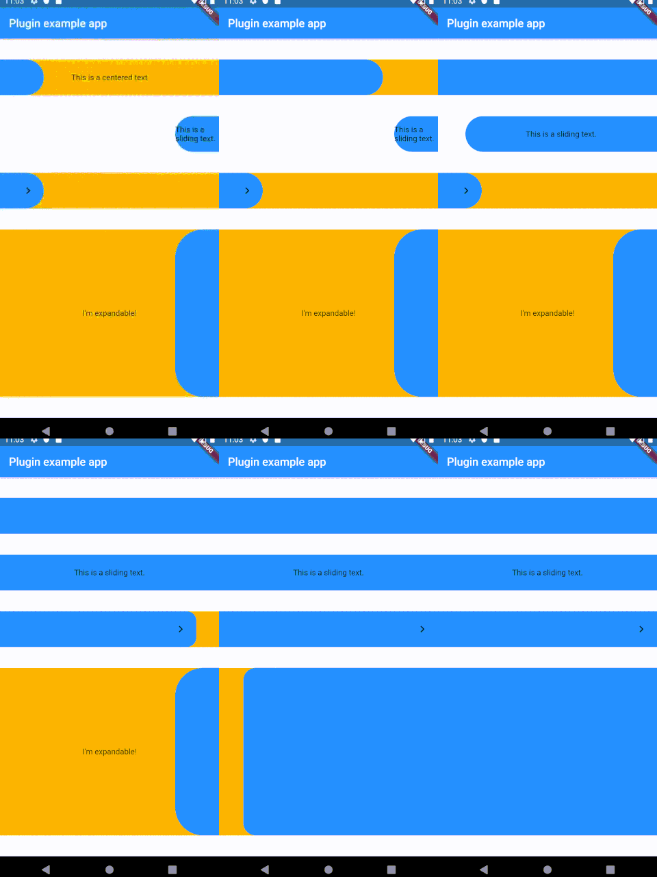
Add the following to your pubspec.yaml:
dependencies:
slide_button: ^0.2.8
Several properties are present and can be customized:
| Properties              	| Description                                                                                                                                                            	|
|-------------------------	|------------------------------------------------------------------------------------------------------------------------------------------------------------------------	|
| height                  	| Height of the Widget, leave blank to get the parent constraints.                                                                                                       	|
| backgroundChild         	| A child to be put on the background bar, NOT centered by default.                                                                                                      	|
| slidingChild            	| A child tobe put on the sliding bar, NOT centered by default.                                                                                                          	|
| backgroundColor         	| The color of the background bar.                                                                                                                                       	|
| slidingBarColor         	| The color of the sliding bar.                                                                                                                                          	|
| confirmPercentage       	| How much of the bar width have to be slided to confirm the action.                                                                                                     	|
| initialSliderPercentage 	| The initial (and resting) percentage of the sliding bar.                                                                                                               	|
| isDraggable             	| Is this widget draggable?                                                                                                                                              	|
| onButtonSlide           	| Callback that returns a `Double` value containing the drag percentage.                                                                                                 	|
| onButtonOpened          	| Callback called when the button is slided all the way.                                                                                                                 	|
| onButtonClosed          	| Callback called when the button is back to the initialSliderPercentage.                                                                                                	|
| slideDirection          	| Either SlideDirection.RIGHT or SlideDirection.LEFT, sets the sliding direction of the sliding bar.                                                                     	|
| shouldCloseBorders      	| This updates the borders when the button reaches 0.9 percent dragged, and set the borderRadius to zero, giving the impression of a "closed" button. Defaults to `true` 	|
| shouldCloseBorders      	| BorderRadius for the sliding bar, default is 50. 	                                                                                                                        |
This widget was partially made possible by inspecting elements from sliding_up_panel.
Dependency list 2 items
{"sdk":"flutter"}{"sdk":"flutter"}Start with your use case, compare repository activity, and check the original project before adopting it.
“A repository is the most basic element of GitHub.”
GitHub Docs — About repositories ↗