Search packages, repositories and app categories

Package detailsv0.2.9

slide_button

A sliding Flutter widget, based on the slide to unlock function from multiple devices. Heavily customizable and flexible.

30-day downloads
36
Likes
33
Pub points
40

Install package

flutter pub add slide_button

Package Overview

Package selection guidance compiled from public package information, community data, and project usage.

SlideButton is a customizable Flutter widget inspired by the 'slide to unlock' functionality found on various devices. It offers a smooth, interactive sliding experience with extensive styling options for colors, shapes, and animations. Developers can tailor its appearance and behavior to fit diverse UI needs, making it ideal for authentication prompts, toggles, or engaging user interactions. The widget is lightweight and easy to integrate into existing Flutter projects.

Use cases

  • Authentication prompts
  • Interactive UI elements
  • Custom toggle switches
  • Onboarding screens
  • User confirmation dialogs

Key features

  • Highly customizable appearance
  • Smooth sliding animation
  • Configurable track and thumb styles
  • Supports callbacks on slide completion
  • Lightweight and performant

Suitable for

  • Developers building intuitive unlock interfaces
  • Designers seeking interactive widgets
  • Apps requiring user confirmation gestures
  • Projects with custom slider requirements

Considerations

  • Limited platform-specific behaviors
  • No built-in accessibility features
  • Requires manual handling of edge cases
  • Not optimized for complex gesture recognition
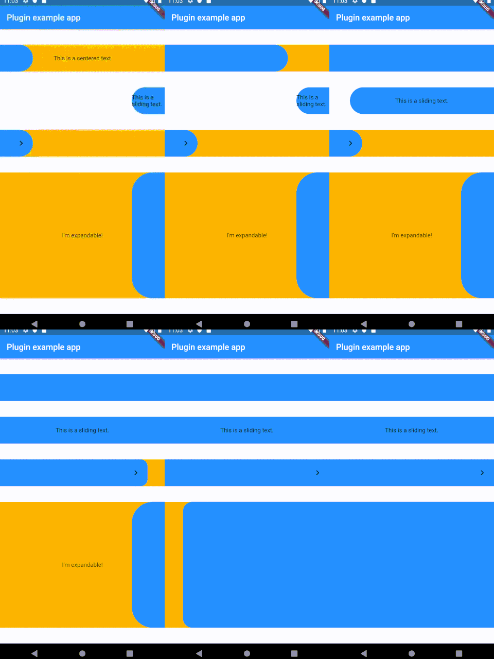
Original README

Original README snapshot from the linked source repository. Visit the repository for the latest content.

Sliding Button

A sliding Flutter widget, based on the slide to unlock function from multiple devices. Heavily customizable and flexible.

pls don't be a giant-ass gif

Installing

Add the following to your pubspec.yaml:

dependencies:
slide_button: ^0.2.8

Usage

  1. Install
  2. Use the SlideButton widget anywhere
  3. ???
  4. Profit

Properties

Several properties are present and can be customized:

| Properties              	| Description                                                                                                                                                            	|
|-------------------------	|------------------------------------------------------------------------------------------------------------------------------------------------------------------------	|
| height                  	| Height of the Widget, leave blank to get the parent constraints.                                                                                                       	|
| backgroundChild         	| A child to be put on the background bar, NOT centered by default.                                                                                                      	|
| slidingChild            	| A child tobe put on the sliding bar, NOT centered by default.                                                                                                          	|
| backgroundColor         	| The color of the background bar.                                                                                                                                       	|
| slidingBarColor         	| The color of the sliding bar.                                                                                                                                          	|
| confirmPercentage       	| How much of the bar width have to be slided to confirm the action.                                                                                                     	|
| initialSliderPercentage 	| The initial (and resting) percentage of the sliding bar.                                                                                                               	|
| isDraggable             	| Is this widget draggable?                                                                                                                                              	|
| onButtonSlide           	| Callback that returns a `Double` value containing the drag percentage.                                                                                                 	|
| onButtonOpened          	| Callback called when the button is slided all the way.                                                                                                                 	|
| onButtonClosed          	| Callback called when the button is back to the initialSliderPercentage.                                                                                                	|
| slideDirection          	| Either SlideDirection.RIGHT or SlideDirection.LEFT, sets the sliding direction of the sliding bar.                                                                     	|
| shouldCloseBorders      	| This updates the borders when the button reaches 0.9 percent dragged, and set the borderRadius to zero, giving the impression of a "closed" button. Defaults to `true` 	|
| shouldCloseBorders      	| BorderRadius for the sliding bar, default is 50. 	                                                                                                                        |

TODO

  • [x] Create the repo
  • [x] Make it work
  • [ ] Fix text on the sliding bar
  • [ ] Find a better activation function capable of activating between x and y percentages
  • [ ] More listeners?
  • [ ] Parallax effect?
  • [ ] Make it pop

Inspiration

This widget was partially made possible by inspecting elements from sliding_up_panel.

Categories

Source repository

Projects using this package

No data available yet.