

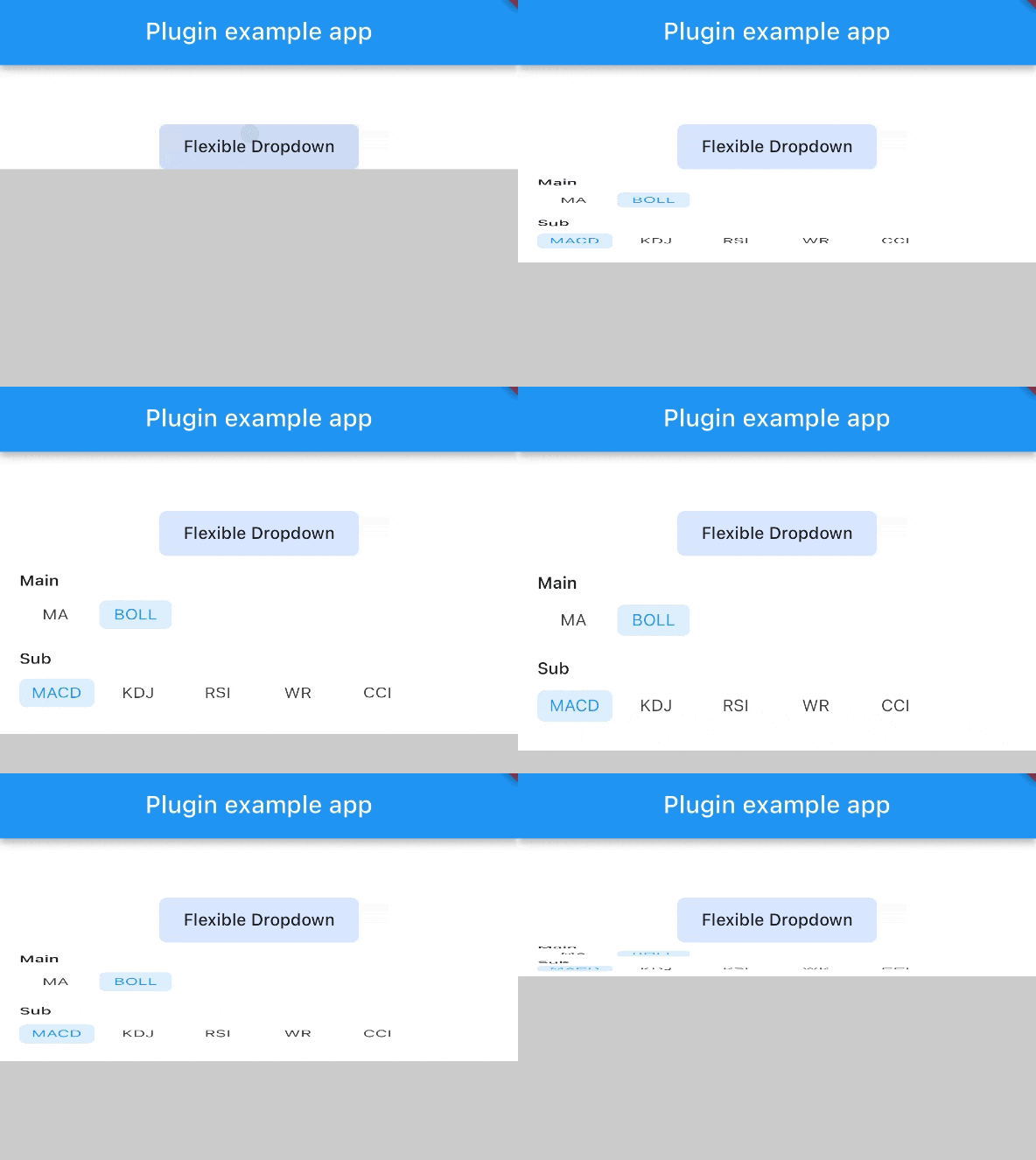
 v1.0.8
flexible_dropdown
Allows the dropdown to be dismissed by tapping | panning the scrim and Set transparent for header(Barrier)
15Likes 10830-day downloads150Pub points
AndroidiOSWebmacOSWindowsLinux
TrangLeQuynh/flexible_dropdown open-source repository details.

English project snapshot. Visit GitHub for the latest content.


Customize dropdown
Auto scroll to selected item position
Support BarrierShape.headerTrans to highlight the content above the flexible dropdown button
Allows the dropdown to be dismissed by tapping | panning the scrim or by pressing the escape key on the keyboard.
Allow to choose the Animation Type
First, add flexible_dropdown as a dependency in your pubspec.yaml file.
dependencies:
  flexible_dropdown: ^1.0.7
FlexibleDropdown(
  overlayChild: Container(
    height: 160,
    width: double.infinity,
    color: Colors.deepPurple,
  ),
  barrierColor: Colors.black38.withOpacity(.2),
  barrierShape: BarrierShape.headerTrans,
  textDirection: TextDirection.ltr,
  offset: Offset.zero,
  duration: const Duration(milliseconds: 400),
  animationType: AnimationType.size,
  animationAlignment: Alignment.topCenter,
  child: Container(
    decoration: BoxDecoration(
      borderRadius: BorderRadius.circular(6),
      color: Colors.blueAccent.withOpacity(.2),
    ),
    child: Padding(
      padding: const EdgeInsets.symmetric(vertical: 10, horizontal: 20),
      child: Text(
        title,
        style: const TextStyle(fontSize: 14, fontWeight: FontWeight.w500),
      ),
    ),
  ),
)
Usage to close the flexible dropdown:
Navigator.pop(context);
| scale | scaleX | scaleY |
|---|---|---|
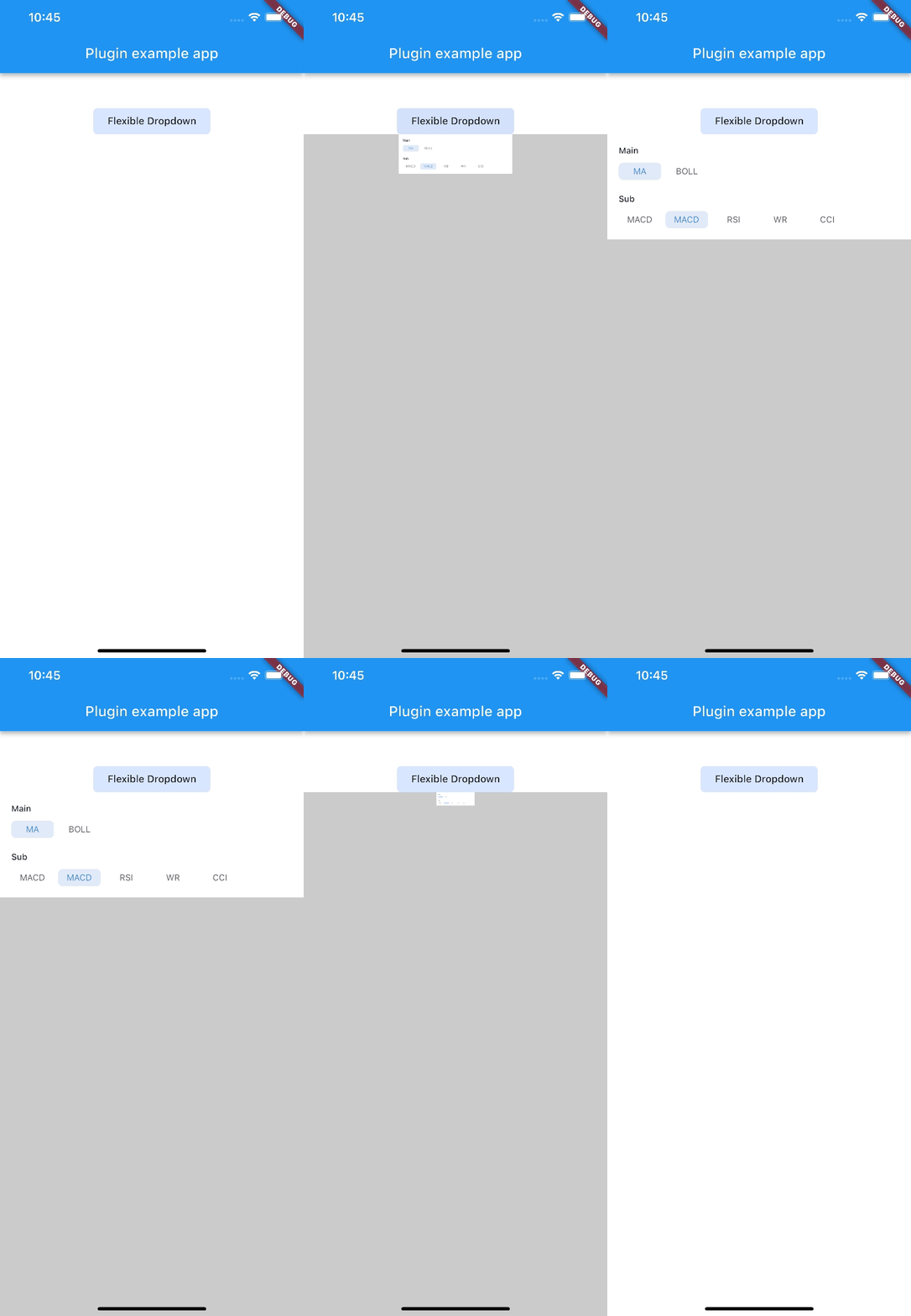 |
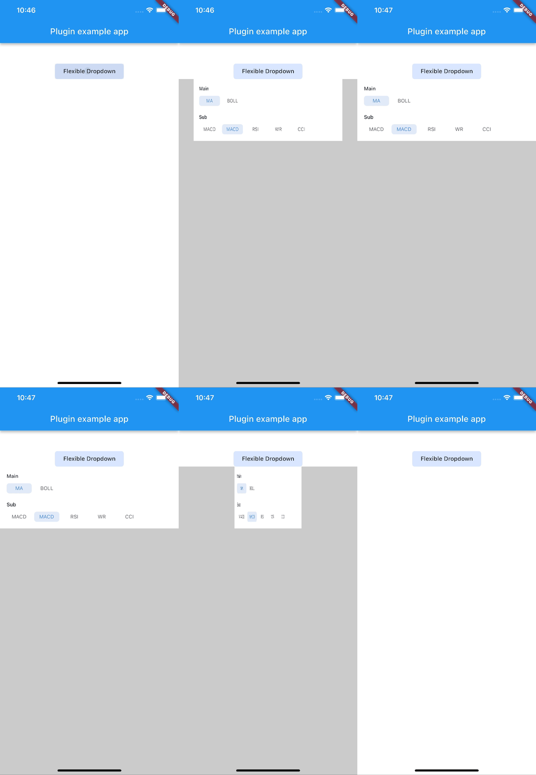 |
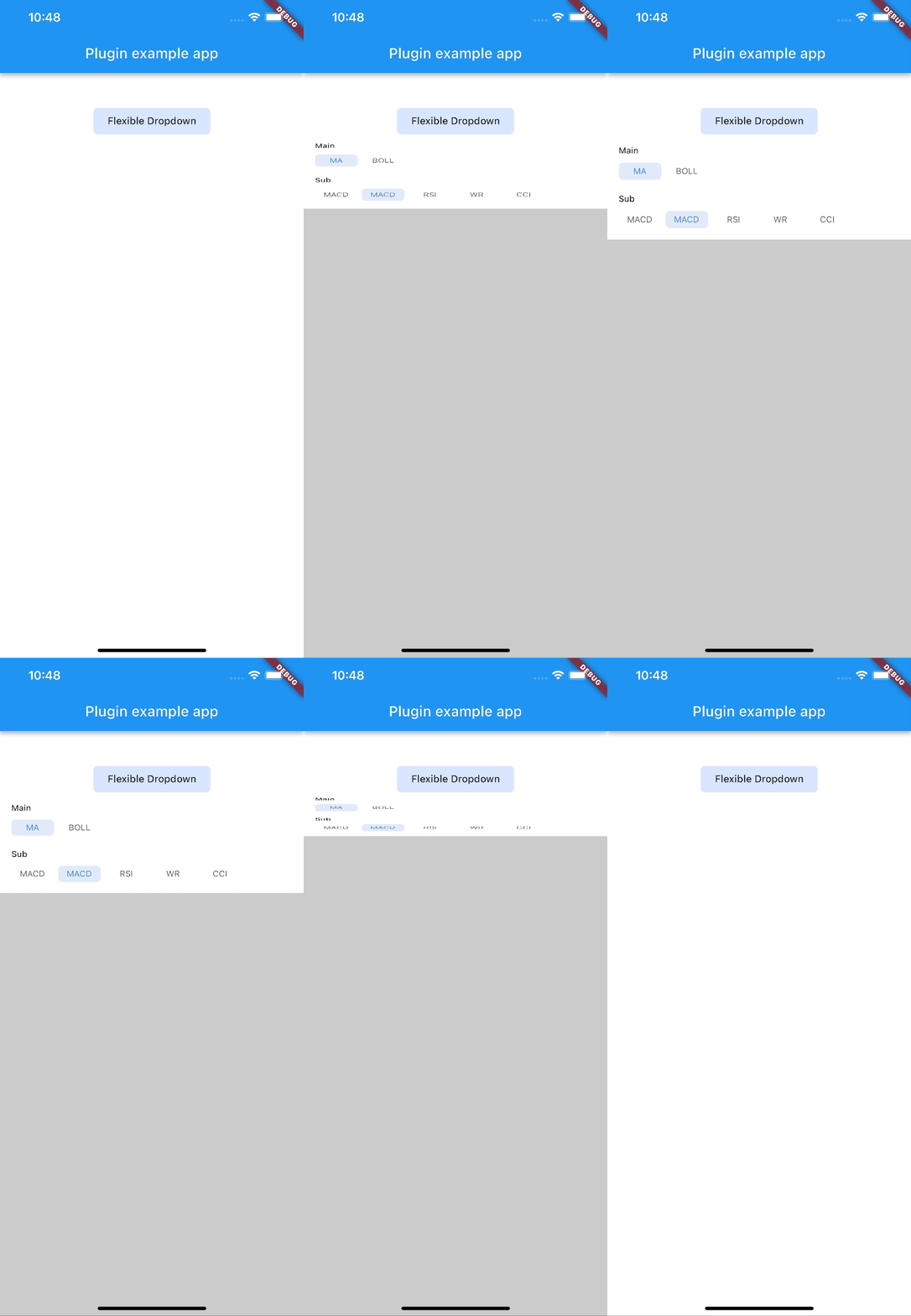 |
| size | slide | fade |
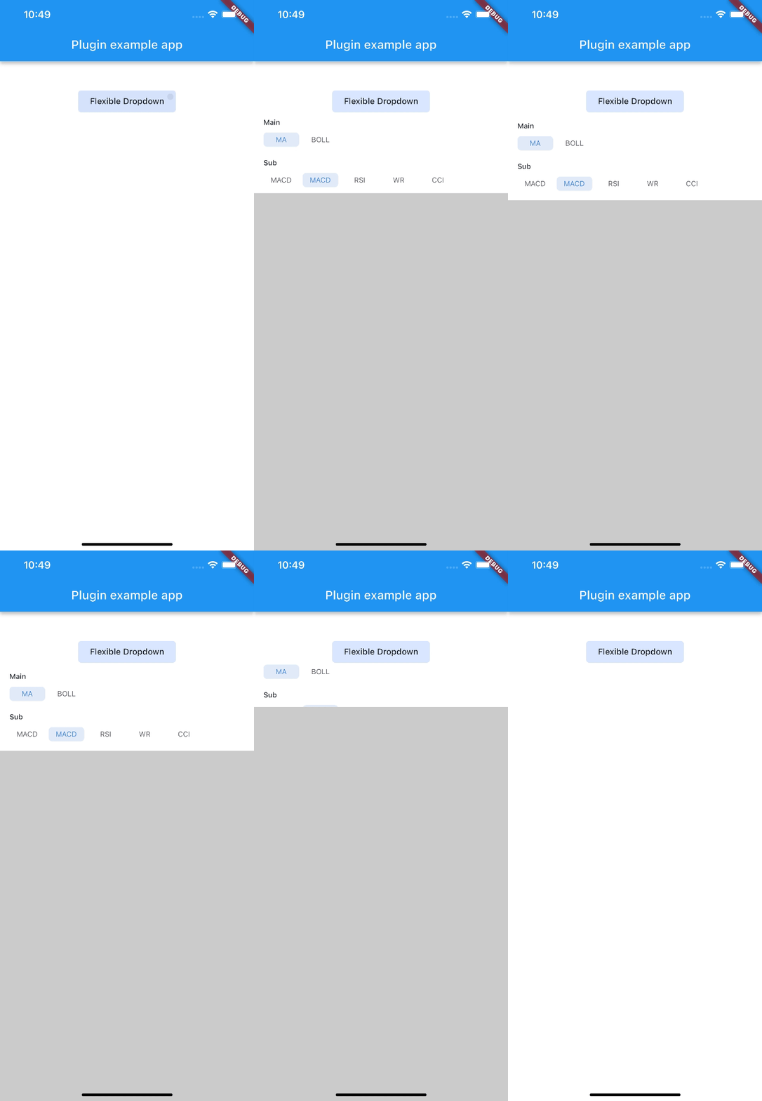 |
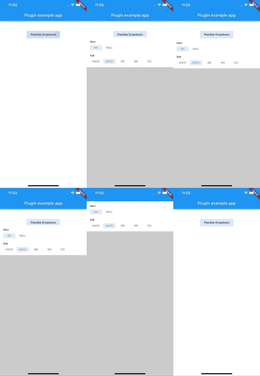 |
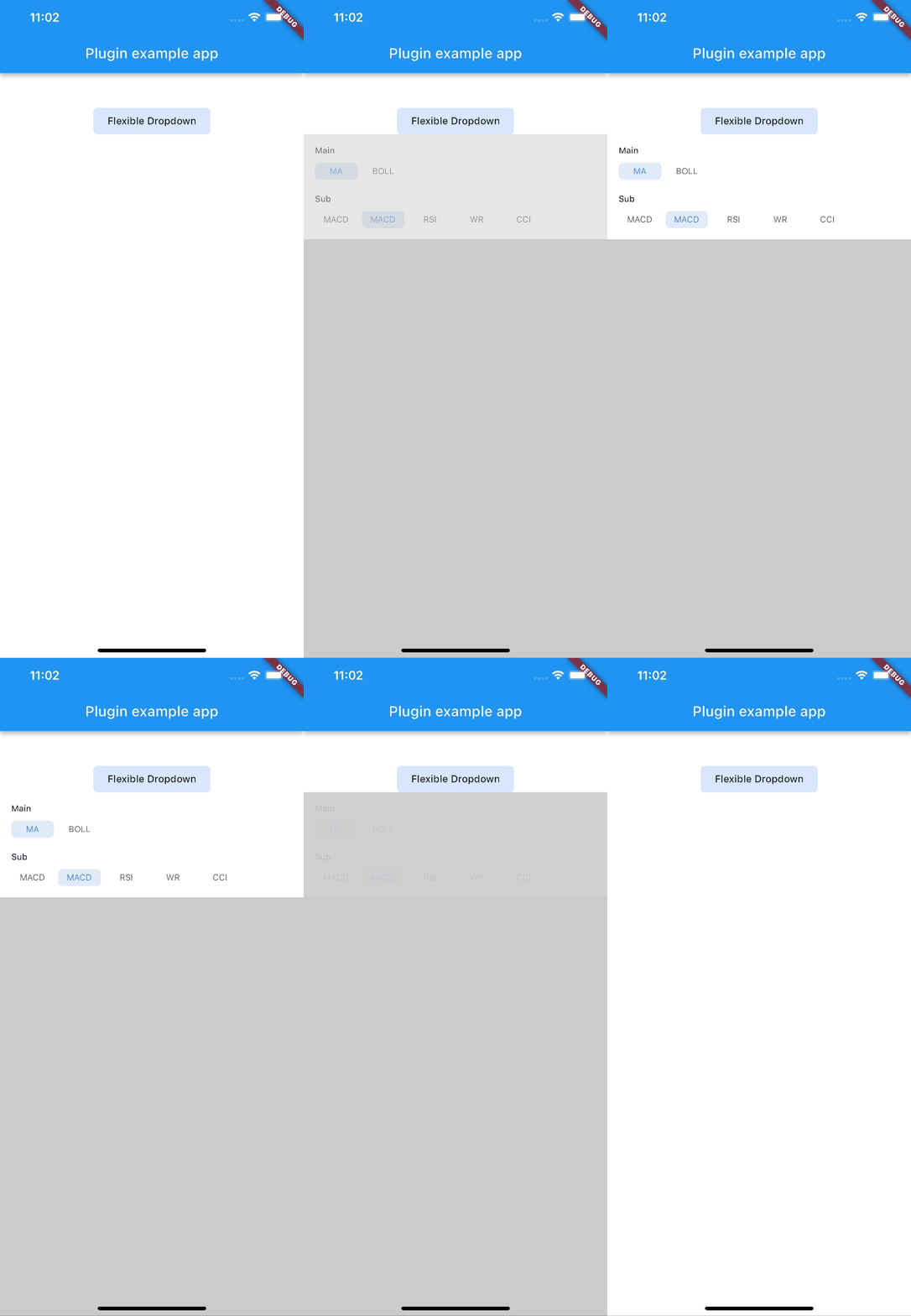 |
| rotate | ||
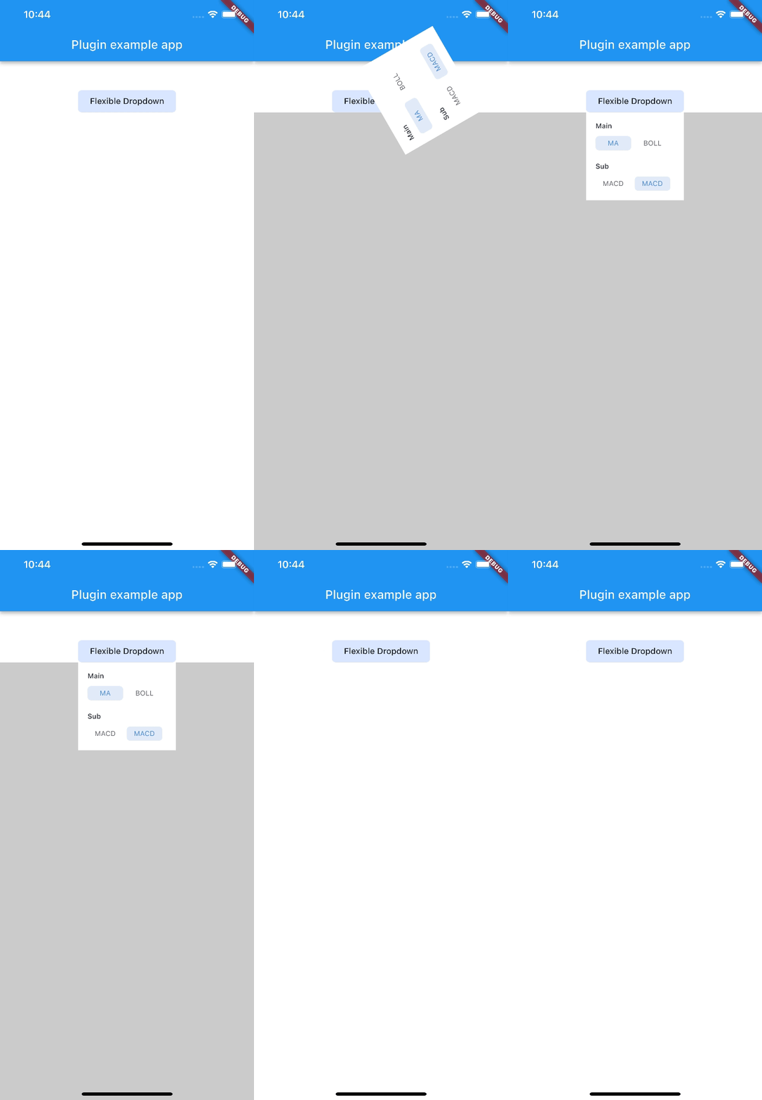 |
Note:
AnimationType.sizeis only suitable for width ofoverlayChildis full screen width.
Dependency list 4 items
{"sdk":"flutter"}^2.0.2{"sdk":"flutter"}^2.0.0Start with your use case, compare repository activity, and check the original project before adopting it.
“A repository is the most basic element of GitHub.”
GitHub Docs — About repositories ↗