Search packages, repositories and app categories

flexible_dropdown cover
Package detailsv1.0.8

flexible_dropdown

Allows the dropdown to be dismissed by tapping | panning the scrim and Set transparent for header(Barrier)

AndroidiOSWebmacOSWindowsLinux
30-day downloads
108
Likes
15
Pub points
150

Install package

flutter pub add flexible_dropdown

Package Overview

Package selection guidance compiled from public package information, community data, and project usage.

A Flutter package that enhances dropdown functionality by allowing dismissal through tapping or panning the scrim, and supports transparent headers with a barrier effect. It provides greater user control and smoother interactions compared to standard dropdowns. Ideal for apps needing customizable, gesture-responsive dropdown menus across multiple platforms. The package is lightweight and integrates easily via pub.dev.

Use cases

  • Customizable dropdown dismissal
  • Gesture-based navigation in dropdowns
  • Transparent header designs
  • Cross-platform dropdown components
  • Improved UX in forms and selection interfaces

Key features

  • Tap-to-dismiss on scrim
  • Pan-to-dismiss gesture
  • Transparent header support
  • Barrier effect for backdrop
  • Cross-platform compatibility

Suitable for

  • Developers seeking interactive dropdowns
  • Apps requiring intuitive user gestures
  • Designers focused on visual clarity
  • Multi-platform Flutter applications
  • Form-heavy UIs with dropdowns

Considerations

  • Requires careful handling of gesture conflicts
  • May need custom styling for complex layouts
  • Limited documentation beyond basic usage
  • Not suitable for simple static dropdowns
  • Potential performance impact with many items

Original README

Original README snapshot from the linked source repository. Visit the repository for the latest content.

Flexible Dropdown Package

Features

  • Customize dropdown

  • Auto scroll to selected item position

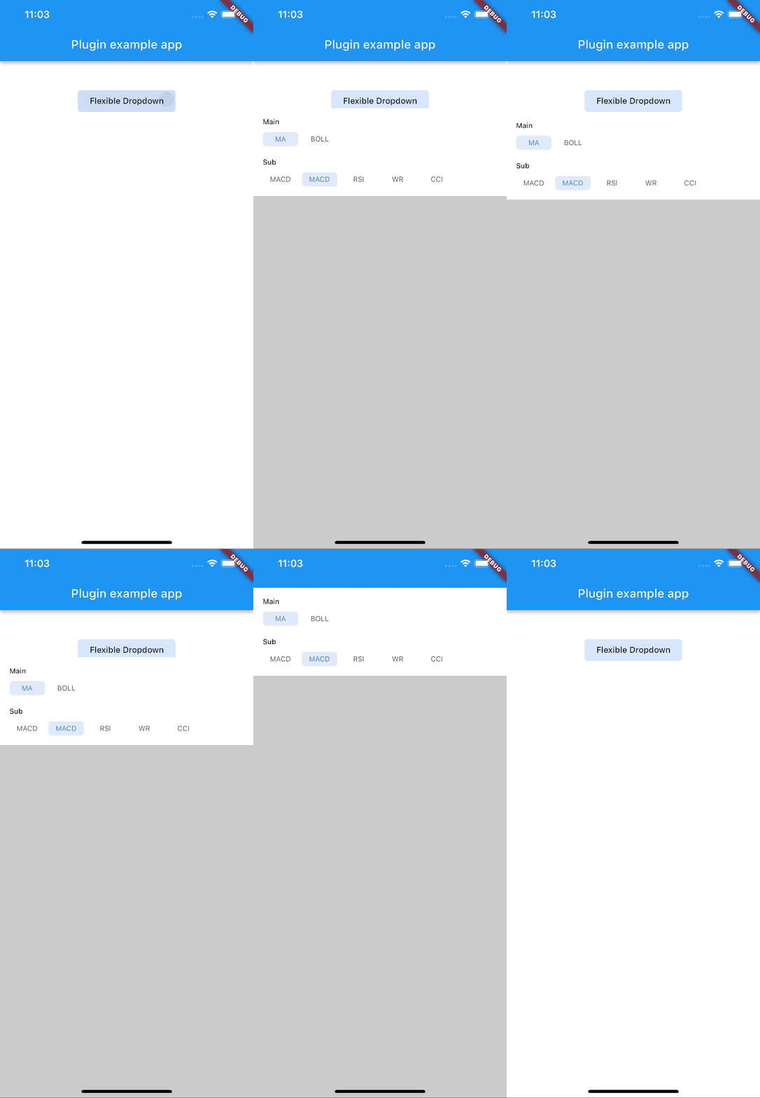
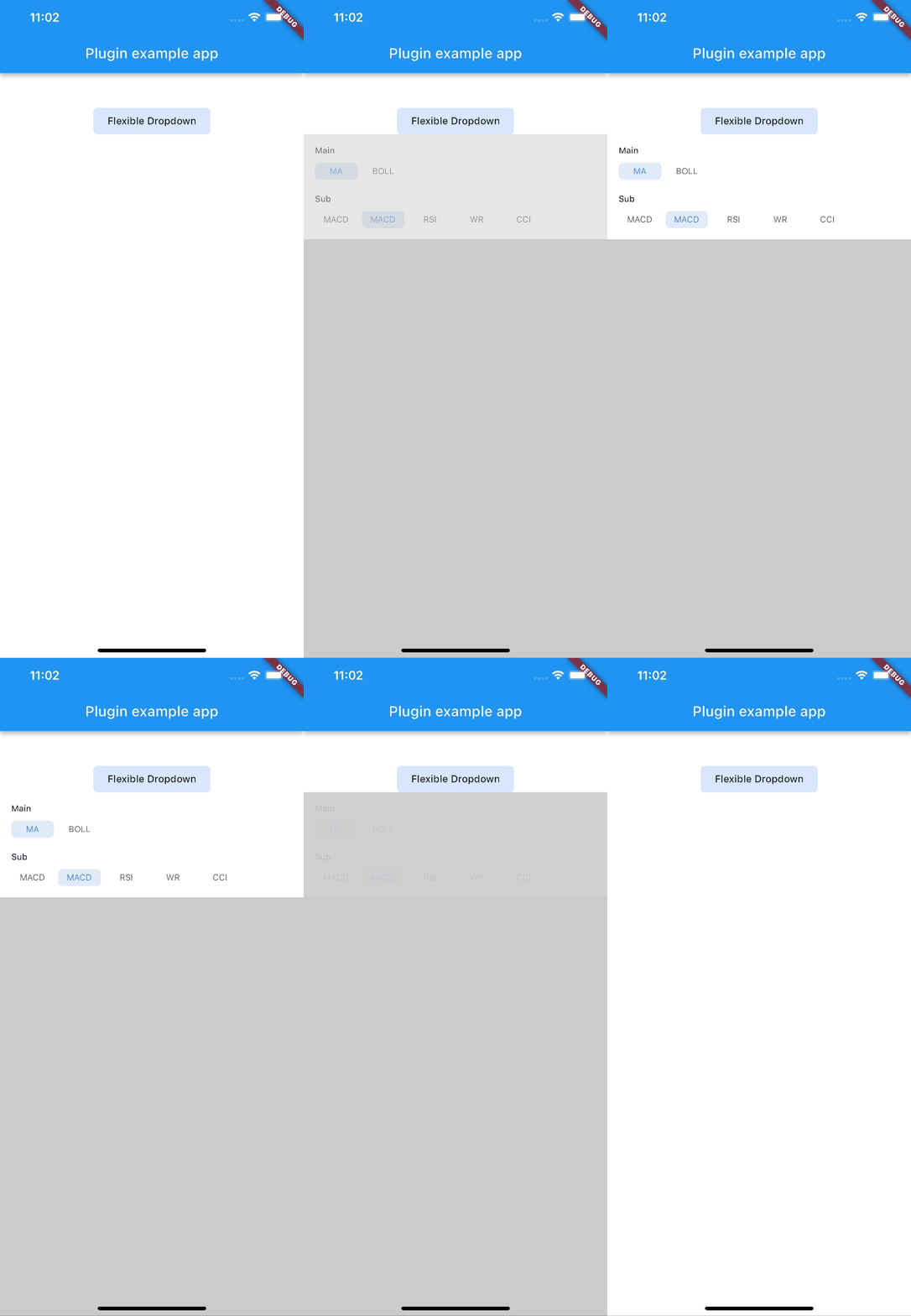
  • Support BarrierShape.headerTrans to highlight the content above the flexible dropdown button

  • Allows the dropdown to be dismissed by tapping | panning the scrim or by pressing the escape key on the keyboard.

  • Allow to choose the Animation Type

Installation

First, add flexible_dropdown as a dependency in your pubspec.yaml file.

dependencies:
  flexible_dropdown: ^1.0.7

Usage

FlexibleDropdown(
  overlayChild: Container(
    height: 160,
    width: double.infinity,
    color: Colors.deepPurple,
  ),
  barrierColor: Colors.black38.withOpacity(.2),
  barrierShape: BarrierShape.headerTrans,
  textDirection: TextDirection.ltr,
  offset: Offset.zero,
  duration: const Duration(milliseconds: 400),
  animationType: AnimationType.size,
  animationAlignment: Alignment.topCenter,
  child: Container(
    decoration: BoxDecoration(
      borderRadius: BorderRadius.circular(6),
      color: Colors.blueAccent.withOpacity(.2),
    ),
    child: Padding(
      padding: const EdgeInsets.symmetric(vertical: 10, horizontal: 20),
      child: Text(
        title,
        style: const TextStyle(fontSize: 14, fontWeight: FontWeight.w500),
      ),
    ),
  ),
)

Usage to close the flexible dropdown:

Navigator.pop(context);

Animation Type

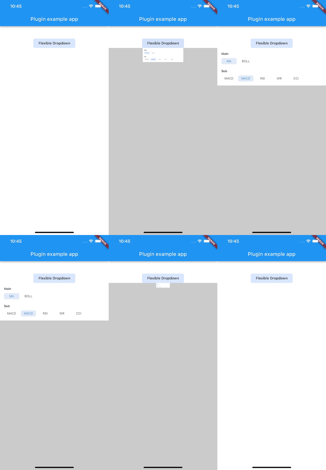
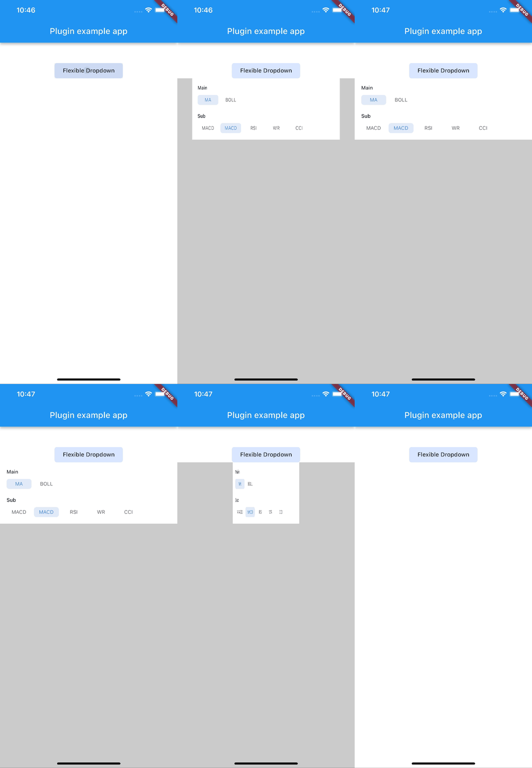
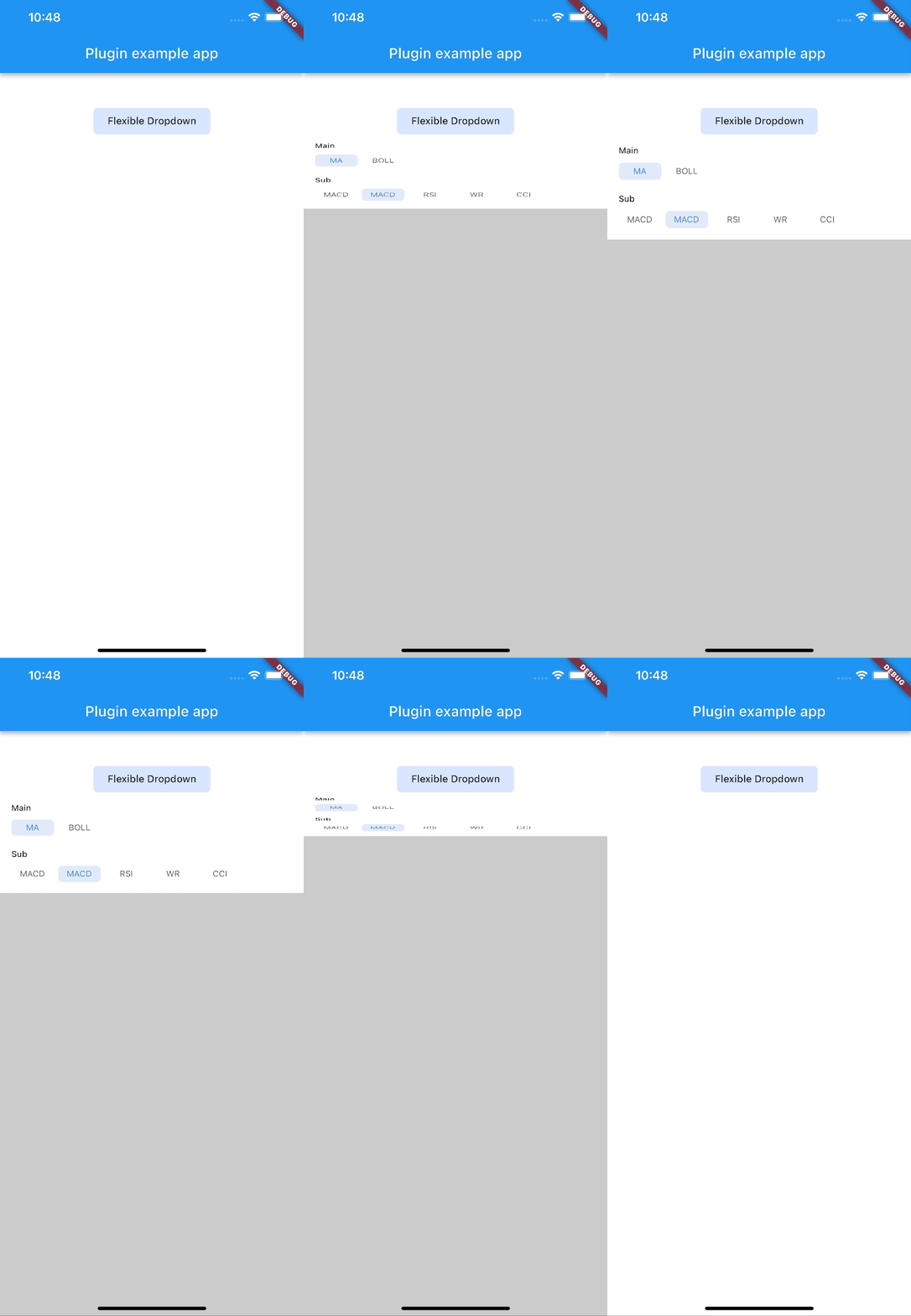
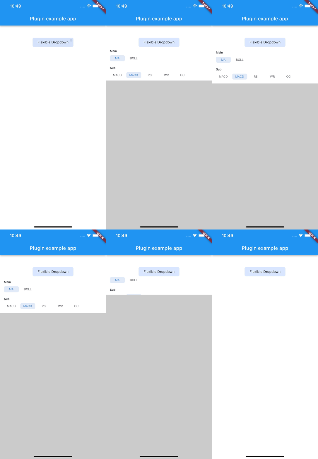
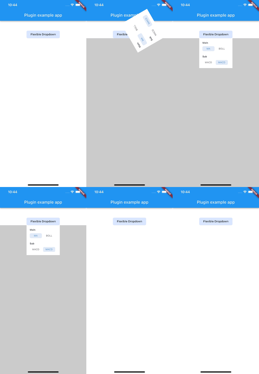
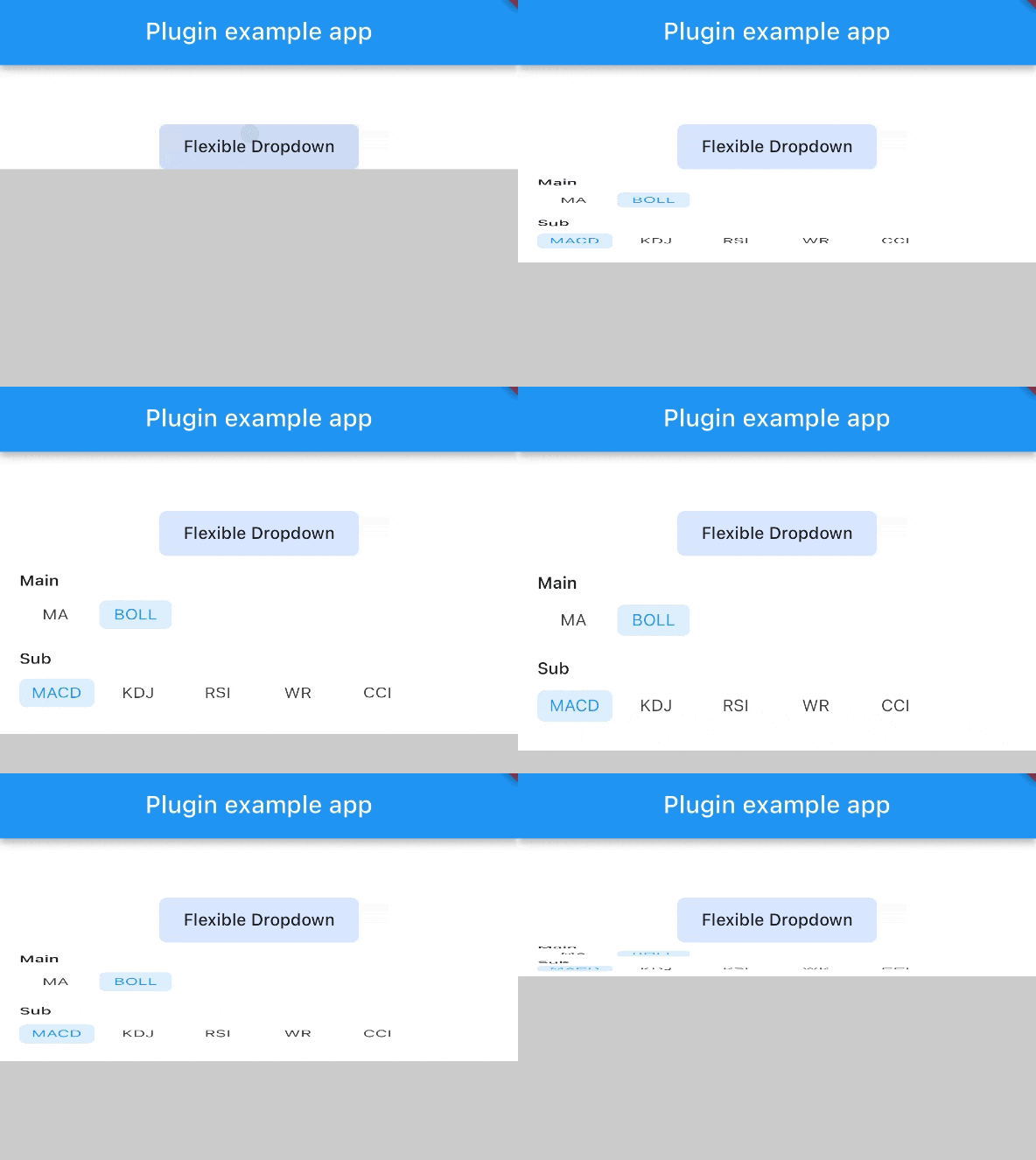
scale scaleX scaleY
size slide fade
rotate

Note: AnimationType.size is only suitable for width of overlayChild is full screen width.

Categories

Dependencies

Dependency list 1 items

  • plugin_platform_interface^2.0.2

Source repository

Projects using this package

No data available yet.