Home / Tushar-Mishra999/Neumorphic_Button
Stars 2
Forks 2
Last push (UTC) Dec 19, 2022
Project status Active GITHUB User @Tushar-Mishra999
Languages C++ CMake Dart HTML C Swift Kotlin Objective-C
Packages published by this repository Dependencies used Dependency list 3 items flutter {"sdk":"flutter"}flutter_test Development {"sdk":"flutter"}flutter_lints Development ^2.0.0Original README English project snapshot. Visit GitHub for the latest content.
Expand / collapse project README
Neumorphic Button
This package lets you create Neumorphic Button with a number of customizable features that can be used throughout your Flutter app.You can create a minimal visual design style that uses monochromatic colors, subtle shadows and low contrasts to showcase buttons and cards, creating a really soft look.
Installation
Add the latest version of package to your pubspec.yaml
dependencies:
  neumorphic_button: ^0.0.1+2
Import the package and use it in your Flutter App.
import 'package:neumorphic_button/neumorphic_button.dart';
Features
There are a number of properties that you can specify for your neumorphic button :
height
width
border-radius
box-shape
shadow-color
spread-radius
blur-radius
onTap function
Example
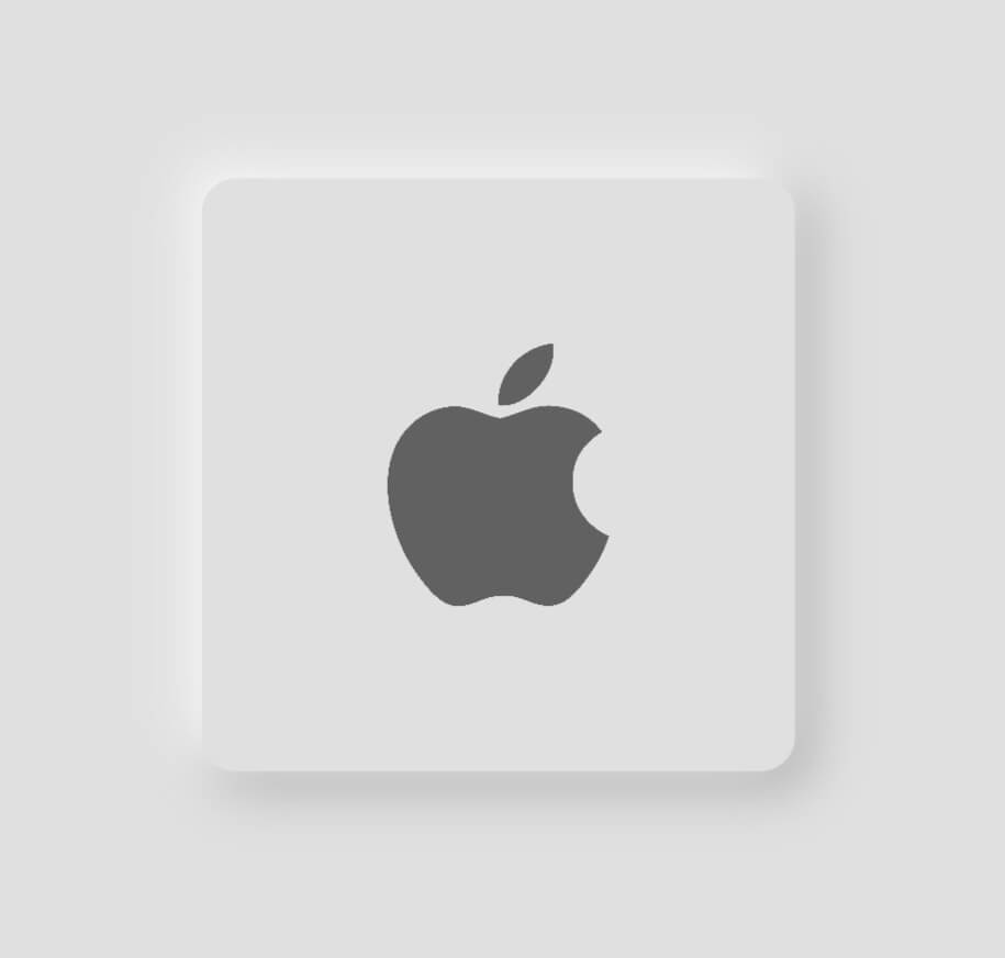
Light mode neumorphic button
class HomeScreen extends StatelessWidget {
  const HomeScreen({Key? key}) : super(key: key);

  @override
  Widget build(BuildContext context) {
    Size size = MediaQuery.of(context).size;
    return Scaffold(
      backgroundColor: Colors.grey.shade300,
      body: Center(
          child: NeumorphicButton(
        onTap: () {},
        child: Image.asset(
          'assets/apple.png',
          height: 80,
          color: Colors.grey[700],
        ),
        BorderRadius: 12,
        bottomRightShadowBlurRadius: 15,
        bottomRightShadowSpreadRadius: 1,
        borderWidth: 5,
        backgroundColor: Colors.grey.shade300,
        topLeftShadowBlurRadius: 15,
        topLeftShadowSpreadRadius: 1,
        topLeftShadowColor: Colors.white,
        bottomRightShadowColor: Colors.grey.shade500,
        height: size.width * 0.5,
        width: size.width * 0.5,
        padding: EdgeInsets.all(50),
        bottomRightOffset: Offset(4, 4),
        topLeftOffset: Offset(-4, -4),
      )),
    );
  }
}
https://github.com/Tushar-Mishra999/VisageR/raw/9321df2e794cb2d7ed3a5abf8eb25c0a4db8278e/assets/apple1.jpeg
Dark mode neumorphic button
class HomeScreen extends StatelessWidget {
  const HomeScreen({Key? key}) : super(key: key);

  @override
  Widget build(BuildContext context) {
    Size size = MediaQuery.of(context).size;
    return Scaffold(
      backgroundColor: Colors.grey.shade900,
      body: Center(
          child: NeumorphicButton(
        onTap: () {},
        child: Image.asset(
          'assets/apple.png',
          height: 80,
          color: Colors.grey[700],
        ),
        BorderRadius: 12,
        bottomRightShadowBlurRadius: 15,
        bottomRightShadowSpreadRadius: 1,
        borderWidth: 5,
        backgroundColor: Colors.grey.shade900,
        topLeftShadowBlurRadius: 15,
        topLeftShadowSpreadRadius: 1,
        topLeftShadowColor: Colors.grey.shade800,
        bottomRightShadowColor: Colors.black,
        height: size.width * 0.5,
        width: size.width * 0.5,
        padding: EdgeInsets.all(50),
        bottomRightOffset: Offset(5, 5),
        topLeftOffset: Offset(-5, -5),
      )),
    );
  }
}
https://github.com/Tushar-Mishra999/VisageR/raw/9321df2e794cb2d7ed3a5abf8eb25c0a4db8278e/assets/apple2.jpeg

 v0.0.1+2