Search packages, repositories and app categories

neumorphic_button cover
Package detailsv0.0.1+2

neumorphic_button

Create Neumorphic Button with a number of customizable features that can be used throughout your Flutter app.

AndroidiOSWebmacOSWindowsLinux
30-day downloads
5
Likes
50
Pub points
150

Install package

flutter pub add neumorphic_button

Package Overview

Package selection guidance compiled from public package information, community data, and project usage.

A Flutter package that enables developers to create sleek, modern neumorphic buttons with extensive customization options. These buttons feature soft shadows and subtle depth effects, enhancing the visual appeal of apps across multiple platforms. The package supports various styling attributes such as color, shadow intensity, border radius, and elevation, allowing consistent UI design throughout an application. Ideal for designers seeking a minimalist yet engaging interface, it integrates seamlessly into existing Flutter projects.

Use cases

  • Creating visually appealing app interfaces
  • Adding depth to interactive elements
  • Designing mobile and web applications with modern aesthetics
  • Implementing consistent button styles across platforms
  • Enhancing user experience with tactile feedback

Key features

  • Customizable shadow and depth effects
  • Support for multiple platform rendering
  • Adjustable button size and corner radius
  • Configurable color schemes
  • Built-in animation support
  • Easy integration with Flutter widgets

Suitable for

  • UI/UX designers using Flutter
  • Developers building modern mobile or web apps
  • Projects requiring a minimalist design language
  • Teams focused on visual consistency
  • Apps targeting iOS and Android with unified styling

Considerations

  • May require performance optimization on low-end devices
  • Limited accessibility features compared to standard buttons
  • Potential overuse leading to visual clutter
  • Not ideal for high-contrast or dark mode-heavy themes
  • Depends on external dependencies for full functionality

Original README

Original README snapshot from the linked source repository. Visit the repository for the latest content.

Neumorphic Button

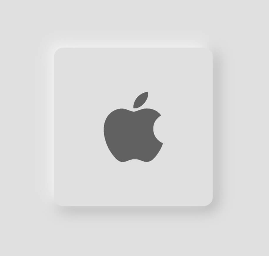
This package lets you create Neumorphic Button with a number of customizable features that can be used throughout your Flutter app.You can create a minimal visual design style that uses monochromatic colors, subtle shadows and low contrasts to showcase buttons and cards, creating a really soft look.

Installation

  1. Add the latest version of package to your pubspec.yaml
dependencies:
  neumorphic_button: ^0.0.1+2
  1. Import the package and use it in your Flutter App.
import 'package:neumorphic_button/neumorphic_button.dart';

Features

There are a number of properties that you can specify for your neumorphic button :

  • height
  • width
  • border-radius
  • box-shape
  • shadow-color
  • spread-radius
  • blur-radius
  • onTap function

Example

Light mode neumorphic button
class HomeScreen extends StatelessWidget {
  const HomeScreen({Key? key}) : super(key: key);

  @override
  Widget build(BuildContext context) {
    Size size = MediaQuery.of(context).size;
    return Scaffold(
      backgroundColor: Colors.grey.shade300,
      body: Center(
          child: NeumorphicButton(
        onTap: () {},
        child: Image.asset(
          'assets/apple.png',
          height: 80,
          color: Colors.grey[700],
        ),
        BorderRadius: 12,
        bottomRightShadowBlurRadius: 15,
        bottomRightShadowSpreadRadius: 1,
        borderWidth: 5,
        backgroundColor: Colors.grey.shade300,
        topLeftShadowBlurRadius: 15,
        topLeftShadowSpreadRadius: 1,
        topLeftShadowColor: Colors.white,
        bottomRightShadowColor: Colors.grey.shade500,
        height: size.width * 0.5,
        width: size.width * 0.5,
        padding: EdgeInsets.all(50),
        bottomRightOffset: Offset(4, 4),
        topLeftOffset: Offset(-4, -4),
      )),
    );
  }
}
Dark mode neumorphic button
class HomeScreen extends StatelessWidget {
  const HomeScreen({Key? key}) : super(key: key);

  @override
  Widget build(BuildContext context) {
    Size size = MediaQuery.of(context).size;
    return Scaffold(
      backgroundColor: Colors.grey.shade900,
      body: Center(
          child: NeumorphicButton(
        onTap: () {},
        child: Image.asset(
          'assets/apple.png',
          height: 80,
          color: Colors.grey[700],
        ),
        BorderRadius: 12,
        bottomRightShadowBlurRadius: 15,
        bottomRightShadowSpreadRadius: 1,
        borderWidth: 5,
        backgroundColor: Colors.grey.shade900,
        topLeftShadowBlurRadius: 15,
        topLeftShadowSpreadRadius: 1,
        topLeftShadowColor: Colors.grey.shade800,
        bottomRightShadowColor: Colors.black,
        height: size.width * 0.5,
        width: size.width * 0.5,
        padding: EdgeInsets.all(50),
        bottomRightOffset: Offset(5, 5),
        topLeftOffset: Offset(-5, -5),
      )),
    );
  }
}

Categories

Source repository

Projects using this package

No data available yet.