
 v0.1.5
flutter_scrolling_fab_animated
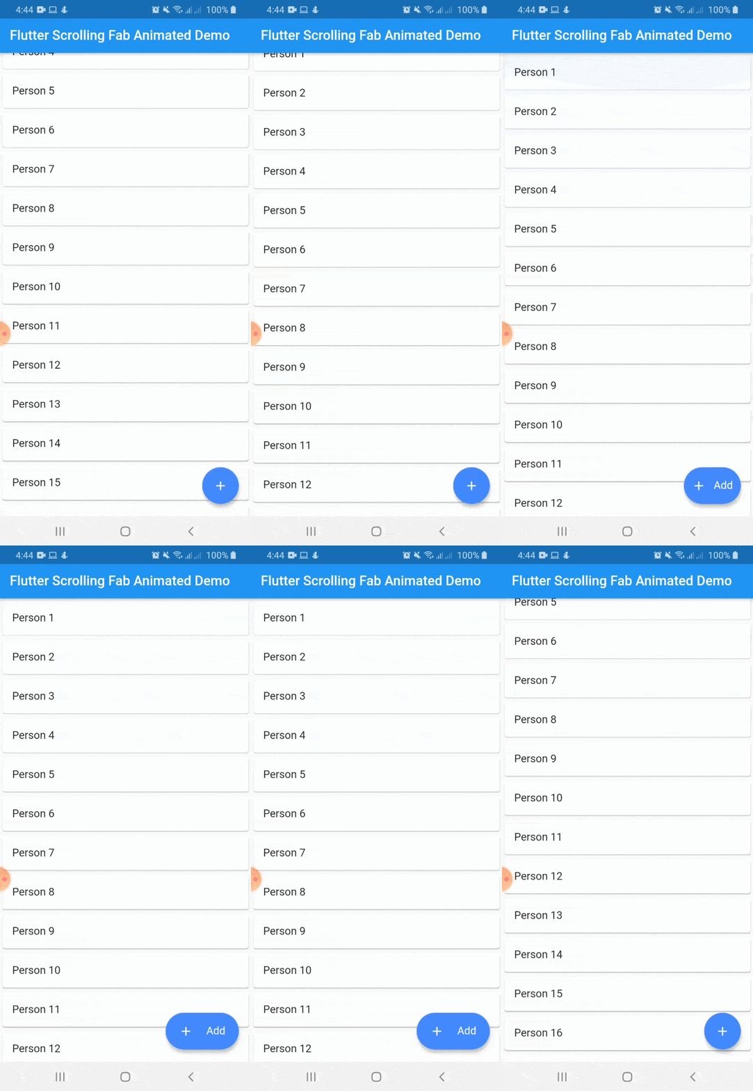
Package to add a floating button whose change of size when scroll down
68Likes 36030-day downloads160Pub points
AndroidiOSWebmacOSWindowsLinux
ajomuch92/flutter-scrolling-fab-animated open-source repository details.

{"sdk":"flutter"}{"sdk":"flutter"}English project snapshot. Visit GitHub for the latest content.
This package is a floating button whose change of size when scroll down and return to its original size when on top again. It's useful with ListView widget and other scrollable widgets.
https://raw.githubusercontent.com/ajomuch92/flutter-scrolling-fab-animated/master/assets/demo.gifWith animated icon
https://raw.githubusercontent.com/ajomuch92/flutter-scrolling-fab-animated/master/assets/demo2.gifInclude flutter_scrolling_fab_animated in your pubspec.yaml file:
dependencies:
  flutter:
    sdk: flutter
  flutter_scrolling_fab_animated: version
To use this package, just import it into your file and enjoy it.
import 'package:bottom_sheet_expandable_bar/bottom_sheet_bar_icon.dart';
import 'package:flutter_scrolling_fab_animated/flutter_scrolling_fab_animated.dart';

...

  @override
  Widget build(BuildContext context) {
    return Scaffold(
      appBar: AppBar(
        title: Text('Flutter Scrolling Fab Animated Demo'),
      ),
      body: Container(
        child: new ListView.builder(
          controller: _scrollController,
          itemCount: items.length,
          itemBuilder: (BuildContext ctxt, int index) {
            return new Card(
              child: ListTile(
                title: Text(items[index]),
              )
            );
          }
        ),
      ),
      floatingActionButton: ScrollingFabAnimated(
        icon: Icon(Icons.add, color: Colors.white,),
        text: Text('Add', style: TextStyle(color: Colors.white, fontSize: 16.0),),
        onPress: (){},
        scrollController: _scrollController,
        gradient: const LinearGradient(colors: [Color(0xff0CA2E6),Color(0xff2E3D97),],begin: Alignment.topCenter, end: Alignment.bottomCenter),
        animateIcon: true,
        inverted: false,
        radius: 10.0,
      )
    );
  }

...
Example with a GridView
import 'package:bottom_sheet_expandable_bar/bottom_sheet_bar_icon.dart';
import 'package:flutter_scrolling_fab_animated/flutter_scrolling_fab_animated.dart';

...

  @override
  Widget build(BuildContext context) {
    return Scaffold(
      appBar: AppBar(
        title: Text('Flutter Scrolling Fab Animated Demo'),
      ),
      body: Container(
        child: new GridView.builder(
          gridDelegate: SliverGridDelegateWithFixedCrossAxisCount(crossAxisCount: 2),
          controller: _scrollController,
          itemCount: items.length,
          itemBuilder: (BuildContext ctxt, int index) {
            return new Card(
              child: ListTile(
                title: Center(child: Text(items[index])),
              )
            );
          }),
      ),
      floatingActionButton: ScrollingFabAnimated(
        icon: Icon(Icons.add, color: Colors.white,),
        text: Text('Add', style: TextStyle(color: Colors.white, fontSize: 16.0),),
        onPress: (){},
        scrollController: _scrollController,
        animateIcon: true,
        inverted: false,
        radius: 10.0,
      )
    );
  }

...
| Name | Description | Required | Default |
|---|---|---|---|
| icon | Widget to use as button icon | True | |
| text | Widget to use as button text when button is expanded | True | |
| onPress | Function to use when press the button | True | |
| scrollController | ScrollController to use to determine when user is on top or not | True | |
| elevation | Double value to set the button elevation | False | 5.0 |
| shadowColor | Color value to set the button shadow color | False | ThemeData.shadowColor |
| width | Double value to set the button width when is expanded | False | 120.0 |
| height | Double value to set the button height | False | 60.0 |
| duration | Value to set the duration for animation | False | 250 milliseconds |
| curve | Value to set the curve for animation | False | Curves.easeInOut |
| limitIndicator | Double value to set the boundary value when scroll animation is triggered | False | 10.0 |
| color | Color to set the button background color | False | Colors.blueAccent |
| gradient | Color to set the button background gradient | False | null |
| animateIcon | Value to indicate if animate or not the icon | False | true |
| inverted | Value to inverte the behavior of the animation | False | false |
| radius | Double value to set the button radius | False | null |