Search packages, repositories and app categories

flutter_scrolling_fab_animated cover
Package detailsv0.1.5

flutter_scrolling_fab_animated

Package to add a floating button whose change of size when scroll down

AndroidiOSWebmacOSWindowsLinux
30-day downloads
484
Likes
68
Pub points
160

Install package

flutter pub add flutter_scrolling_fab_animated

Package Overview

Package selection guidance compiled from public package information, community data, and project usage.

A Flutter package that enhances user experience by animating a floating action button (FAB) in response to scroll events. As the user scrolls down, the FAB shrinks or disappears, and expands or reappears when scrolling up. This behavior helps maintain UI cleanliness while keeping the primary action accessible. The package supports all major platforms including Android, iOS, Web, macOS, Windows, and Linux, making it ideal for consistent cross-platform designs.

Use cases

  • Scroll-driven FAB animations
  • Enhancing mobile app UX with dynamic FABs
  • Creating clean interfaces with hidden FABs on scroll
  • Consistent FAB behavior across multiple platforms
  • Improving visual hierarchy in scrollable lists

Key features

  • Automatic FAB size animation on scroll
  • Cross-platform compatibility
  • Simple integration with existing scroll views
  • Configurable animation curves
  • Supports both shrinking and expanding FABs

Suitable for

  • Mobile and web app developers
  • Designers focusing on interactive UIs
  • Apps with long scrollable content
  • Developers seeking lightweight FAB enhancements
  • Projects requiring platform-agnostic components

Considerations

  • May require fine-tuning for optimal animation timing
  • Best suited for single-scrolling screens
  • Limited customization beyond size and visibility
  • Not ideal for complex nested scroll scenarios
  • Depends on parent scrollable widget's behavior

Original README

Original README snapshot from the linked source repository. Visit the repository for the latest content.

Flutter Scrolling Fab Animated

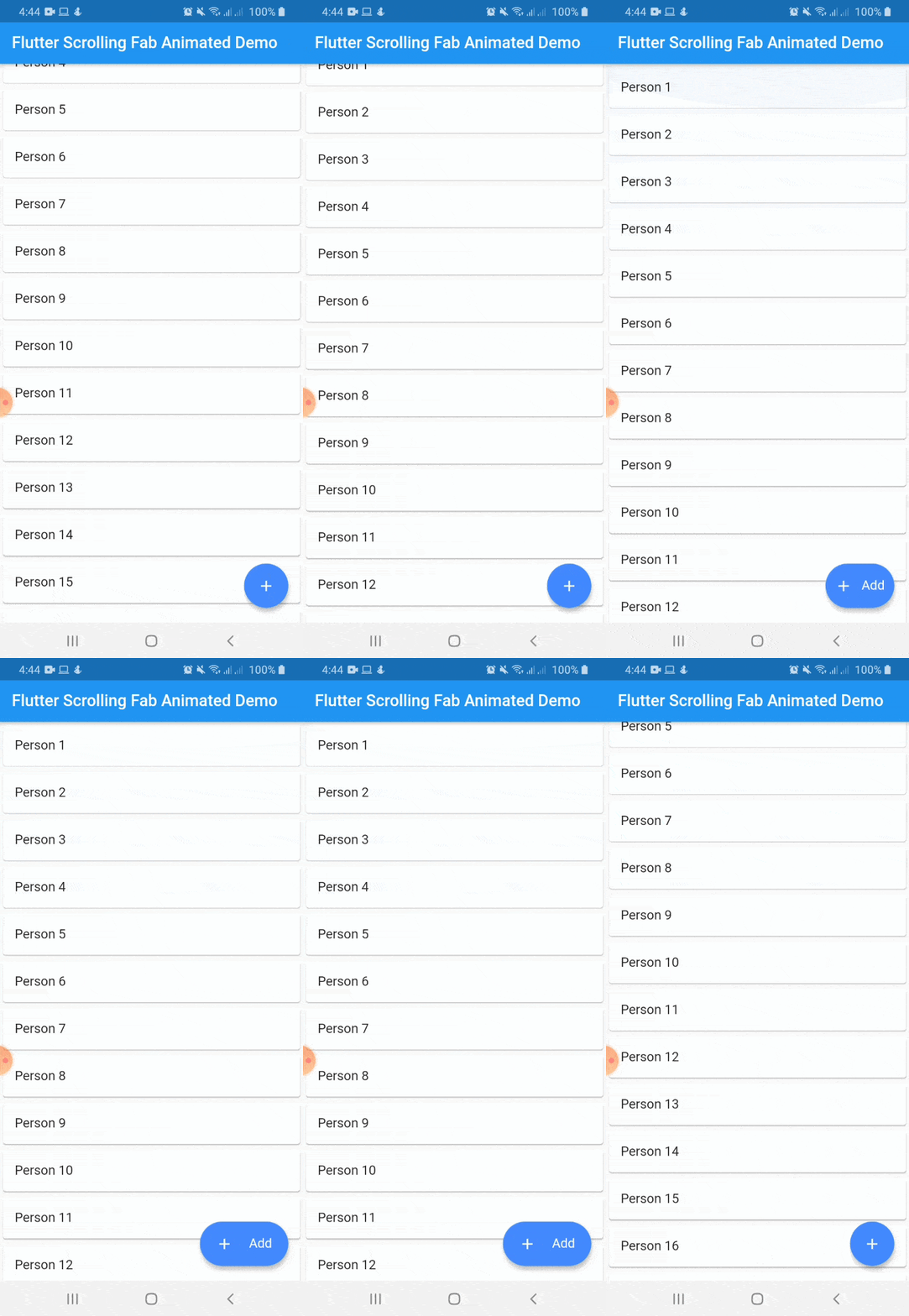
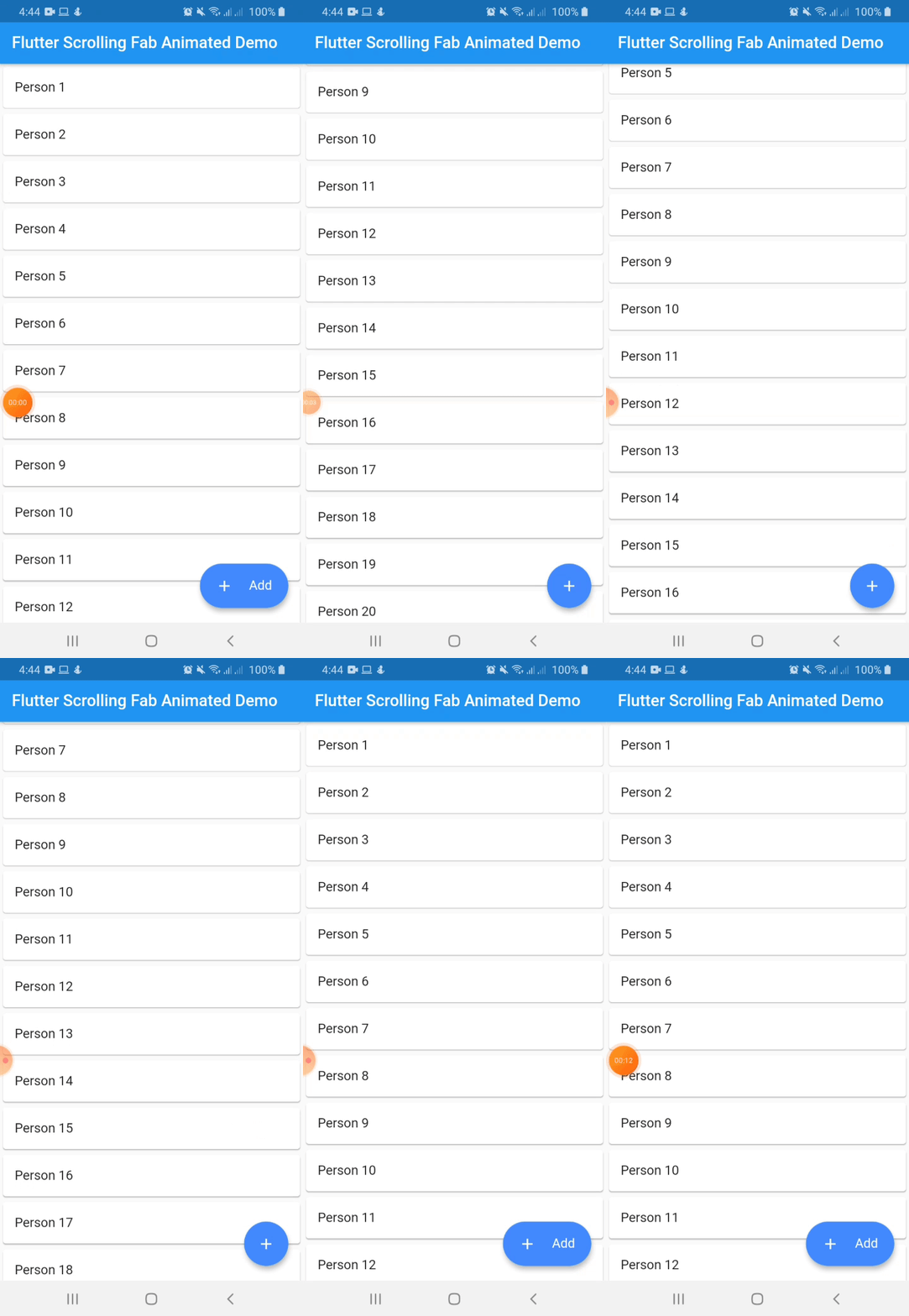
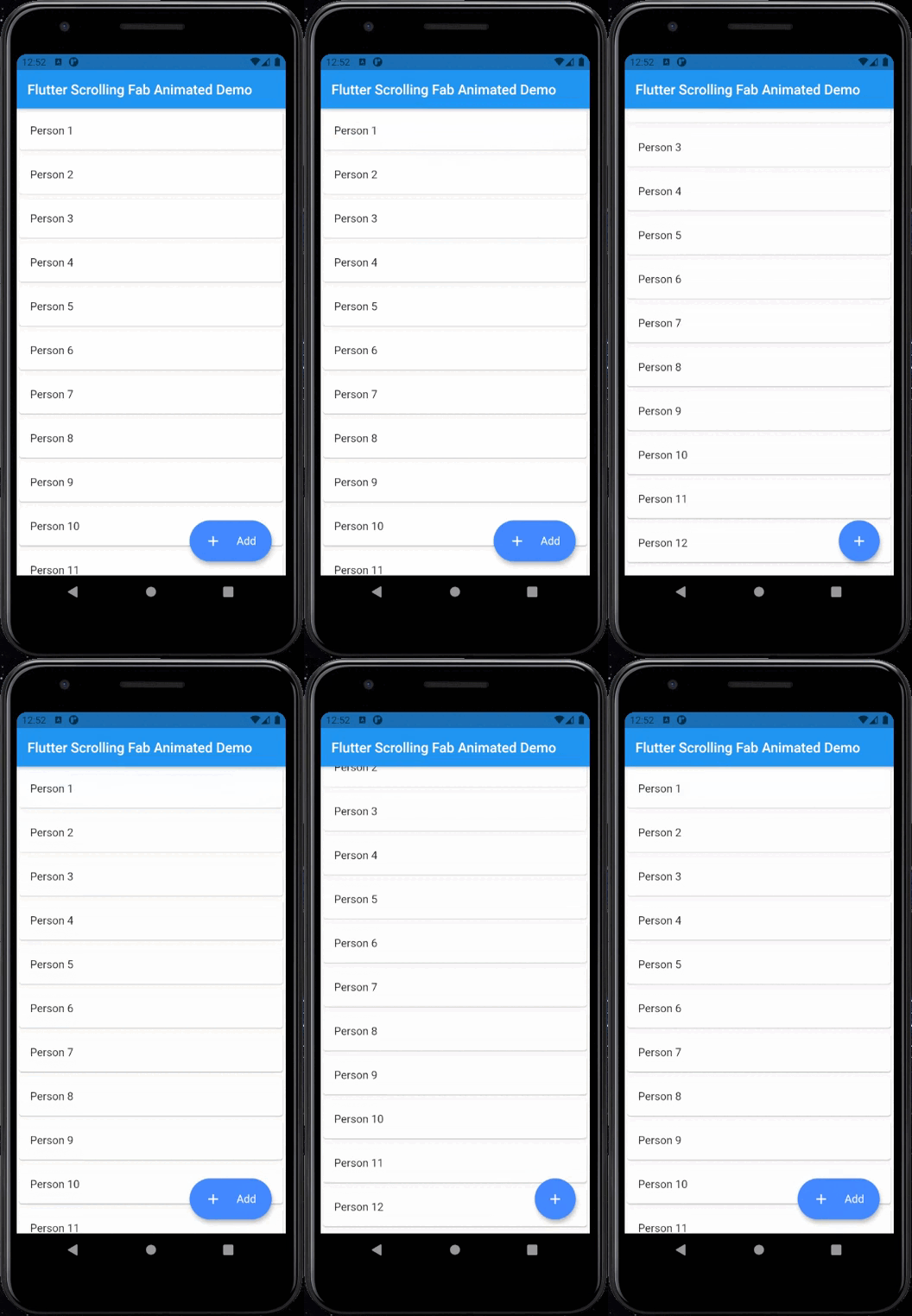
This package is a floating button whose change of size when scroll down and return to its original size when on top again. It's useful with ListView widget and other scrollable widgets.

With animated icon

New Features 💥

  • Adding on long press support
  • Adding ripple effect for the button
  • Removing square shadow around the button when pressing it
  • Added gradient background

Instalation

Include flutter_scrolling_fab_animated in your pubspec.yaml file:

dependencies:
  flutter:
    sdk: flutter
  flutter_scrolling_fab_animated: version

Usage

To use this package, just import it into your file and enjoy it.

import 'package:bottom_sheet_expandable_bar/bottom_sheet_bar_icon.dart';
import 'package:flutter_scrolling_fab_animated/flutter_scrolling_fab_animated.dart';

...

  @override
  Widget build(BuildContext context) {
    return Scaffold(
      appBar: AppBar(
        title: Text('Flutter Scrolling Fab Animated Demo'),
      ),
      body: Container(
        child: new ListView.builder(
          controller: _scrollController,
          itemCount: items.length,
          itemBuilder: (BuildContext ctxt, int index) {
            return new Card(
              child: ListTile(
                title: Text(items[index]),
              )
            );
          }
        ),
      ),
      floatingActionButton: ScrollingFabAnimated(
        icon: Icon(Icons.add, color: Colors.white,),
        text: Text('Add', style: TextStyle(color: Colors.white, fontSize: 16.0),),
        onPress: (){},
        scrollController: _scrollController,
        gradient: const LinearGradient(colors: [Color(0xff0CA2E6),Color(0xff2E3D97),],begin: Alignment.topCenter, end: Alignment.bottomCenter),
        animateIcon: true,
        inverted: false,
        radius: 10.0,
      )
    );
  }

...

Example with a GridView

import 'package:bottom_sheet_expandable_bar/bottom_sheet_bar_icon.dart';
import 'package:flutter_scrolling_fab_animated/flutter_scrolling_fab_animated.dart';

...

  @override
  Widget build(BuildContext context) {
    return Scaffold(
      appBar: AppBar(
        title: Text('Flutter Scrolling Fab Animated Demo'),
      ),
      body: Container(
        child: new GridView.builder(
          gridDelegate: SliverGridDelegateWithFixedCrossAxisCount(crossAxisCount: 2),
          controller: _scrollController,
          itemCount: items.length,
          itemBuilder: (BuildContext ctxt, int index) {
            return new Card(
              child: ListTile(
                title: Center(child: Text(items[index])),
              )
            );
          }),
      ),
      floatingActionButton: ScrollingFabAnimated(
        icon: Icon(Icons.add, color: Colors.white,),
        text: Text('Add', style: TextStyle(color: Colors.white, fontSize: 16.0),),
        onPress: (){},
        scrollController: _scrollController,
        animateIcon: true,
        inverted: false,
        radius: 10.0,
      )
    );
  }

...

Properties
Name Description Required Default
icon Widget to use as button icon True
text Widget to use as button text when button is expanded True
onPress Function to use when press the button True
scrollController ScrollController to use to determine when user is on top or not True
elevation Double value to set the button elevation False 5.0
shadowColor Color value to set the button shadow color False ThemeData.shadowColor
width Double value to set the button width when is expanded False 120.0
height Double value to set the button height False 60.0
duration Value to set the duration for animation False 250 milliseconds
curve Value to set the curve for animation False Curves.easeInOut
limitIndicator Double value to set the boundary value when scroll animation is triggered False 10.0
color Color to set the button background color False Colors.blueAccent
gradient Color to set the button background gradient False null
animateIcon Value to indicate if animate or not the icon False true
inverted Value to inverte the behavior of the animation False false
radius Double value to set the button radius False null

Categories

Source repository

Projects using this package

No data available yet.