
 v2.2.2+1
shimmer_animation
This shimmer animation widget can help you bring simple yet beautiful skeleton loaders to your project with ease.
517Likes 9.5K30-day downloads160Pub points
AndroidiOSWebmacOSWindowsLinux
Shimmer Animation provides a simple and customizable widget to create skeleton loaders and placeholder effects with ease.

{"sdk":"flutter"}{"sdk":"flutter"}^5.1.1English project snapshot. Visit GitHub for the latest content.
pub package Libraries.io dependency status for latest release License
Supports Null Safety
This shimmer animation widget can help you bring simple yet beautiful skeleton loaders to your project with ease.
Shimmer is very widely used as the default animation for skeleton loaders or placeholder widgets throughout the development community. Therefore, having an easy to use, yet customizable widget ready to use for Android, iOS and Web, gives developers an advantage to focus on their actual functionality, let shimmer make the loading experience smoother.
An example can be found in the example directory of this repository.
A list of detailed examples can be found in this Examples Repository
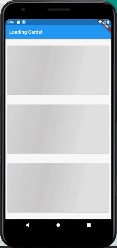
| Full Screen | Loading Widgets | Loading Buttons |
|---|---|---|
| https://github.com/maddyb99/shimmer_animation/blob/master/screenshots/shimmer.gif?raw=true | https://github.com/maddyb99/shimmer_examples/blob/master/loading_cards/screenshots/shimmer.gif?raw=true | https://github.com/maddyb99/shimmer_examples/blob/master/buttons/screenshots/shimmer.gif?raw=true |
Add shimmer_animation to pubspec.yaml of your project:
dependencies:
  shimmer_animation: ^2.1.0
Import it in your Dart code:
import 'package:shimmer_animation/shimmer_animation.dart';
Wrap any widget with Shimmer() widget to apply animaton:
  Shimmer(
    child: Container(
      color: Colors.deepPurple,
    ),
  ),
A number of parameters can be passed to customise the look and feel of this animation:
  Shimmer(
    duration: Duration(seconds: 3), //Default value
    interval: Duration(seconds: 5), //Default value: Duration(seconds: 0)
    color: Colors.white, //Default value
    colorOpacity: 0, //Default value
    enabled: true, //Default value
    direction: ShimmerDirection.fromLTRB(),  //Default Value
    child: Container(
      color: Colors.deepPurple,
    ),
  ),
A detailed API Reference can be found here.