Search packages, repositories and app categories

shimmer_animation cover
Package detailsv2.2.2+1

shimmer_animation

This shimmer animation widget can help you bring simple yet beautiful skeleton loaders to your project with ease.

AndroidiOSWebmacOSWindowsLinux
30-day downloads
12K
Likes
517
Pub points
160

Install package

flutter pub add shimmer_animation

Package Overview

Package selection guidance compiled from public package information, community data, and project usage.

ShimmerAnimation is a Flutter package that provides a simple and elegant way to implement skeleton loaders in your app. It enables developers to create smooth, animated placeholder UIs that mimic the look of real content loading, improving perceived performance and user experience. With minimal setup, it supports multiple platforms including Android, iOS, Web, macOS, Windows, and Linux. The widget is highly customizable and integrates seamlessly into existing Flutter projects.

Use cases

  • Loading placeholders for lists
  • Preventing empty screens during data fetch
  • Enhancing UX in slow-loading interfaces
  • Creating modern, dynamic UIs
  • Displaying content skeletons in grids
  • Simulating real-time data loading

Key features

  • Smooth shimmer animation effect
  • Cross-platform compatibility
  • Easy integration with Flutter
  • Customizable colors and gradients
  • Supports various container shapes
  • Lightweight and performant

Suitable for

  • UI/UX designers seeking visual polish
  • Developers building data-heavy apps
  • Teams focusing on perceived performance
  • Projects requiring modern loading states
  • Apps with dynamic or async content
  • Prototyping interactive interfaces

Considerations

  • May require additional styling for complex layouts
  • Not ideal for static placeholder content
  • Performance impact on very large lists
  • Limited customization beyond basic animations
  • Best used with proper loading state management
  • Requires understanding of Flutter's widget tree

Original README

Original README snapshot from the linked source repository. Visit the repository for the latest content.

Shimmer Animation

pub package Libraries.io dependency status for latest release License

Supports Null Safety

This shimmer animation widget can help you bring simple yet beautiful skeleton loaders to your project with ease.

Shimmer is very widely used as the default animation for skeleton loaders or placeholder widgets throughout the development community. Therefore, having an easy to use, yet customizable widget ready to use for Android, iOS and Web, gives developers an advantage to focus on their actual functionality, let shimmer make the loading experience smoother.

Examples

An example can be found in the example directory of this repository.

A list of detailed examples can be found in this Examples Repository

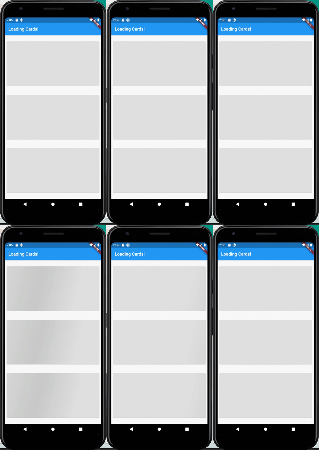
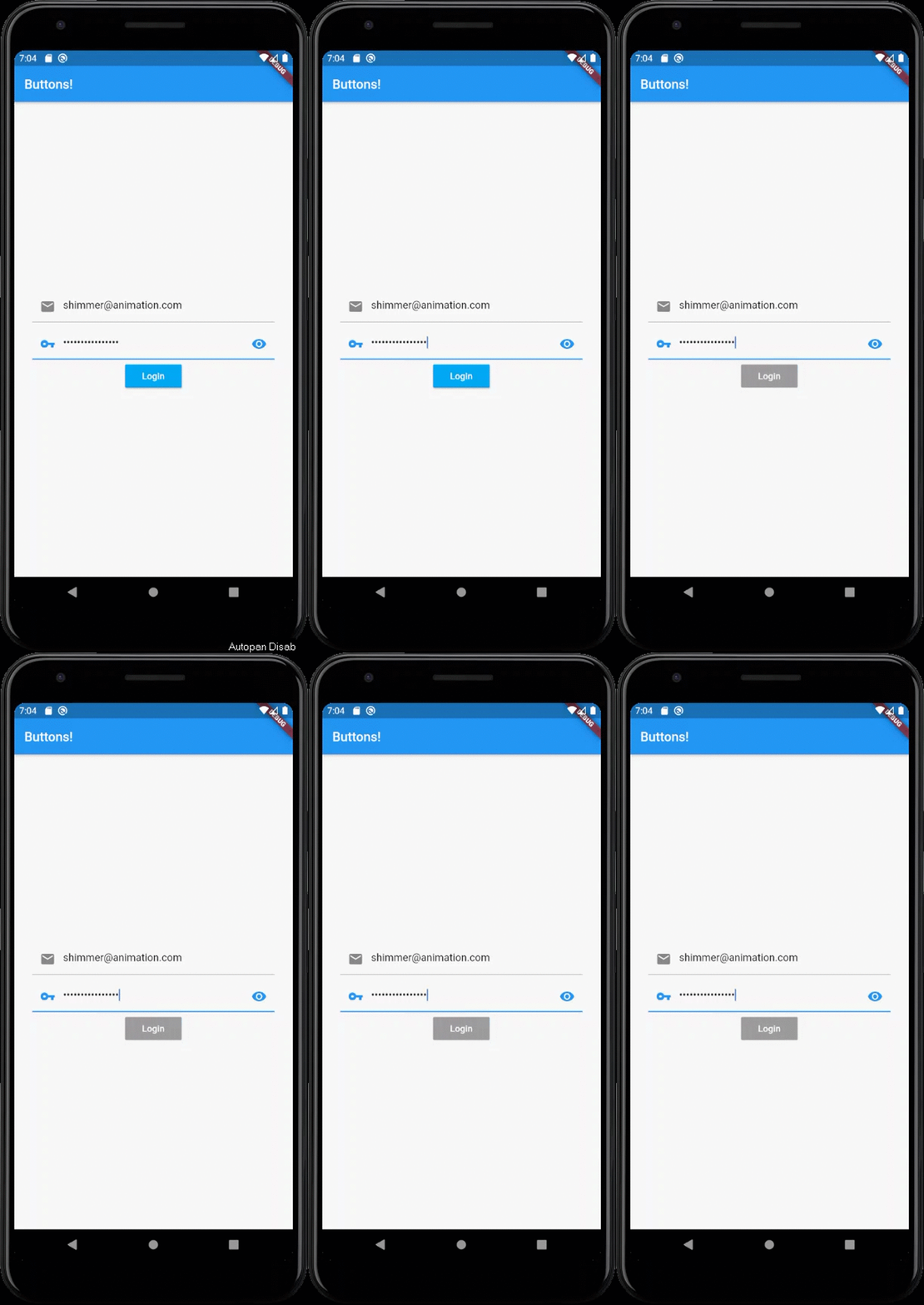
Full Screen Loading Widgets Loading Buttons

How to use

Add shimmer_animation to pubspec.yaml of your project:

dependencies:
  shimmer_animation: ^2.1.0

Import it in your Dart code:

import 'package:shimmer_animation/shimmer_animation.dart';

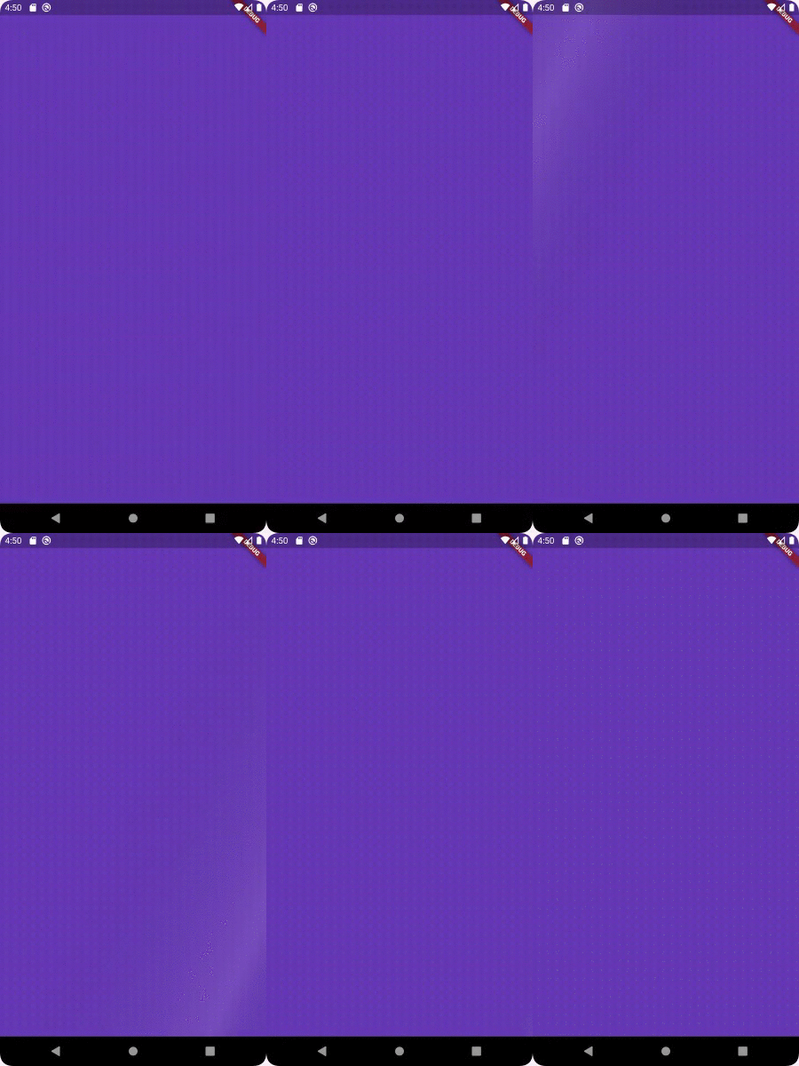
Wrap any widget with Shimmer() widget to apply animaton:

  Shimmer(
    child: Container(
      color: Colors.deepPurple,
    ),
  ),

A number of parameters can be passed to customise the look and feel of this animation:

  Shimmer(
    duration: Duration(seconds: 3), //Default value
    interval: Duration(seconds: 5), //Default value: Duration(seconds: 0)
    color: Colors.white, //Default value
    colorOpacity: 0, //Default value
    enabled: true, //Default value
    direction: ShimmerDirection.fromLTRB(),  //Default Value
    child: Container(
      color: Colors.deepPurple,
    ),
  ),
Parameters:
  • @required child : accepts a child Widget over which the animation is to be displayed
  • color : accepts a parameter of type Color and sets the color of the animation overlay. Default value is Colors.white
  • color : accepts a parameter of type double and sets the Opacity of the color of the animation overlay. Default value is 0.3
  • enabled : accepts a bool which toggles the animation on/off. Default value is true
  • duration : accepts a Duration that would be the time period of animation. Default value is Duration(seconds: 3)
  • interval : accepts a Duration that would be the interval between the repeating animation. Default value is Duration(seconds: 0) i.e. no interval
  • direction : accepts a ShimmerDirection and aligns the animation accordingly. Default value is ShimmerDirection.fromLBRT()

A detailed API Reference can be found here.

License

MIT License.

Categories

Source repository

Projects using this package