
 v0.1.5
simple_grid
A dynamic grid inspired by boostrap, you can use it to describe your grid layout. This package purely using mediaquery, don't worry about the render.
79Likes 54430-day downloads160Pub points
AndroidiOSWebmacOSWindowsLinux
Inspired by bootstrap , This is dynamic grid layout that you can use Like a bootstrap grid, and the size is following material UI break points. But, don't to worry you can customize your break point like here. This package purely using mediaquery, don't worry about the render.

{"sdk":"flutter"}{"sdk":"flutter"}English project snapshot. Visit GitHub for the latest content.
Indonesian documentation is here
Inspired by bootstrap , This is dynamic grid layout that you can use Like a bootstrap grid, but the size following material UI break points. You can also customize your break point like here. This package purely using mediaquery, don't worry about the render.
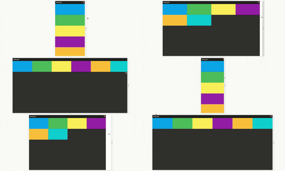
code example here https://raw.githubusercontent.com/nggepe/simple_grid/master/doc/demo-grid.gif
code example here https://raw.githubusercontent.com/nggepe/simple_grid/master/doc/order-example.gif
Bootstrap, material-ui or another web-grid always use 12 size. Here is the image example: https://raw.githubusercontent.com/nggepe/simple_grid/master/doc/grid-example.png
There are 4 classes that you have to now, these are:
SpGrid is the container of grid, more information hereSpGridItem is the children of SpGrid, more information hereSpGridSize is the class that you can declare the maximum of the screen size, more information hereSpOrder, this class is a sort class. when you use 1 of it's value, the value will create an ordering when the screen on the value condition. more information hereSpGrid(width: MediaQuery.of(context).size.width, children: [
SpGridItem(
xs: 12,
sm: 6,
md: 4,
lg: 3,
child: Container(
color: Colors.blue,
height: 200,
),
),
SpGridItem(
xs: 12,
sm: 6,
md: 4,
lg: 3,
child: Container(
color: Colors.green,
height: 200,
),
),
SpGridItem(
xs: 12,
sm: 6,
md: 4,
lg: 3,
child: Container(
color: Colors.yellow,
height: 200,
),
),
SpGridItem(
xs: 12,
sm: 6,
md: 4,
lg: 3,
child: Container(
color: Colors.purple,
height: 200,
),
),
]);
import 'package:flutter/material.dart';
import 'package:simple_grid/simple_grid.dart';

void main() {
  runApp(MyApp());
}

class MyApp extends StatelessWidget {
  @override
  Widget build(BuildContext context) {
    return MaterialApp(
      title: 'Simple_grid',
      theme: ThemeData(
        brightness: Brightness.dark,
      ),
      home: MyHomePage(),
    );
  }
}

class MyHomePage extends StatelessWidget {
  @override
  Widget build(BuildContext context) {
    return Scaffold(
      appBar: AppBar(
        title: Text("SIMPLE GRID EXAMPLE"),
      ),
      body: SpGrid(
        width: MediaQuery.of(context).size.width,
        spacing: 10,
        runSpacing: 10,
        children: [
          SpGridItem(
            xs: 12,
            md: 6,
            order: SpOrder(sm: 1, xs: 1),
            child: Container(
              height: 200,
              child: Column(
                mainAxisAlignment: MainAxisAlignment.center,
                children: [
                  Text(
                    "Hello!",
                    style: TextStyle(fontSize: 40),
                    textAlign: TextAlign.center,
                  ),
                  SizedBox(
                    height: 10,
                  ),
                  Text(
                    "I'm John Doe and I Love Programming",
                    style: TextStyle(fontSize: 25),
                    textAlign: TextAlign.center,
                  ),
                ],
              ),
            ),
          ),
          SpGridItem(
            xs: 12,
            md: 6,
            order: SpOrder(sm: 0, xs: 0),
            child: Container(
              height: 200,
              decoration: BoxDecoration(
                  image: DecorationImage(
                      image: NetworkImage(
                          "https://raw.githubusercontent.com/nggepe/simple_grid/master/doc/john.png"))),
            ),
          ),
        ],
      ),
    );
  }
}
SpGrid(
  width: MediaQuery.of(context).size.width,
  gridSize: SpGridSize(xs: 0, sm: 500, md: 768, lg: 980, xl: 1200),
  children:[],
)