Search packages, repositories and app categories

simple_grid cover
Package detailsv0.1.5

simple_grid

A dynamic grid inspired by boostrap, you can use it to describe your grid layout. This package purely using mediaquery, don't worry about the render.

AndroidiOSWebmacOSWindowsLinux
30-day downloads
955
Likes
79
Pub points
160

Install package

flutter pub add simple_grid

Package Overview

Package selection guidance compiled from public package information, community data, and project usage.

Simple Grid is a responsive grid layout package for Flutter that draws inspiration from Bootstrap. It enables developers to define flexible, dynamic grid systems using MediaQuery, ensuring layouts adapt seamlessly across different screen sizes and platforms. The package simplifies responsive UI design by abstracting complex calculations, allowing intuitive grid definitions without manual rendering concerns. Ideal for building consistent, scalable interfaces across mobile, web, and desktop apps.

Use cases

  • Building responsive dashboards
  • Creating adaptive card layouts
  • Designing multi-column forms
  • Developing cross-platform UIs
  • Implementing fluid content grids

Key features

  • MediaQuery-based responsiveness
  • Bootstrap-inspired syntax
  • No manual rendering required
  • Cross-platform support
  • Simple declarative grid definition

Suitable for

  • Beginner Flutter developers
  • Responsive UI designers
  • Cross-platform app creators
  • Rapid prototyping teams
  • Layout-focused projects

Considerations

  • Limited customization beyond grid structure
  • Dependent on MediaQuery accuracy
  • Not suitable for highly complex layouts
  • May require additional styling for advanced designs
  • Best for standard grid patterns

Original README

Original README snapshot from the linked source repository. Visit the repository for the latest content.

Indonesian documentation is here

Introduction

pub package build

Inspired by bootstrap , This is dynamic grid layout that you can use Like a bootstrap grid, but the size following material UI break points. You can also customize your break point like here. This package purely using mediaquery, don't worry about the render.

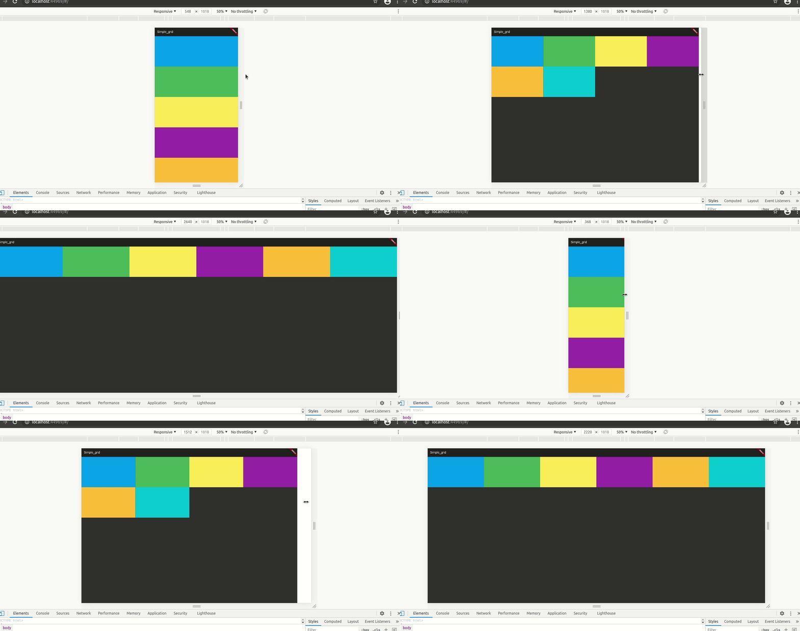
Simple Demo

code example here

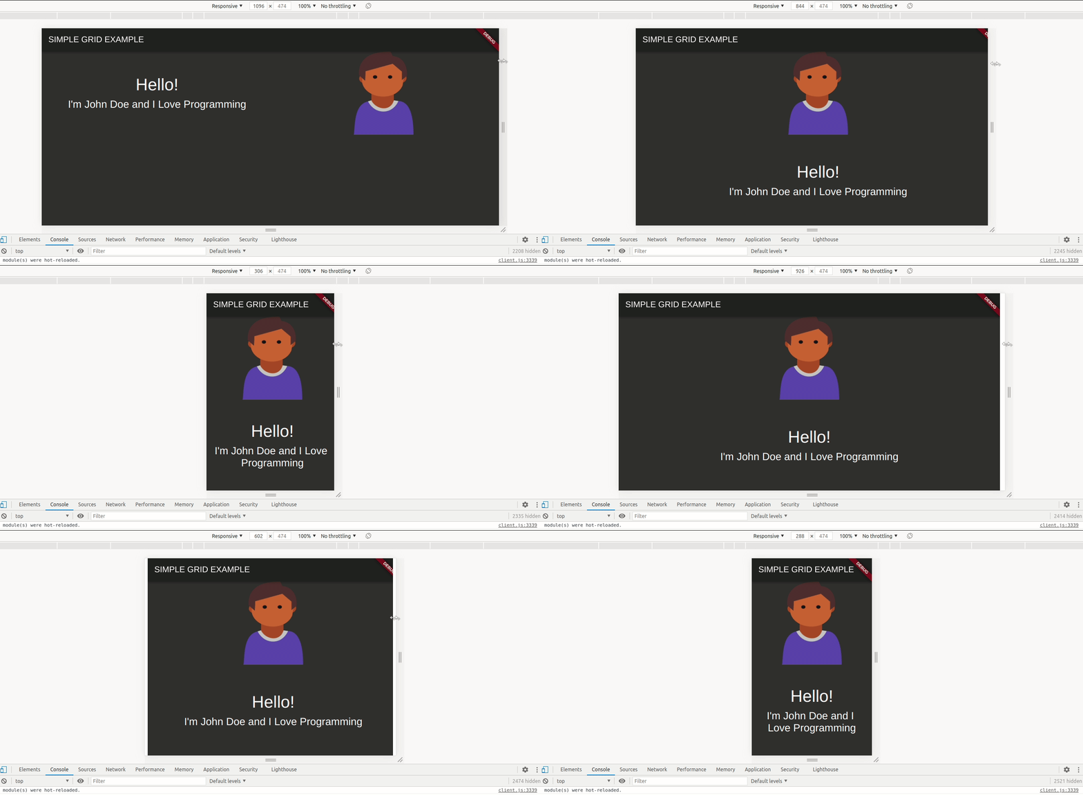
Order Demo

code example here

Grid Explanation

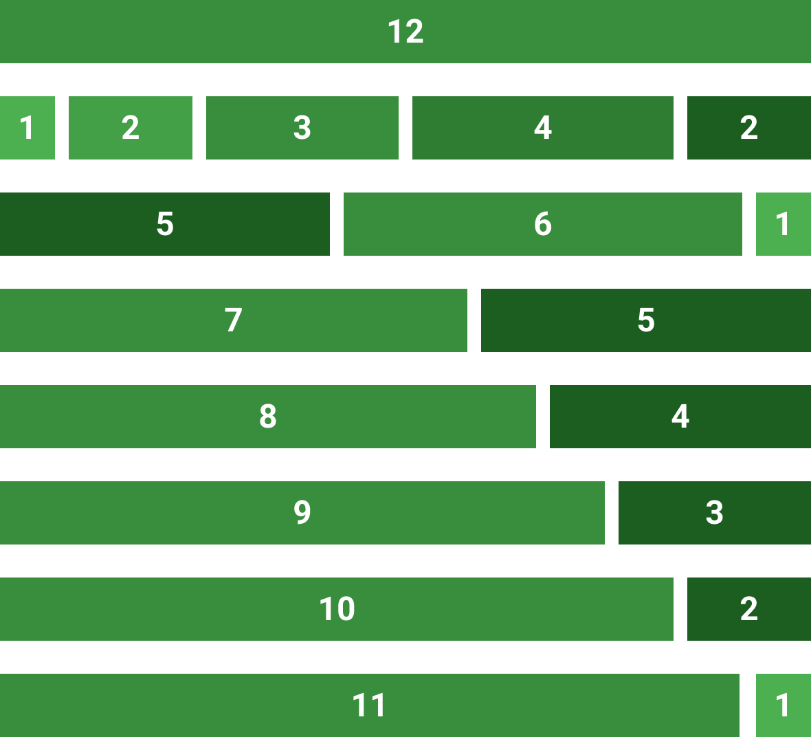
Bootstrap, material-ui or another web-grid always use 12 size. Here is the image example:

Classes

There are 4 classes that you have to now, these are:

  1. SpGrid is the container of grid, more information here
  2. SpGridItem is the children of SpGrid, more information here
  3. SpGridSize is the class that you can declare the maximum of the screen size, more information here
  4. SpOrder, this class is a sort class. when you use 1 of it's value, the value will create an ordering when the screen on the value condition. more information here

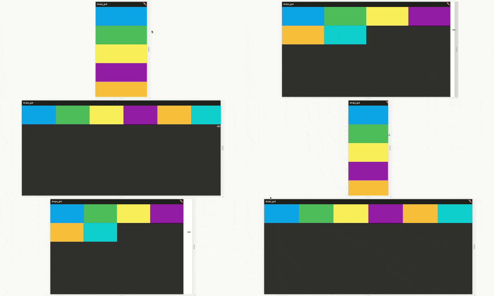
Example

SpGrid(width: MediaQuery.of(context).size.width, children: [
  SpGridItem(
    xs: 12,
    sm: 6,
    md: 4,
    lg: 3,
    child: Container(
      color: Colors.blue,
      height: 200,
    ),
  ),
  SpGridItem(
    xs: 12,
    sm: 6,
    md: 4,
    lg: 3,
    child: Container(
      color: Colors.green,
      height: 200,
    ),
  ),
  SpGridItem(
    xs: 12,
    sm: 6,
    md: 4,
    lg: 3,
    child: Container(
      color: Colors.yellow,
      height: 200,
    ),
  ),
  SpGridItem(
    xs: 12,
    sm: 6,
    md: 4,
    lg: 3,
    child: Container(
      color: Colors.purple,
      height: 200,
    ),
  ),
]);

Order Example

import 'package:flutter/material.dart';
import 'package:simple_grid/simple_grid.dart';

void main() {
  runApp(MyApp());
}

class MyApp extends StatelessWidget {
  @override
  Widget build(BuildContext context) {
    return MaterialApp(
      title: 'Simple_grid',
      theme: ThemeData(
        brightness: Brightness.dark,
      ),
      home: MyHomePage(),
    );
  }
}

class MyHomePage extends StatelessWidget {
  @override
  Widget build(BuildContext context) {
    return Scaffold(
      appBar: AppBar(
        title: Text("SIMPLE GRID EXAMPLE"),
      ),
      body: SpGrid(
        width: MediaQuery.of(context).size.width,
        spacing: 10,
        runSpacing: 10,
        children: [
          SpGridItem(
            xs: 12,
            md: 6,
            order: SpOrder(sm: 1, xs: 1),
            child: Container(
              height: 200,
              child: Column(
                mainAxisAlignment: MainAxisAlignment.center,
                children: [
                  Text(
                    "Hello!",
                    style: TextStyle(fontSize: 40),
                    textAlign: TextAlign.center,
                  ),
                  SizedBox(
                    height: 10,
                  ),
                  Text(
                    "I'm John Doe and I Love Programming",
                    style: TextStyle(fontSize: 25),
                    textAlign: TextAlign.center,
                  ),
                ],
              ),
            ),
          ),
          SpGridItem(
            xs: 12,
            md: 6,
            order: SpOrder(sm: 0, xs: 0),
            child: Container(
              height: 200,
              decoration: BoxDecoration(
                  image: DecorationImage(
                      image: NetworkImage(
                          "https://raw.githubusercontent.com/nggepe/simple_grid/master/doc/john.png"))),
            ),
          ),
        ],
      ),
    );
  }
}

Customize Break Point

SpGrid(
  width: MediaQuery.of(context).size.width,
  gridSize: SpGridSize(xs: 0, sm: 500, md: 768, lg: 980, xl: 1200),
  children:[],
)

Categories

Source repository

Projects using this package

No data available yet.