
 v1.0.3
day_month_picker
Select your desired month and day easily with this package! Pick from the picker a simple date choice process—no year needed. Enjoy!
29Likes 10330-day downloads150Pub points
AndroidiOSWebmacOSWindowsLinux
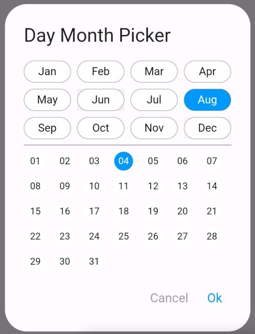
A repo which can help you to select the month and day of the month from Dialog. if you don't want to show year option to user
English project snapshot. Visit GitHub for the latest content.
The DayMonthPicker widget is a customizable Flutter component that allows users to select a specific day and month from a dialog interface. It is particularly useful in forms or applications where date input is needed without year.
Easy selection of months and days Customizable appearance Built-in support for existing day and month values Callback function to handle changes
const DayMonthPicker({
  Key? key,
  this.surfaceTintColor,
  this.titleTextStyle,
  this.selectedMonthBgColor = Colors.blue,
  this.unSelectedMonthBgColor = Colors.white,
  this.selectedDayBgColor = Colors.blue,
  this.unSelectedDayBgColor = Colors.white,
  this.title = "Date Month Picker",
  this.selectedMonthTextStyle = const TextStyle(color: Colors.white, fontSize: 14),
  this.unSelectedMonthTextStyle = const TextStyle(color: Colors.black, fontSize: 14),
  this.selectedDayTextStyle = const TextStyle(color: Colors.white, fontSize: 12),
  this.unSelectedDayTextStyle = const TextStyle(color: Colors.black, fontSize: 12),
  this.child = const Padding(
    padding: EdgeInsets.all(8.0),
    child: Text("Month Picker"),
  ),
  this.cancelTextStyle = const TextStyle(color: Colors.grey, fontSize: 16),
  this.okTextStyle = const TextStyle(color: Colors.blue, fontSize: 16),
  this.existingDay,
  this.existingMonth,
  required this.onChange,
});
Short and useful examples for package users.
DayMonthPicker(onChange: (DayMonth? dayMonth){
        if(dayMonth != null) {
          print("Day: ${dayMonth.day}");
          print("Month: ${dayMonth.month}");
        }
      }),
@override
Widget build(BuildContext context) {
  return Scaffold(
    appBar: AppBar(title: Text('Day Month Picker Example')),
    body: Center(
      child: DayMonthPicker(
        onChange: (dayMonth) {
          // Do something with the selected day and month
          print('Selected Day: ${dayMonth.day}, Month: ${dayMonth.month}');
        },
      ),
    ),
  );
}

Dependency list 3 items
{"sdk":"flutter"}{"sdk":"flutter"}^3.0.0Start with your use case, compare repository activity, and check the original project before adopting it.
“A repository is the most basic element of GitHub.”
GitHub Docs — About repositories ↗