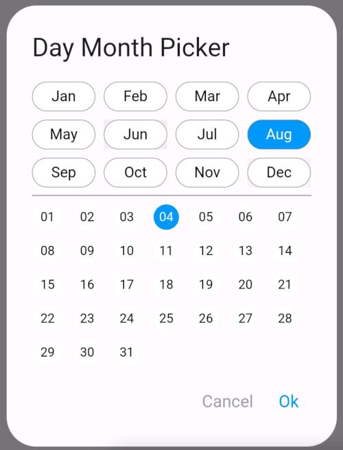
Original README snapshot from the linked source repository. Visit the repository for the latest content.
Day Month Picker or You can say Date Month picker
The DayMonthPicker widget is a customizable Flutter component that allows users to select a specific day and month from a dialog interface. It is particularly useful in forms or applications where date input is needed without year.
Features
Easy selection of months and days
Customizable appearance
Built-in support for existing day and month values
Callback function to handle changes
Constructor
const DayMonthPicker({
  Key? key,
  this.surfaceTintColor,
  this.titleTextStyle,
  this.selectedMonthBgColor = Colors.blue,
  this.unSelectedMonthBgColor = Colors.white,
  this.selectedDayBgColor = Colors.blue,
  this.unSelectedDayBgColor = Colors.white,
  this.title = "Date Month Picker",
  this.selectedMonthTextStyle = const TextStyle(color: Colors.white, fontSize: 14),
  this.unSelectedMonthTextStyle = const TextStyle(color: Colors.black, fontSize: 14),
  this.selectedDayTextStyle = const TextStyle(color: Colors.white, fontSize: 12),
  this.unSelectedDayTextStyle = const TextStyle(color: Colors.black, fontSize: 12),
  this.child = const Padding(
    padding: EdgeInsets.all(8.0),
    child: Text("Month Picker"),
  ),
  this.cancelTextStyle = const TextStyle(color: Colors.grey, fontSize: 16),
  this.okTextStyle = const TextStyle(color: Colors.blue, fontSize: 16),
  this.existingDay,
  this.existingMonth,
  required this.onChange,
});
Parameters
- key: An optional key to identify the widget.
- surfaceTintColor: A color to tint the dialog surface (default is transparent).
- titleTextStyle: Text style for the dialog title.
- selectedMonthBgColor: Background color for the selected month (default is blue).
- unSelectedMonthBgColor: Background color for unselected months (default is white).
- selectedDayBgColor: Background color for the selected day (default is blue).
- unSelectedDayBgColor: Background color for unselected days (default is white).
- title: The title of the dialog (default is "Date Month Picker").
- selectedMonthTextStyle: Text style for the selected month label.
- unSelectedMonthTextStyle: Text style for unselected month labels.
- selectedDayTextStyle: Text style for the selected day label.
- unSelectedDayTextStyle: Text style for unselected day labels.
- child: The widget displayed as the button to open the picker (default is a padded "Month Picker" text).
- cancelTextStyle: Text style for the cancel button.
- okTextStyle: Text style for the ok button.
- existingDay: An optional string representing the already selected day.
- existingMonth: An optional string representing the already selected month.
- onChange: A required callback function that is triggered when the user selects a day and month.
Usage
Short and useful examples for package users.
DayMonthPicker(onChange: (DayMonth? dayMonth){
        if(dayMonth != null) {
          print("Day: ${dayMonth.day}");
          print("Month: ${dayMonth.month}");
        }
      }),
Example
@override
Widget build(BuildContext context) {
return Scaffold(
appBar: AppBar(title: Text('Day Month Picker Example')),
body: Center(
child: DayMonthPicker(
onChange: (dayMonth) {
print('Selected Day: ${dayMonth.day}, Month: ${dayMonth.month}');
},
),
),
);
}
Some UI examples