


v4.0.1
flutter_widget_catalogue
Create awesome apps very faster with Flutter's collection of visual, structural, platform, UI, and interactive widgets.
34Likes 15130-day downloads160Pub points
AndroidiOSmacOSWindowsLinux
techvootsolutions/flutter_widget_catalogue open-source repository details.

English project snapshot. Visit GitHub for the latest content.


A collection of visual, structural, platform-adaptive, and interactive widgets to help you build beautiful and functional Flutter apps faster.
🎯 100% Dart | 💙 Flutter-ready | ✅ Easy to use | 🧩 Modular components
Highly customizable Flutter switch widget:
Ready-to-use Neumorphic-styled widgets with glass mode:
Fully customizable and themeable text input fields:
Add the dependency to your pubspec.yaml:
dependencies:
  flutter_widget_catalogue: <latest-version>
Then import it:
import 'package:flutter_widget_catalogue/flutter_widget_catalogue.dart';
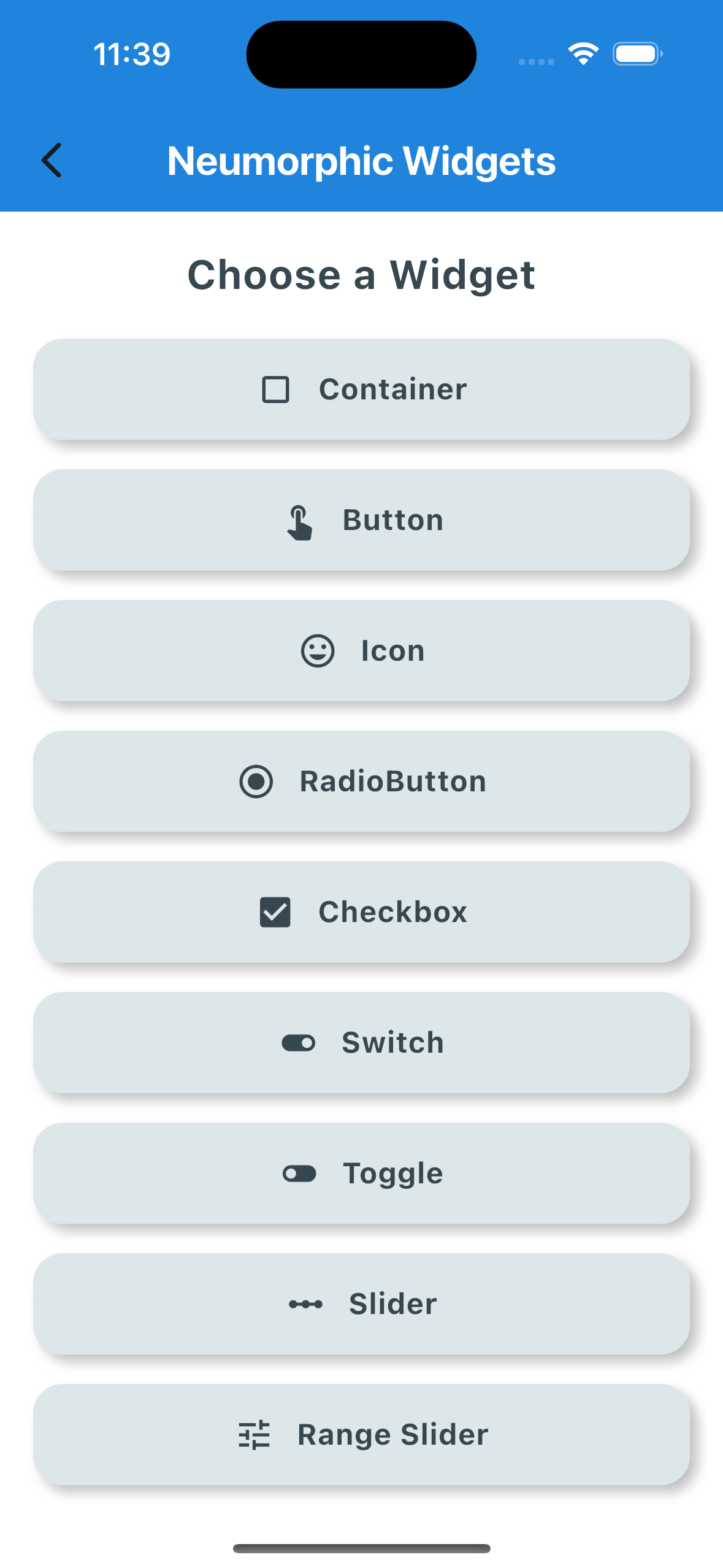 |
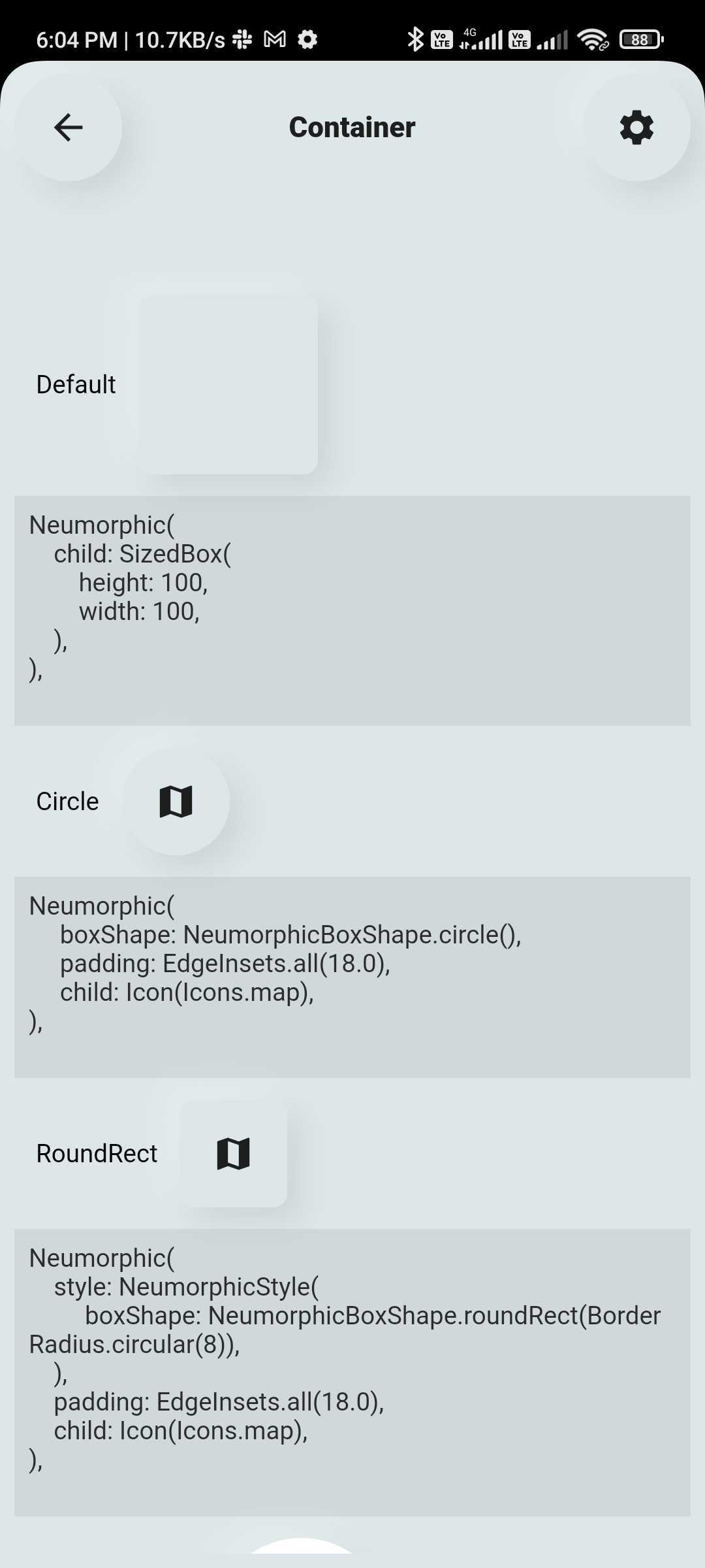 |
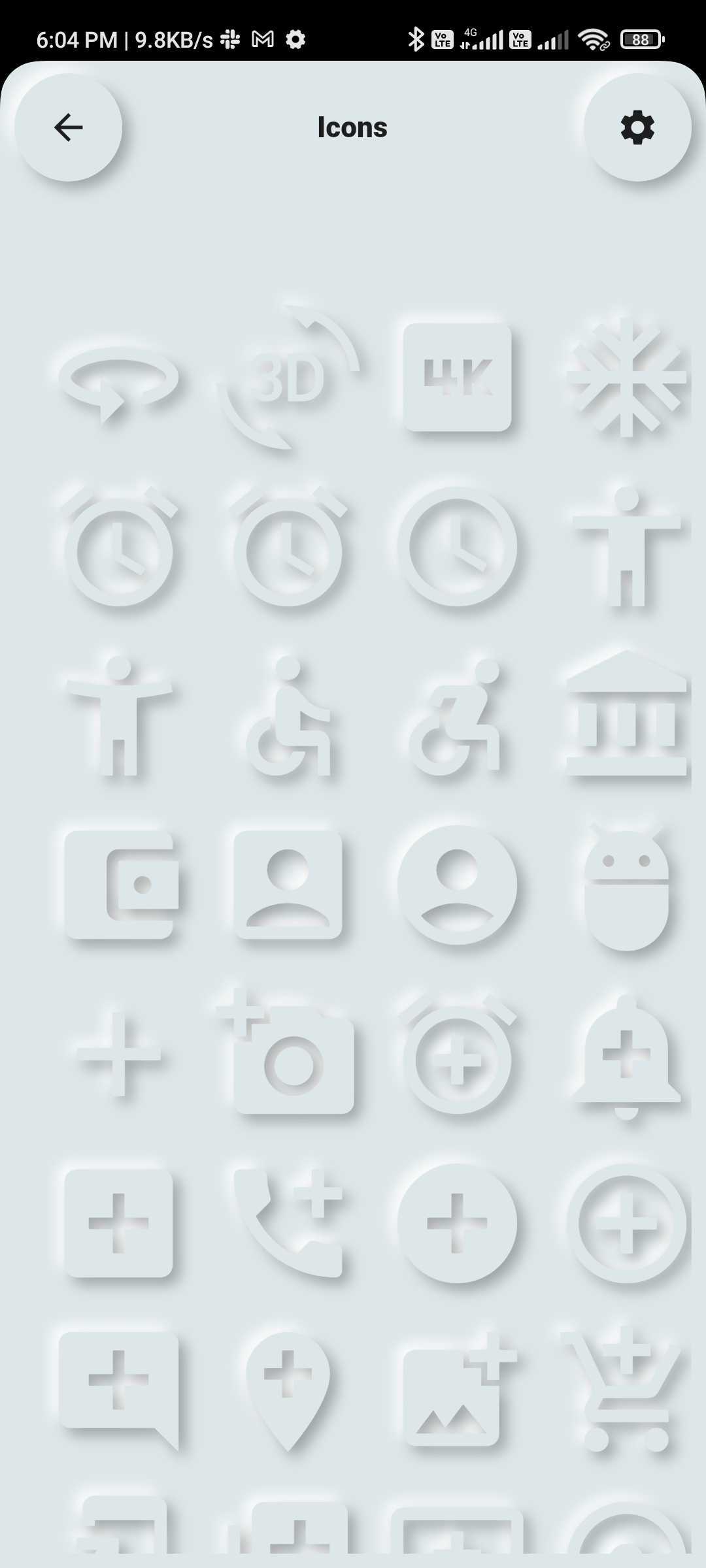 |
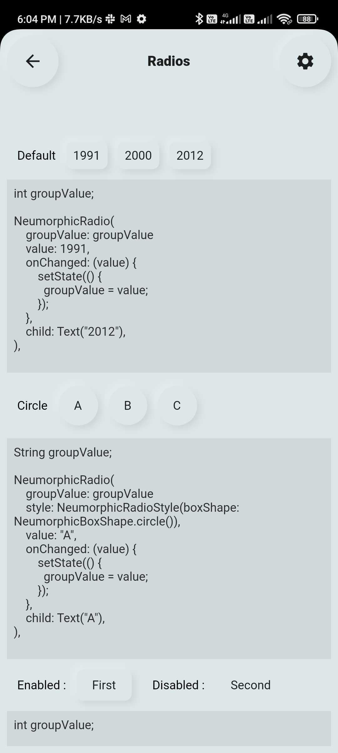 |
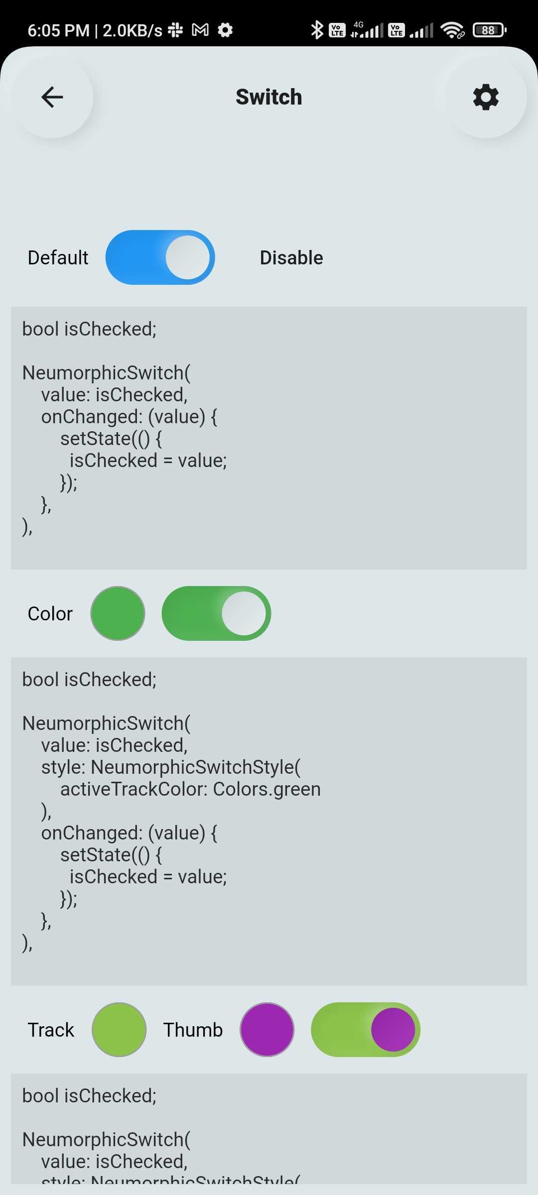 |
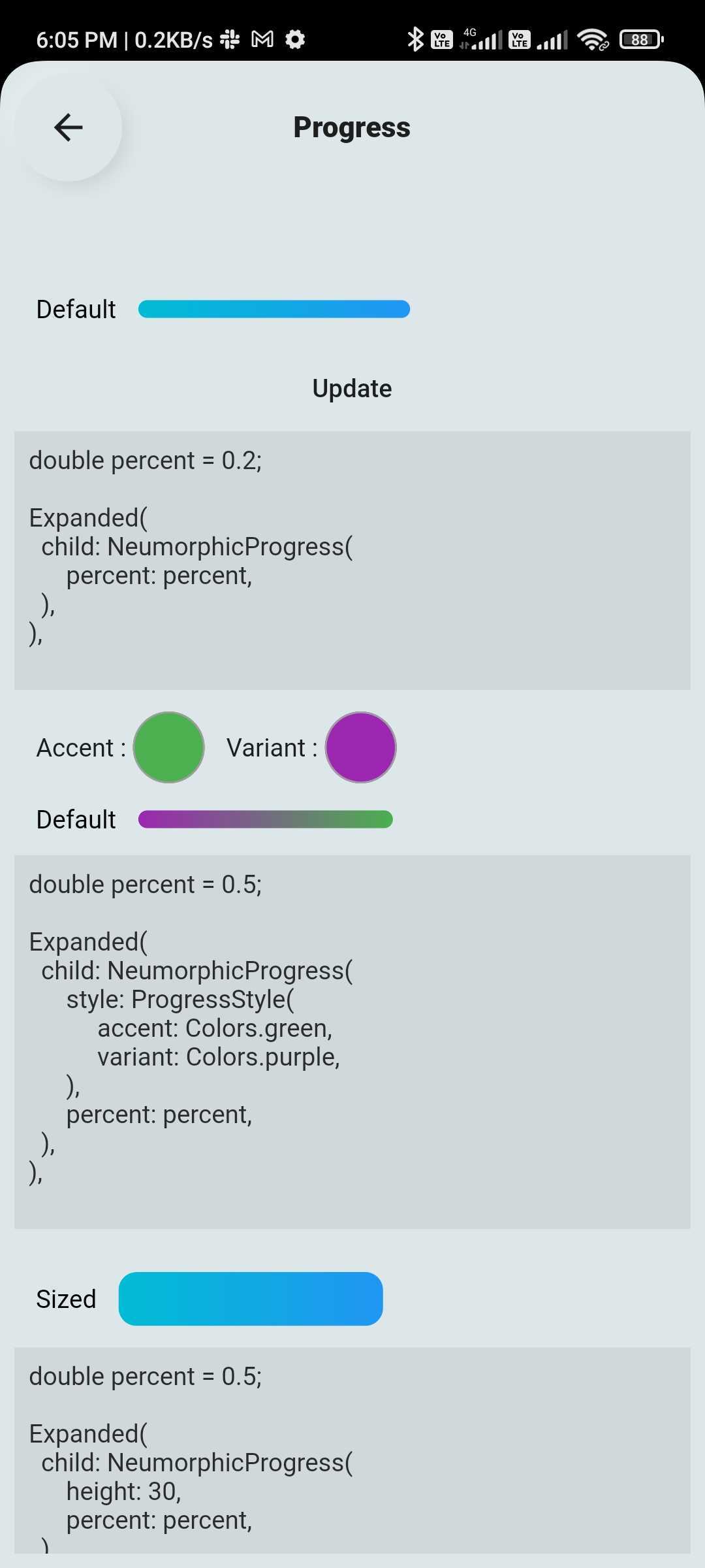 |
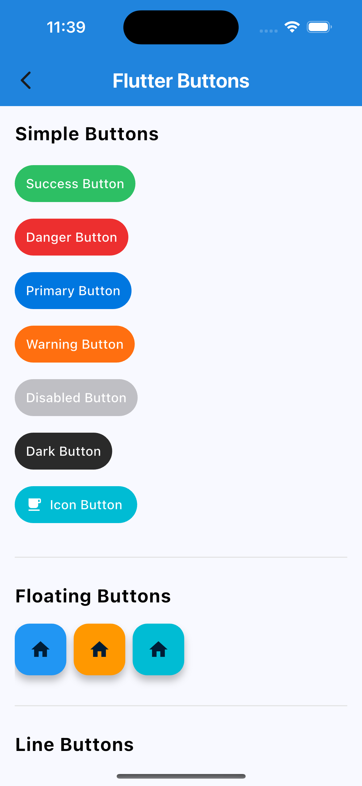 |
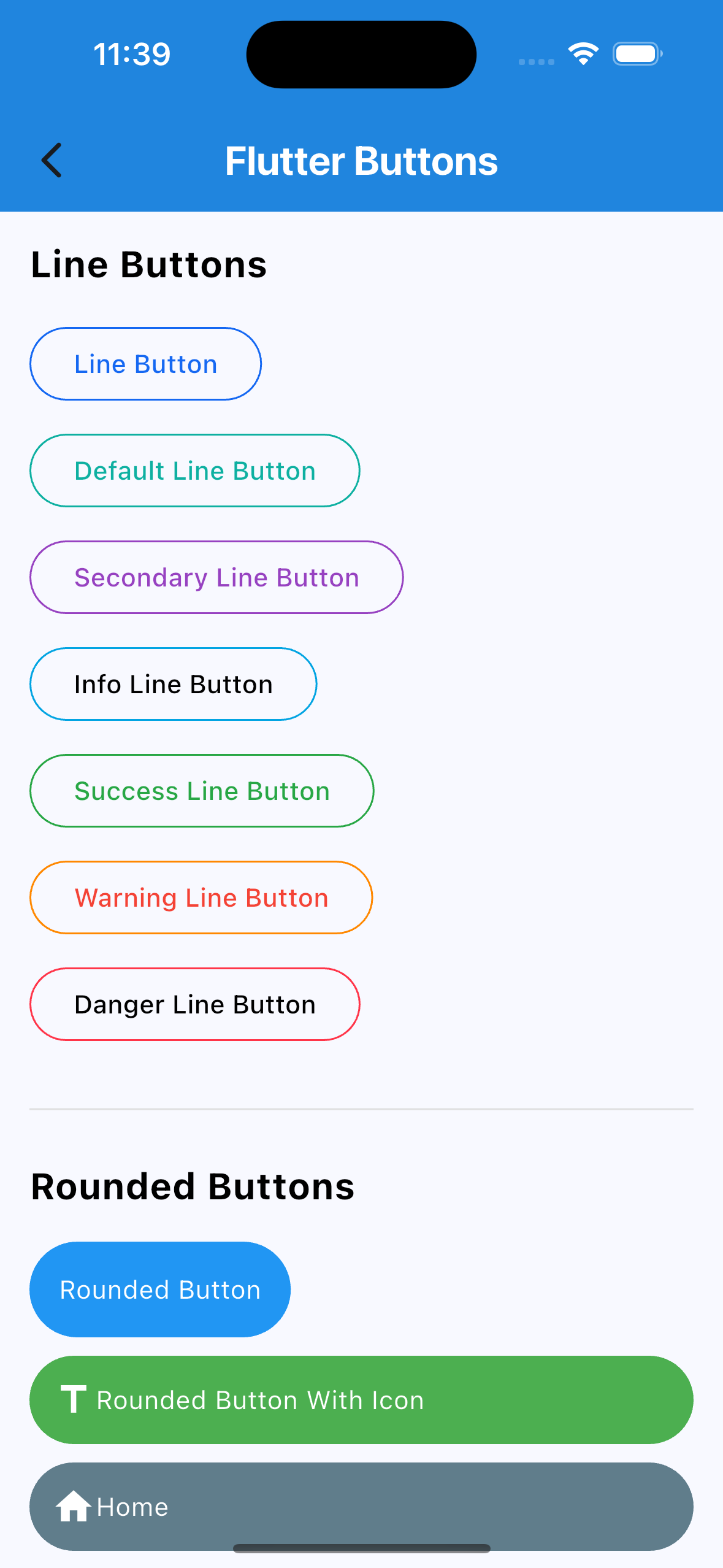 |
 |
 |
 |
 |
| Switch | TextField | List & Grid |
 |
 |
 |
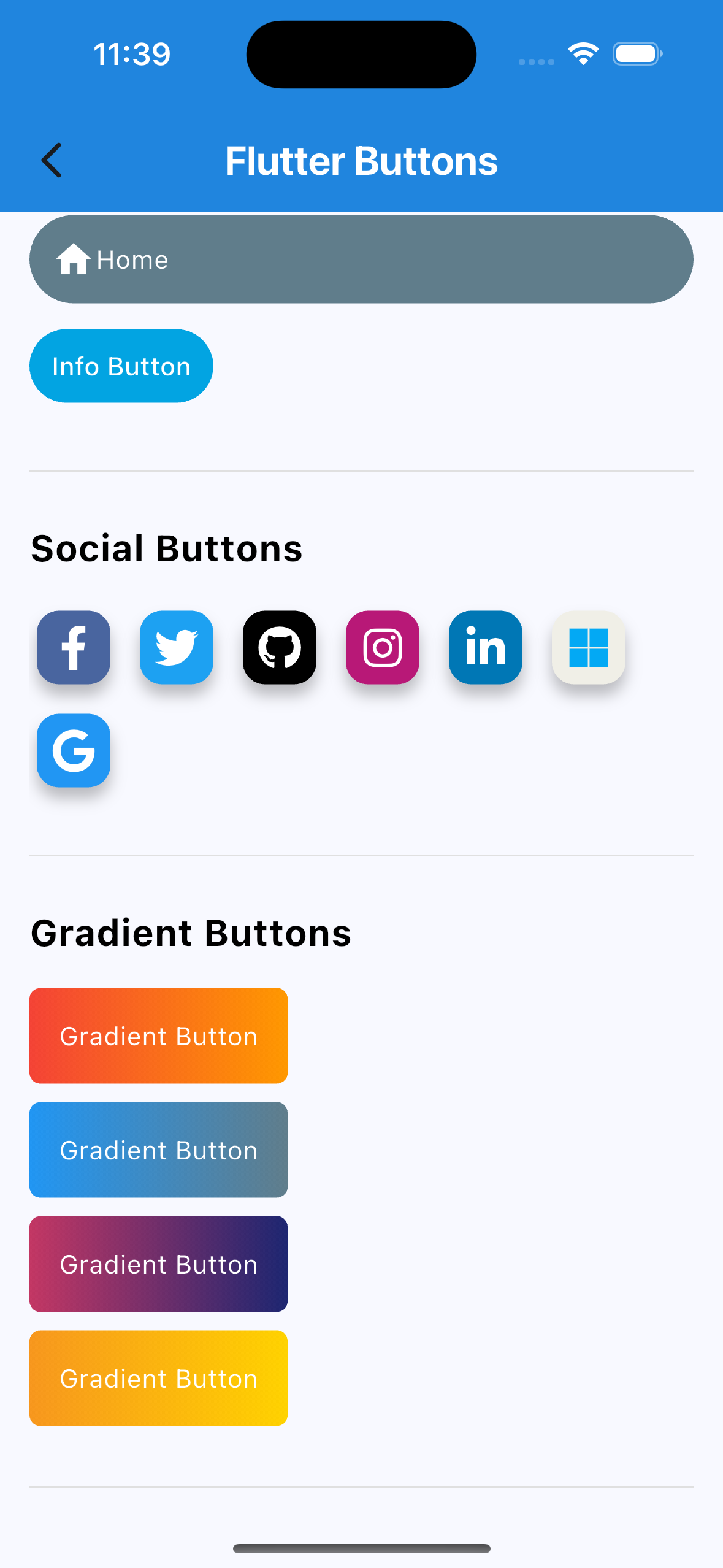
SuccessButton(title: "Success Button", onPressed: () {});
ButtonWithIcon(
  icon: Icons.local_cafe,
  title: "Icon Button",
  color: Colors.white,
  buttonColor: Colors.cyan,
  onPressed: () {},
);
GradientButton(
  onPressed: () {},
  splashColor: Colors.orange,
  colors: [Colors.red, Colors.orange],
  title: "Gradient Button",
);
FlutterSwitch(
  width: 90.0,
  height: 45.0,
  toggleSize: 38.0,
  value: status,
  borderRadius: 24.0,
  padding: 2.0,
  toggleColor: Colors.white,
  switchBorder: Border.all(color: Colors.blueAccent, width: 3.0),
  activeColor: Colors.cyan,
  inactiveColor: Colors.grey.shade400,
  onToggle: (val) {
    setState(() {
      status = val;
    });
  },
);
FlutterTextField(
  borderRadius: 50,
  hintText: "Fill Color",
  hintStyling: TextStyle(color: Colors.black),
  readOnly: false,
  fillColor: Colors.pink,
  borderColor: Colors.transparent,
  cursorColor: Colors.black,
);
FlutterTextField(
  iconBackgroundColor: Colors.black,
  borderRadius: 20,
  customTextFieldIcon: Icon(
  Icons.lock,
  color: Colors.black,),
  hintText: "Enter your password",
  isPasswordField: true,
  isIconShow: true,
  readOnly: false,
  fillColor: Colors.white,
  borderColor: Colors.black,
  cursorColor: Colors.black,
  leadingIconColor: Colors.black,
  labelName: "Password",
);
FlutterTextField(
  isIconShow: false,
  iconBackgroundColor: Colors.white10,
  borderRadius: 30,
  isNumber: true,
  hintText: "Enter your number",
  readOnly: false,
  borderColor: Colors.yellow,
  labelName: "Phone number",
  labelNameTextStyle: const TextStyle(color: Colors.black, fontSize: 20, fontWeight: FontWeight.w600),
);
HierarchySearchableDropdown(
  items: _kSampleData,
  hint: 'Select Multiple Items',
  isMultiline: true,
  isMultiSelect: true,
  onChanged: (label) => setState(() => selectedLabel = label),
  validator: (value) {
    if (value == null || value.isEmpty) {
      return 'Please select at least one item';
    }
    return null;
  },
  itemSpacing: 2,
  listPadding: const EdgeInsets.symmetric(vertical: 16),
  itemTextStyle: const TextStyle(
    color: Colors.black,
    fontSize: 15,
  ),
);
HierarchySearchableDropdown(
  items: _kFilterData,
  hint: 'Select Filters',
  isMultiSelect: true,
  showChips: true,
  isMultiline: false,
  onChanged: (label) => setState(() => selectedFilters = label),
),
| Platform | Supported |
|---|---|
| Android | ✅ |
| iOS | ✅ |
| Web | ✅ |
Please see the CHANGELOG.md for a list of recent changes.
This project is licensed under the MIT License.
Dependency list 4 items
{"sdk":"flutter"}^11.0.0{"sdk":"flutter"}^6.0.0Start with your use case, compare repository activity, and check the original project before adopting it.
“A repository is the most basic element of GitHub.”
GitHub Docs — About repositories ↗