Search packages, repositories and app categories

Package detailsv4.0.1

flutter_widget_catalogue

Create awesome apps very faster with Flutter's collection of visual, structural, platform, UI, and interactive widgets.

AndroidiOSmacOSWindowsLinux
30-day downloads
151
Likes
34
Pub points
160

Install package

flutter pub add flutter_widget_catalogue

Package Overview

Package selection guidance compiled from public package information, community data, and project usage.

Flutter Widget Catalogue is a comprehensive collection of pre-built, visually appealing widgets designed to accelerate app development. It offers a wide range of UI components for visual design, structural layout, platform-specific behavior, and interactive elements. Built for Flutter, it enables developers to create polished, responsive applications quickly without starting from scratch. The library supports multiple platforms including Android, iOS, macOS, Windows, and Linux, ensuring consistent cross-platform experiences. Ideal for rapid prototyping and production-ready interfaces.

Use cases

  • Rapid UI prototyping
  • Building production apps faster
  • Cross-platform app development
  • Creating consistent UI patterns
  • Enhancing developer productivity

Key features

  • Pre-designed visual widgets
  • Platform-agnostic components
  • Interactive UI elements
  • Structured layout tools
  • Easy integration via pub.dev

Suitable for

  • Beginner Flutter developers
  • Experienced developers seeking speed
  • Teams focused on UI consistency
  • Startups needing fast time-to-market
  • Designers collaborating with developers

Considerations

  • May require customization for unique designs
  • Depends on publisher's maintenance
  • Limited documentation in some areas
  • Not suitable for highly specialized UI needs
  • Potential dependency bloat if overused

Original README

Original README snapshot from the linked source repository. Visit the repository for the latest content.

🚀 Flutter Widget Catalogue

pub package GitHub stars License: MIT Flutter Compatible Platform


A collection of visual, structural, platform-adaptive, and interactive widgets to help you build beautiful and functional Flutter apps faster.
🎯 100% Dart | 💙 Flutter-ready | ✅ Easy to use | 🧩 Modular components


✨ Available Components

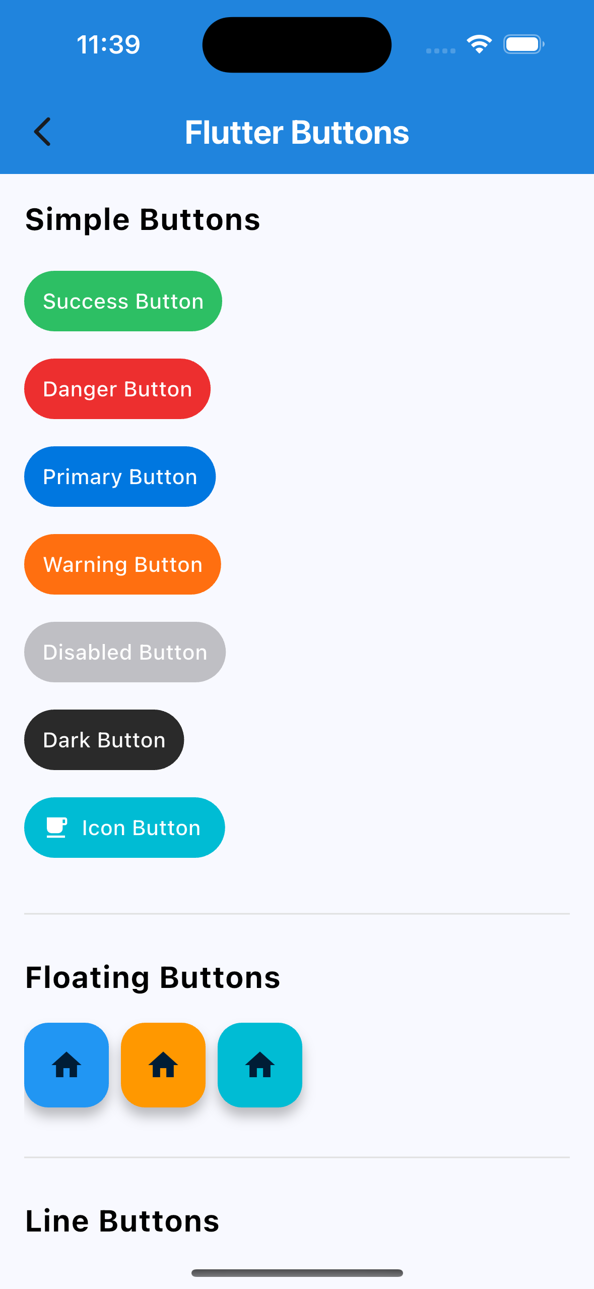
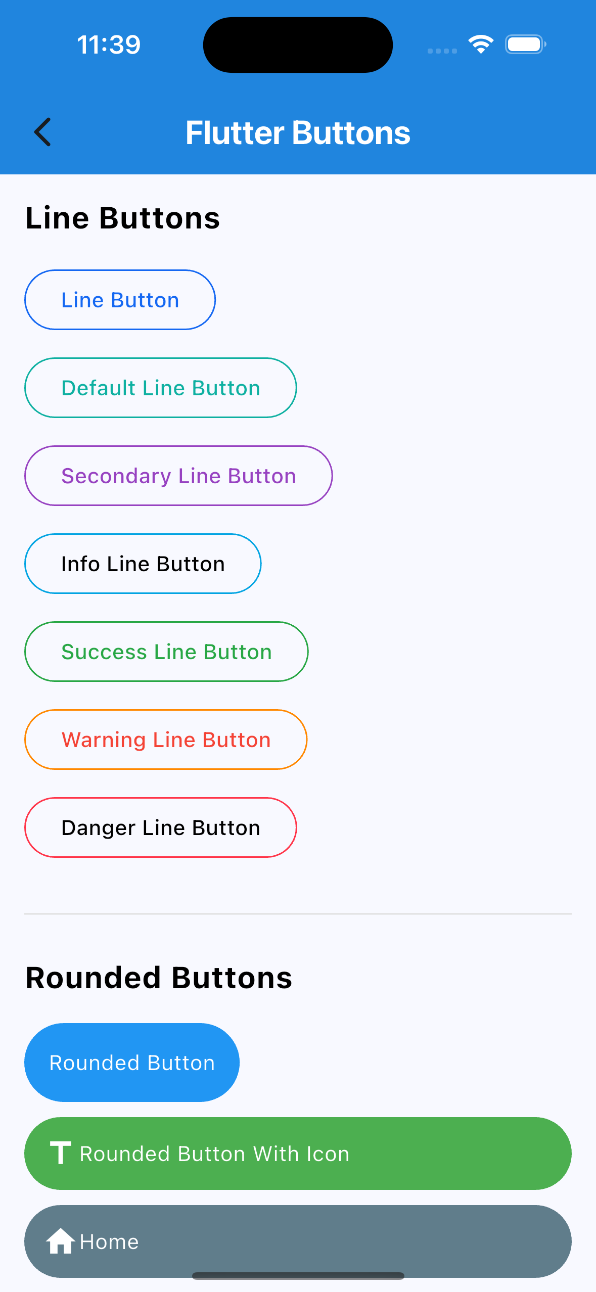
🔘 Buttons
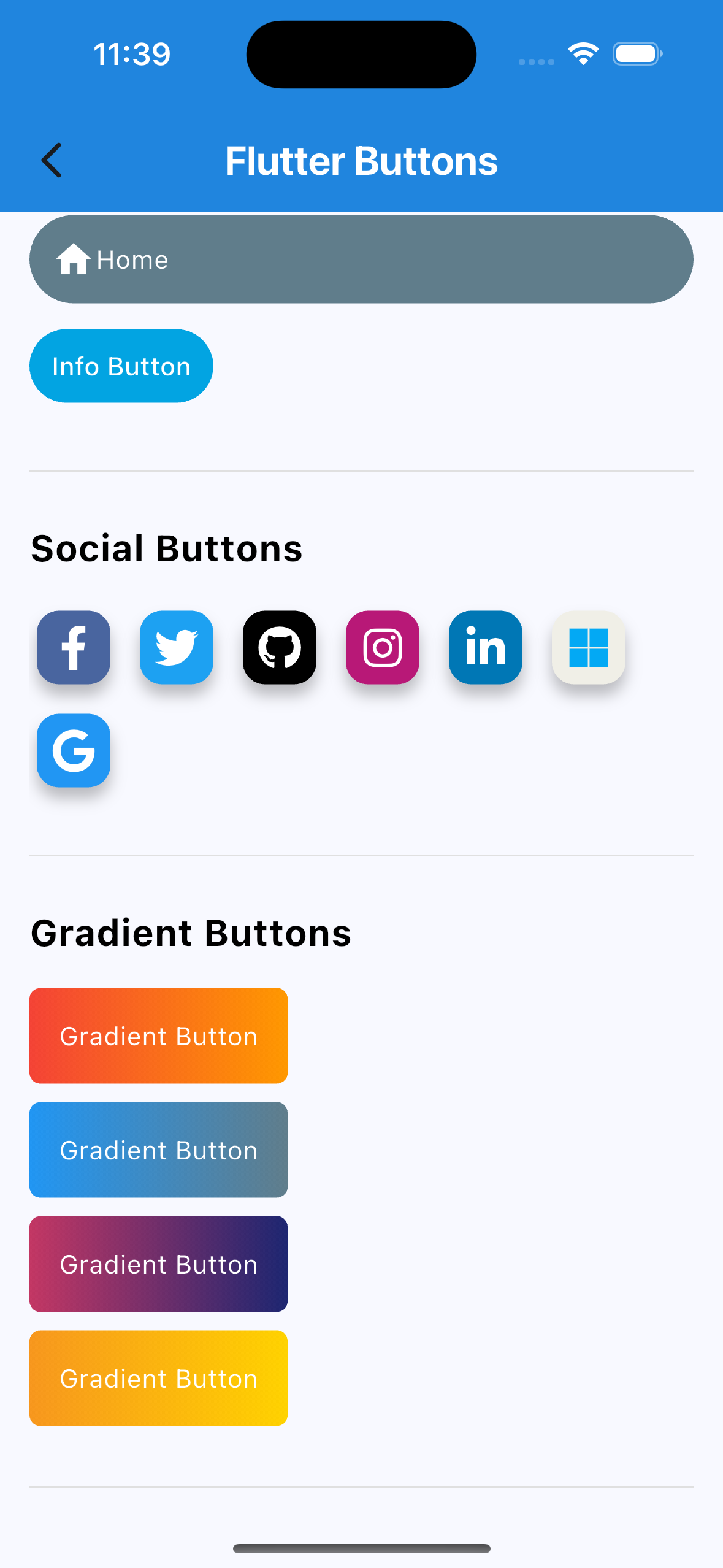
  • Social Auth Buttons (Google, Facebook, Apple, etc.)
  • Rounded Buttons
  • Icon Buttons
  • Line Buttons
  • Gradient Buttons
  • Many more…
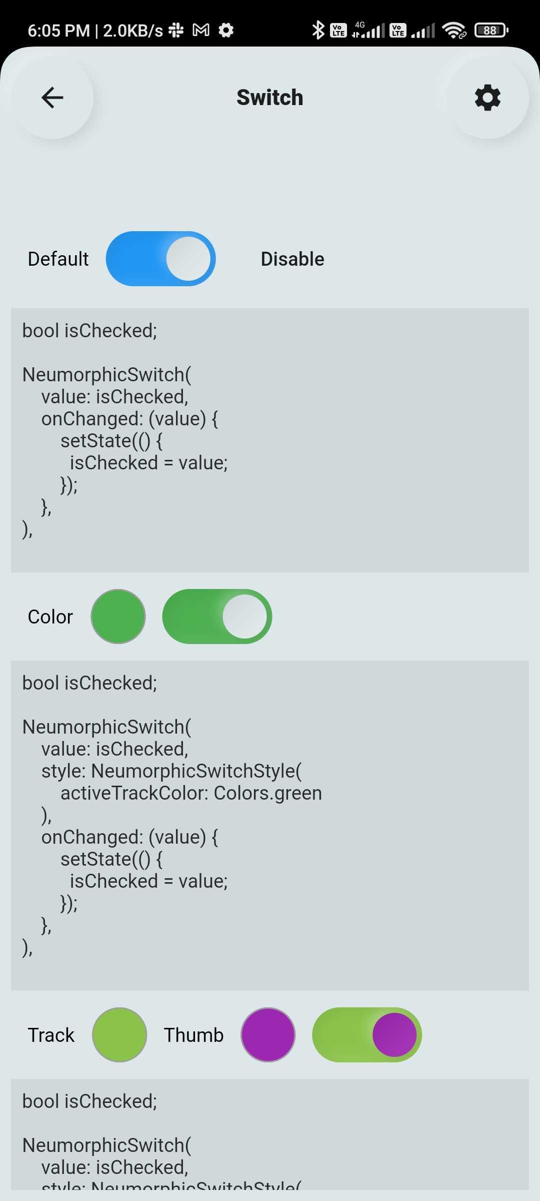
🔄 Custom Switch

Highly customizable Flutter switch widget:

  • Adjustable height, width, toggle size
  • Borders, colors, radius, icons, labels
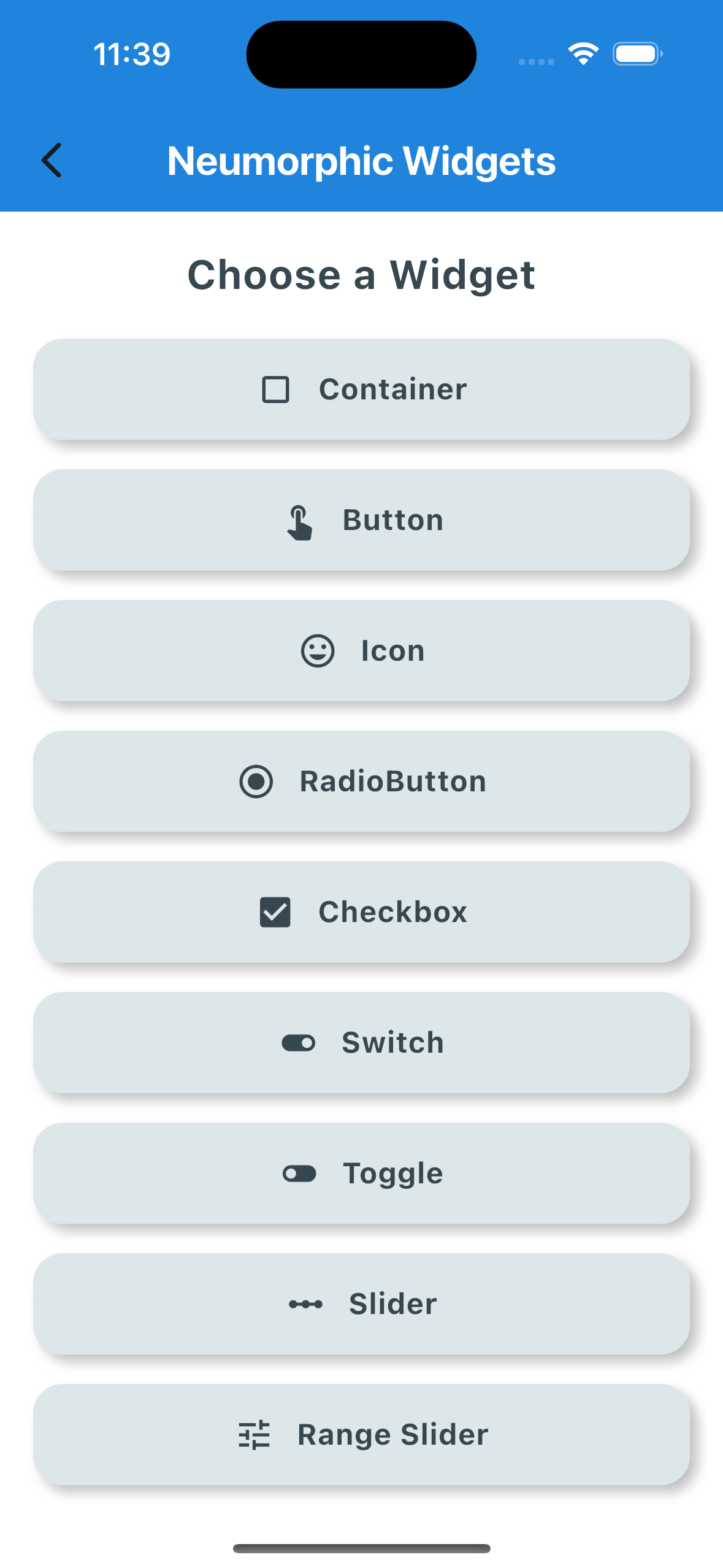
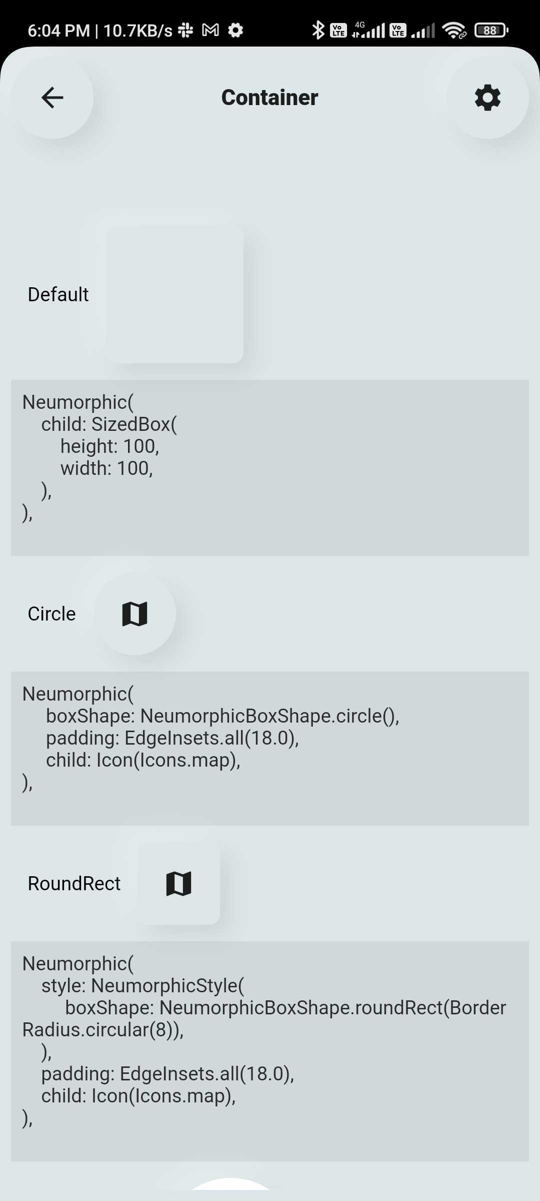
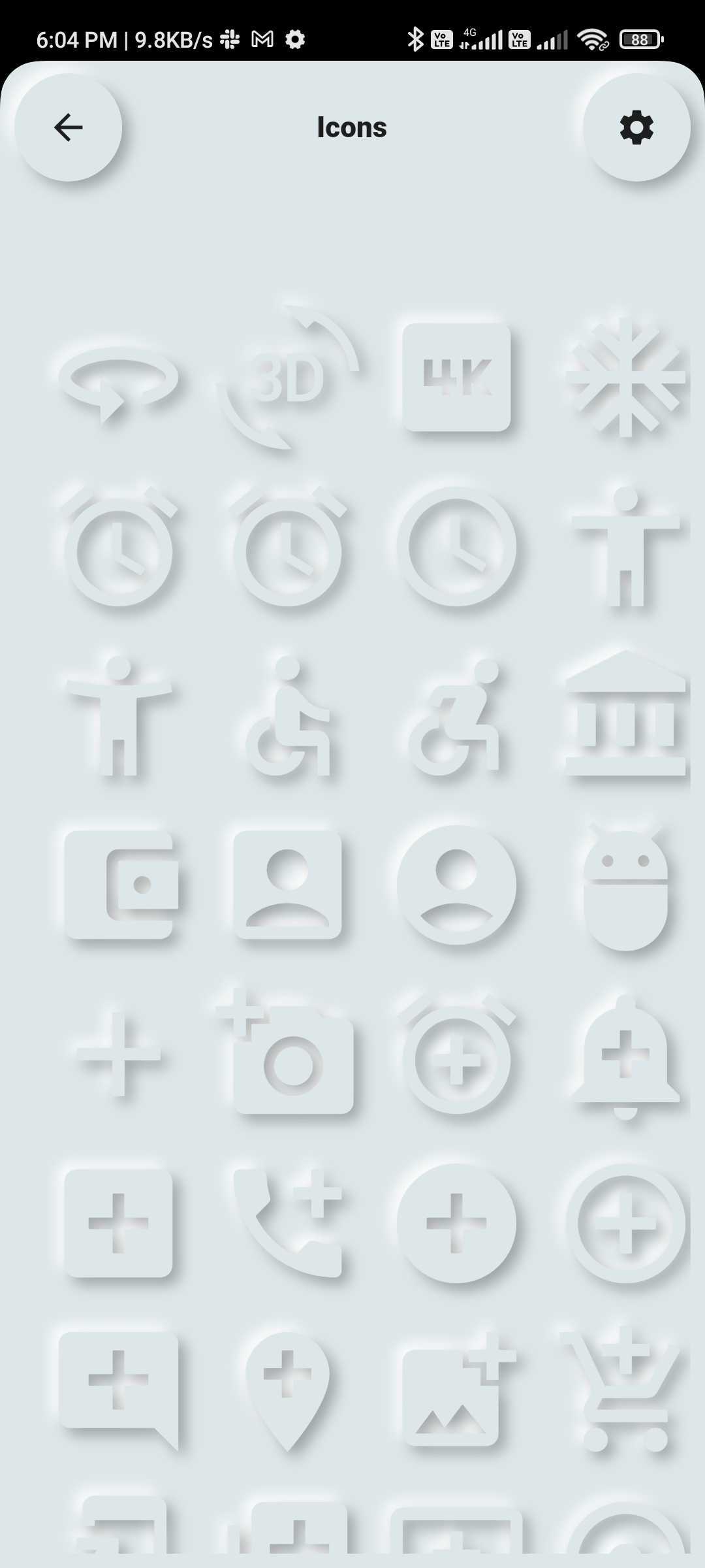
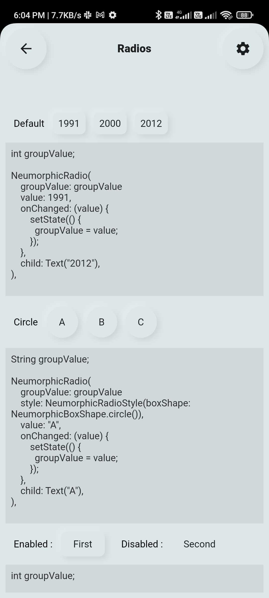
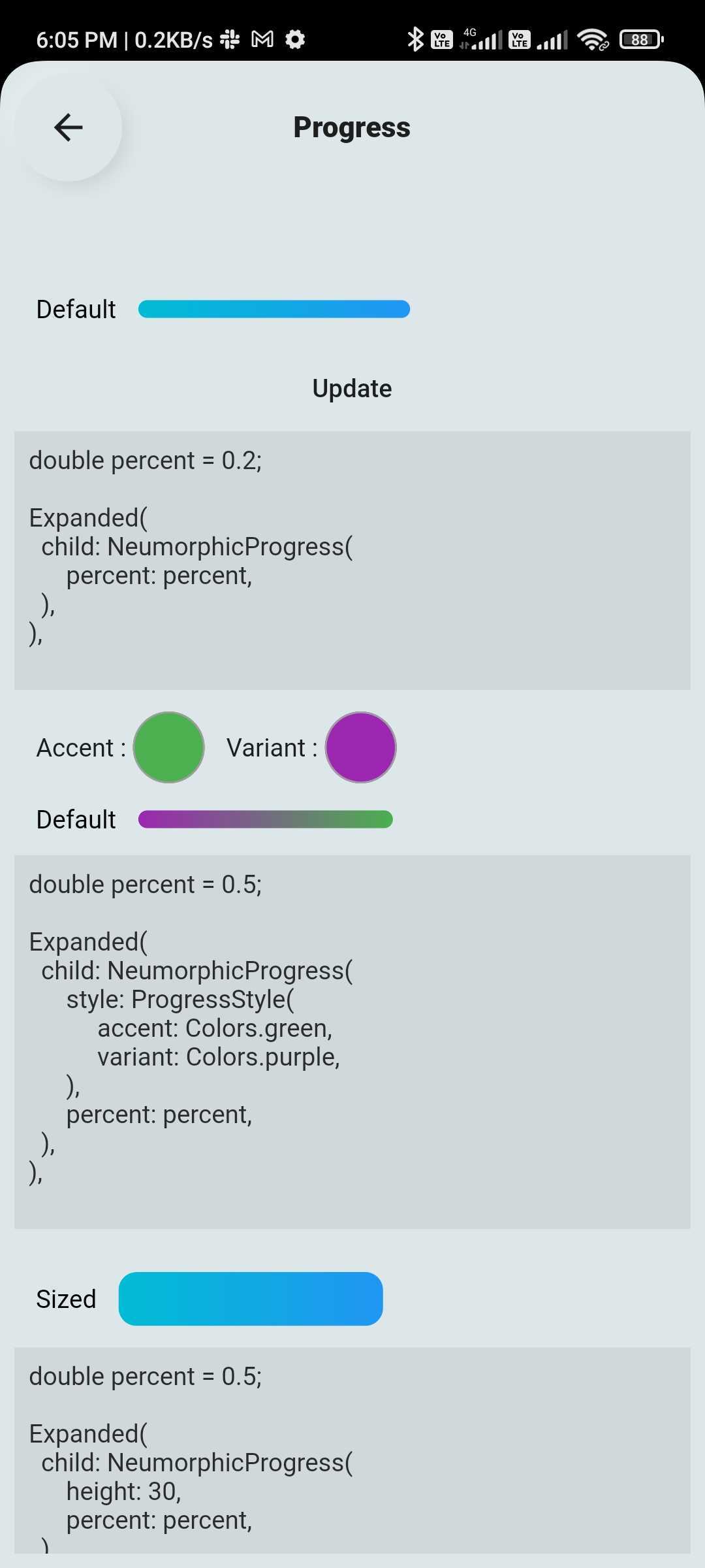
💠 Neumorphic UI Kit

Ready-to-use Neumorphic-styled widgets with glass mode:

  • Buttons, Switches, Containers, Sliders, Texts, Icons
  • Checkboxes, Toggles, Indicators, Range Sliders, AnimatedList and more
🔤 Text Fields

Fully customizable and themeable text input fields:

  • Outline, filled, underlined, or borderless styles
  • Support for icons, hint text, labels
  • Password visibility toggle, character counter, input formatter support
  • Focus, validation, and keyboard behavior control

🆕 New Features (Latest Update 🚀)

📊 Customizable & Animated Layouts
  • Animated ListView
  • Animated GridView
  • Masonry Layout support
  • Quilted Layout support
  • Smooth UI transitions & effects
💎 Glass Effect in Neumorphic UI
  • Added Glassmorphism (blur + transparency) support view
  • Works with existing Neumorphic components
🔽 Advanced Custom Dropdowns
  • Multi-select dropdown with chips
  • Scrollable chip-based selection
  • Hierarchical dropdown (tree structure)
  • Autocomplete dropdown (e.g., locations)
  • Custom item UI (user profile, icons, etc.)
  • Custom header & builder support

📦 Installation

Add the dependency to your pubspec.yaml:

dependencies:
  flutter_widget_catalogue: <latest-version>

Then import it:

import 'package:flutter_widget_catalogue/flutter_widget_catalogue.dart';

🖼️ Screenshots

Neumorphic Widgets
Buttons
DropDown
Components
Switch TextField List & Grid

🧪 Usage

Buttons Example
SuccessButton(title: "Success Button", onPressed: () {});
ButtonWithIcon(
  icon: Icons.local_cafe,
  title: "Icon Button",
  color: Colors.white,
  buttonColor: Colors.cyan,
  onPressed: () {},
);
GradientButton(
  onPressed: () {},
  splashColor: Colors.orange,
  colors: [Colors.red, Colors.orange],
  title: "Gradient Button",
);
Switch Example
FlutterSwitch(
  width: 90.0,
  height: 45.0,
  toggleSize: 38.0,
  value: status,
  borderRadius: 24.0,
  padding: 2.0,
  toggleColor: Colors.white,
  switchBorder: Border.all(color: Colors.blueAccent, width: 3.0),
  activeColor: Colors.cyan,
  inactiveColor: Colors.grey.shade400,
  onToggle: (val) {
    setState(() {
      status = val;
    });
  },
);
TextField Example
FlutterTextField(
  borderRadius: 50,
  hintText: "Fill Color",
  hintStyling: TextStyle(color: Colors.black),
  readOnly: false,
  fillColor: Colors.pink,
  borderColor: Colors.transparent,
  cursorColor: Colors.black,
);
FlutterTextField(
  iconBackgroundColor: Colors.black,
  borderRadius: 20,
  customTextFieldIcon: Icon(
  Icons.lock,
  color: Colors.black,),
  hintText: "Enter your password",
  isPasswordField: true,
  isIconShow: true,
  readOnly: false,
  fillColor: Colors.white,
  borderColor: Colors.black,
  cursorColor: Colors.black,
  leadingIconColor: Colors.black,
  labelName: "Password",
);
FlutterTextField(
  isIconShow: false,
  iconBackgroundColor: Colors.white10,
  borderRadius: 30,
  isNumber: true,
  hintText: "Enter your number",
  readOnly: false,
  borderColor: Colors.yellow,
  labelName: "Phone number",
  labelNameTextStyle: const TextStyle(color: Colors.black, fontSize: 20, fontWeight: FontWeight.w600),
);
Dropdown Example
HierarchySearchableDropdown(
  items: _kSampleData,
  hint: 'Select Multiple Items',
  isMultiline: true,
  isMultiSelect: true,
  onChanged: (label) => setState(() => selectedLabel = label),
  validator: (value) {
    if (value == null || value.isEmpty) {
      return 'Please select at least one item';
    }
    return null;
  },
  itemSpacing: 2,
  listPadding: const EdgeInsets.symmetric(vertical: 16),
  itemTextStyle: const TextStyle(
    color: Colors.black,
    fontSize: 15,
  ),
);
HierarchySearchableDropdown(
  items: _kFilterData,
  hint: 'Select Filters',
  isMultiSelect: true,
  showChips: true,
  isMultiline: false,
  onChanged: (label) => setState(() => selectedFilters = label),
),

✅ Platform Support

Platform Supported
Android ✅
iOS ✅
Web ✅

📌 Changelog

Please see the CHANGELOG.md for a list of recent changes.


👨‍💻 Contributors


📃 License

This project is licensed under the MIT License.

Categories

Dependencies

Dependency list 1 items

Source repository

Projects using this package

No data available yet.