

 v5.0.1
sliver_sticky_collapsable_panel
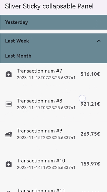
A Sliver implementation of sticky collapsable panel, with a box header rebuild on status and a sliver child as panel content.
121Likes 2.5K30-day downloads160Pub points
AndroidiOSWebmacOSWindowsLinux
A Sliver implementation of panel with a sticky collapsable header and a sliver as child.
English project snapshot. Visit GitHub for the latest content.




A Sliver implementation of sticky collapsable panel, with a box header rebuild on status and a sliver child as panel content.
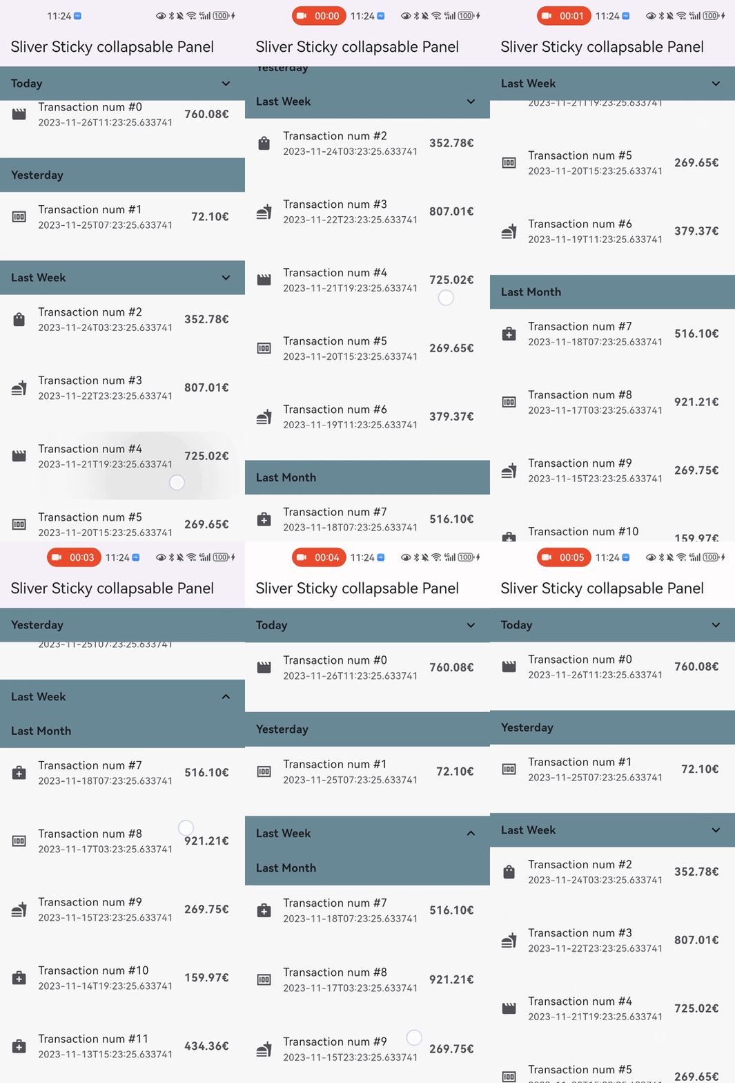
sticky: false parameter).disableCollapsable = true parameter in panelController).iOSStyleSticky = true parameter).paddingBeforeCollapse parameter).paddingAfterCollapse parameter).In the pubspec.yaml of your flutter project, add the following dependency:
dependencies:
  sliver_sticky_collapsable_panel: ^5.0.1
In your library add the following import:
import 'package:sliver_sticky_collapsable_panel/sliver_sticky_collapsable_panel.dart';
In your code, use the sliver like this:
CustomScrollView(
  controller: _scrollController,
  slivers: [
    SliverStickyCollapsablePanel(
      scrollController: _scrollController,
      panelController: StickyCollapsablePanelController(key:'key_1'),
      headerBuilder: (context, status) => SizedBox.fromSize(size: Size.fromHeight(48)),
      sliverPanel: SliverList.list(children: [...]),
    ),
    SliverStickyCollapsablePanel(
      scrollController: _scrollController,
      panelController: StickyCollapsablePanelController(key:'key_2'),
      headerBuilder: (context, status) => SizedBox.fromSize(size: Size.fromHeight(48)),
      sliverPanel: SliverList.list(children: [...]),
    ),
    ...,
  ],
);
For simple right side header arrow hint ^, you can build with widget in flutter framework like AnimatedRotation:
SliverStickyCollapsablePanel(
  scrollController: _scrollController,
  panelController: StickyCollapsablePanelController(key:'key_1'),
  headerBuilder: (context, status) => Container(
    width: double.infinity,
    height: 48,
    child: Stack(
      children: [
        Text("your title, or any other box widget you like"),
        Align(
          alignment: Alignment.centerRight,
          child: AnimatedRotation(
            duration: const Duration(milliseconds: 0),
            turns: status.isExpanded ? 0 : 0.5,
            child: const Icon(Icons.expand_more),
          ),
        ),
      ],
    ),
  ),
  sliverPanel: SliverList.list(children: [...]),
),
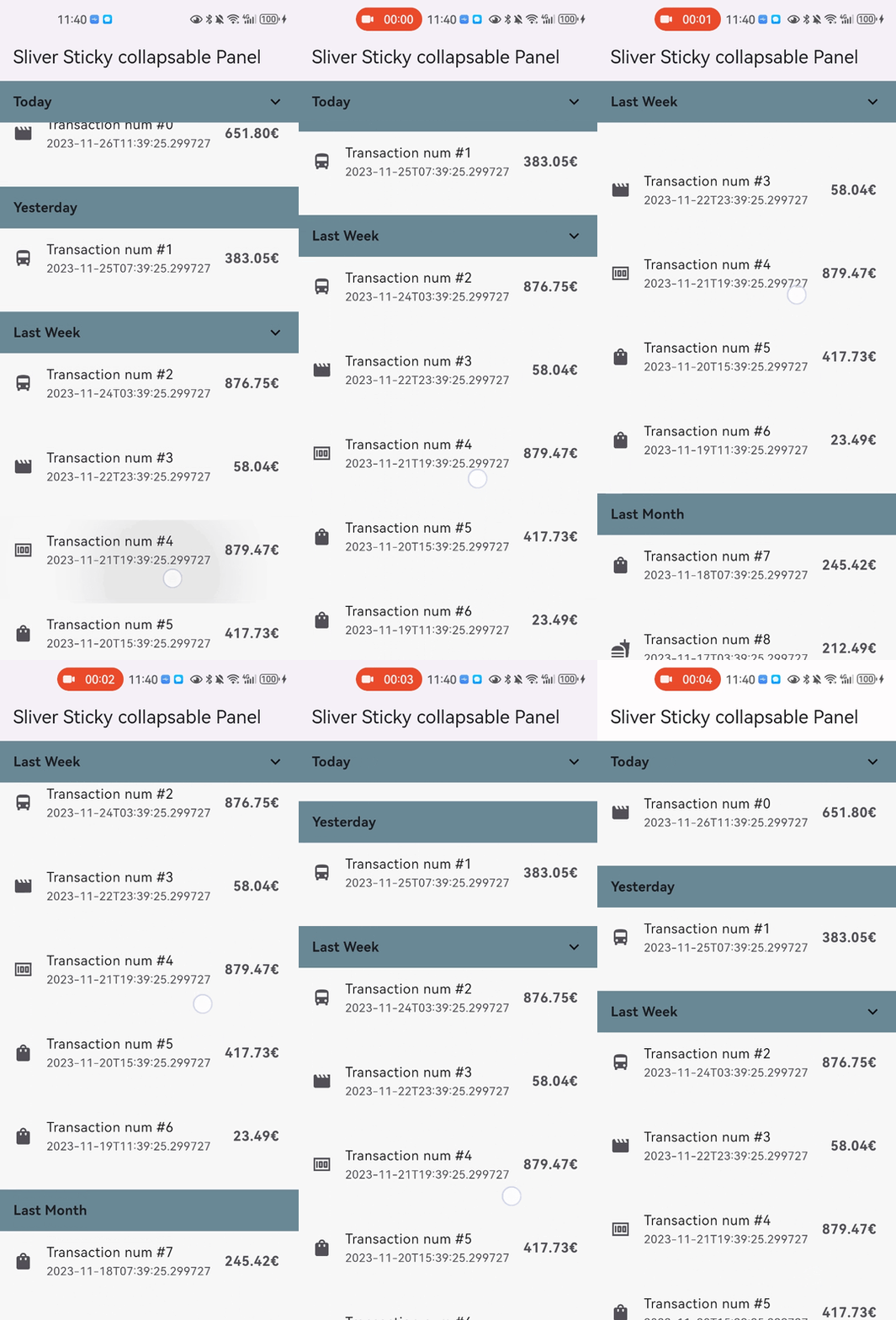
disableCollapsable = true.CustomScrollView(
controller: _scrollController,
slivers: [
SliverStickyCollapsablePanel(
scrollController: _scrollController,
panelController: StickyCollapsablePanelController(key:'key_1',disableCollapsable: true),
headerBuilder: (context, status) => SizedBox.fromSize(size: Size.fromHeight(48)),
sliverPanel: SliverList.list(children: [...]),
),
...,
],
);
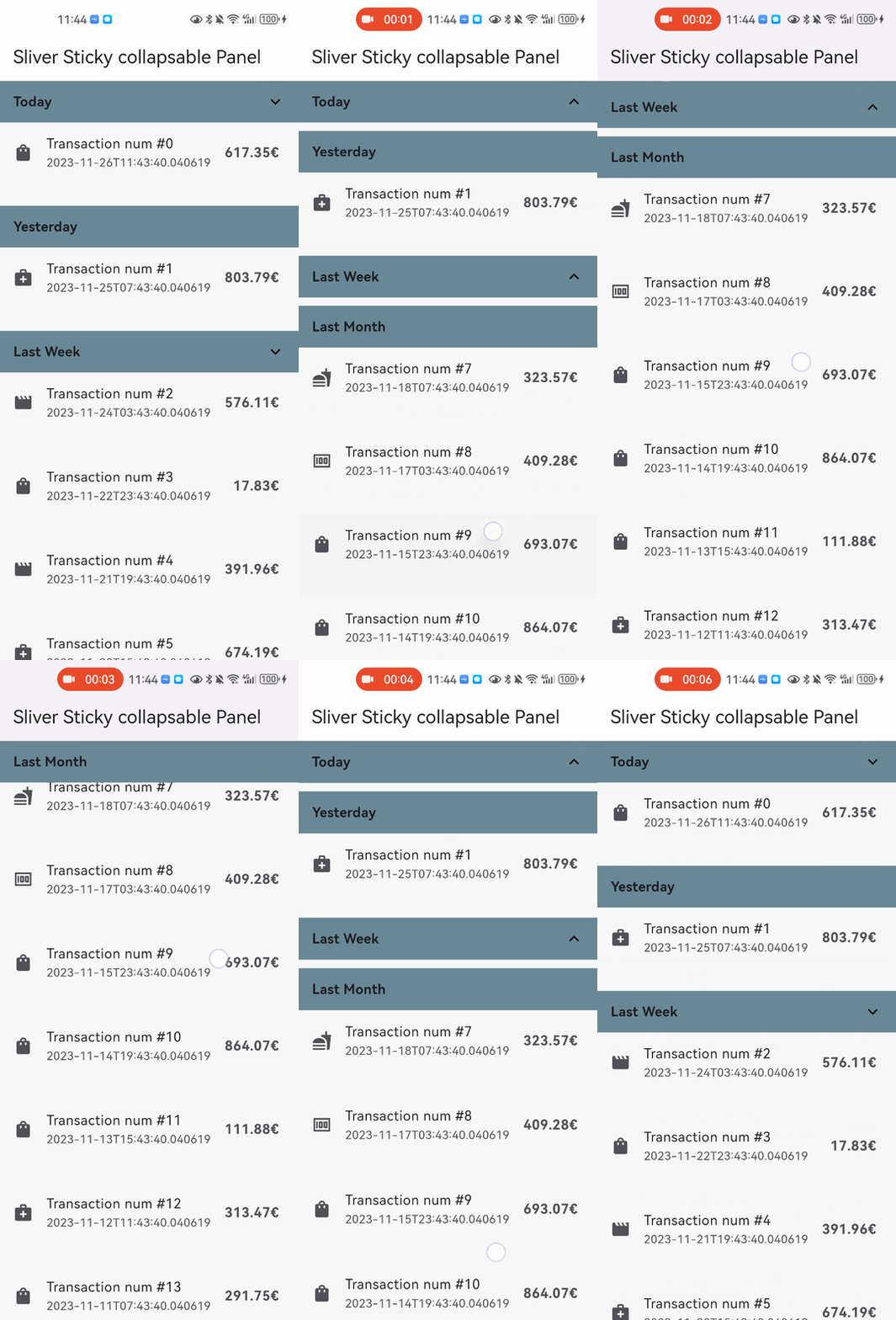
iOSStyleSticky = true.CustomScrollView(
controller: _scrollController,
slivers: [
SliverStickyCollapsablePanel(
scrollController: _scrollController,
panelController: StickyCollapsablePanelController(key:'key_1'),
iOSStyleSticky: true,
headerBuilder: (context, status) => SizedBox.fromSize(size: Size.fromHeight(48)),
sliverPanel: SliverList.list(children: [...]),
),
...,
],
);
paddingBeforeCollapse), even if the panel is collapsed, the padding still work between headers with paddingAfterCollapse.CustomScrollView(
controller: _scrollController,
slivers: [
SliverStickyCollapsablePanel(
scrollController: _scrollController,
panelController: StickyCollapsablePanelController(key:'key_1'),
paddingBeforeCollapse: const EdgeInsets.all(16),
paddingAfterCollapse: const EdgeInsets.only(bottom: 10),
headerBuilder: (context, status) => SizedBox.fromSize(size: Size.fromHeight(48)),
sliverPanel: SliverList.list(children: [...]),
),
...,
],
);
panelAnimationDurationCustomScrollView(
controller: _scrollController,
slivers: [
SliverStickyCollapsablePanel(
scrollController: _scrollController,
panelController: StickyCollapsablePanelController(key:'key_1'),
panelAnimationDuration: Duration(milliseconds: 300),
paddingBeforeCollapse: const EdgeInsets.all(16),
paddingAfterCollapse: const EdgeInsets.only(bottom: 10),
headerBuilder: (context, status) => SizedBox.fromSize(size: Size.fromHeight(48)),
sliverPanel: SliverList.list(children: [...]),
),
...,
],
);
headerSize to speed up the layout process when the size not change
CustomScrollView(
  controller: _scrollController,
  slivers: [
    SliverStickyCollapsablePanel(
      scrollController: _scrollController,
      panelController: StickyCollapsablePanelController(key:'key_1'),
      iOSStyleSticky: true,
      headerBuilder: (context, status) => SizedBox.fromSize(size: Size.fromHeight(48)),
      headerSize: Size(MediaQuery.of(context).size.width, 48),
      sliverPanel: SliverList.list(children: [...]),
    ),
    ...,
  ],
);

Dependency list 3 items
{"sdk":"flutter"}{"sdk":"flutter"}^6.0.0Start with your use case, compare repository activity, and check the original project before adopting it.
“A repository is the most basic element of GitHub.”
GitHub Docs — About repositories ↗