Package selection guidance compiled from public package information, community data, and project usage.
A Sliver-based widget that implements a sticky, collapsible panel with dynamic header rebuilding based on scroll state. It features a customizable box header that updates as the panel expands or collapses, and accepts a sliver child for the panel content. Designed for efficient scrolling in complex lists, it integrates seamlessly into CustomScrollView layouts across multiple platforms.
Use cases
Scrolling lists with interactive headers
Dynamic header states during scroll
Complex UIs requiring sticky panels
Content sections that expand/collapse
Customizable scroll-driven interactions
Key features
Sticky panel behavior
Header rebuild on scroll status
Sliver-compatible layout
Collapsible content section
Platform-agnostic implementation
Suitable for
Developers building scrollable interfaces
Apps needing responsive headers
CustomScrollView integrations
Cross-platform mobile and web apps
UIs with layered scrollable content
Considerations
Requires integration within CustomScrollView
Limited to sliver-based layouts
Header logic may need custom tuning
Performance depends on child complexity
Not suitable for non-scrolling contexts
Original README
Original README snapshot from the linked source repository. Visit the repository for the latest content.
sliver_sticky_collapsable_panel
A Sliver implementation of sticky collapsable panel, with a box header rebuild on status and a sliver child as panel content.
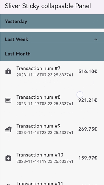
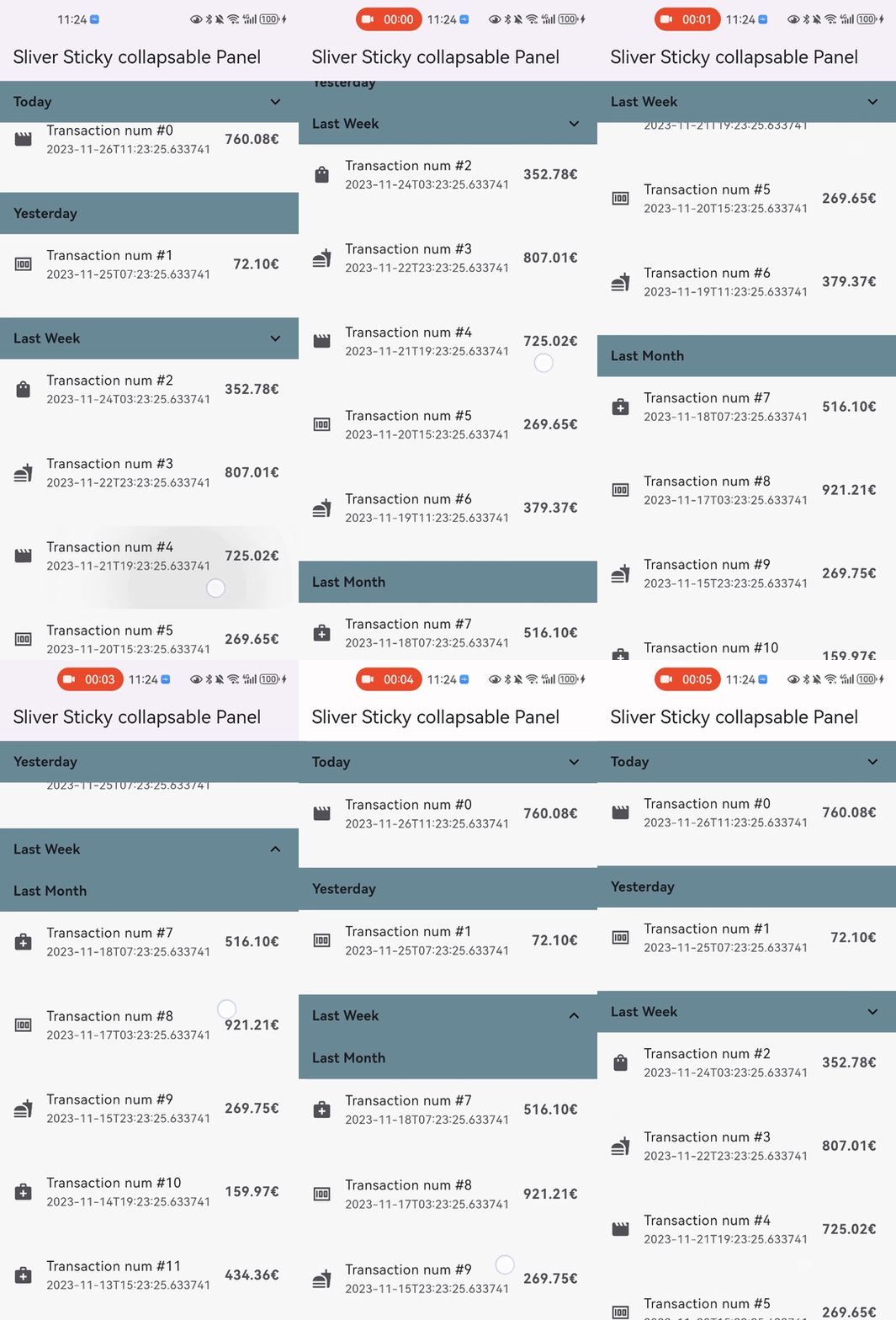
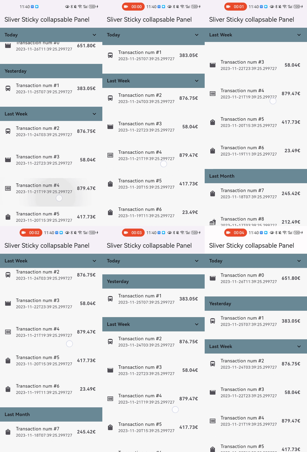
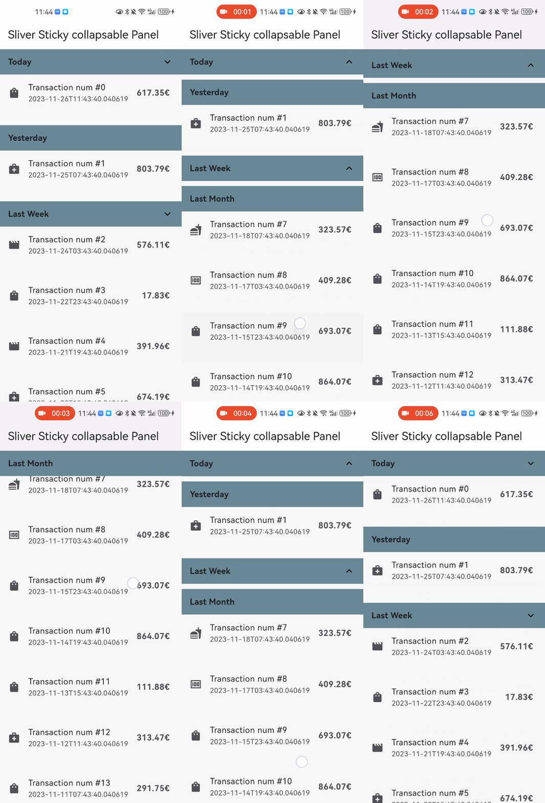
Snap Shot
Features
Relying solely on the Flutter framework itself, no any other dependencies.
Pure Dart implementation, running on any platform who supports Flutter.
Command style support for expand/collpase the panel.(it's still compatible with declarative style)
Accept one box child as header and one sliver child as panel content.
Header can overlap panel content (useful for sticky side header for example).
Notify and rebuild the header when status changed (scroll outside the viewport for example).
Support not sticky headers (with sticky: false parameter).
Support a controller which notifies the scroll offset of the current sticky header.
Support click the header to collapse the panel, or disable collapse (with disableCollapsable = true parameter in panelController).
Support iOS style sticky header, just like iOS's system contact app (with iOSStyleSticky = true parameter).
Support add padding for sliver child (with paddingBeforeCollapse parameter).
Support add padding after the header even the panel collapsed (with paddingAfterCollapse parameter).
Getting started
In the pubspec.yaml of your flutter project, add the following dependency:
You can add padding for sliver child (with paddingBeforeCollapse), even if the panel is collapsed, the padding still work between headers with paddingAfterCollapse.