
 v2.0.1
swipeable_tile
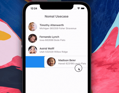
A package to dismiss with animated background. Also Swipe to tigger action without dismiss.
214Likes 2.9K30-day downloads150Pub points
AndroidiOSWebmacOSWindowsLinux
Animated background and swipe to tigger action

{"sdk":"flutter"}{"sdk":"flutter"}^1.0.4English project snapshot. Visit GitHub for the latest content.
Loading Animation Widget
The package is fork of Dismissible. Without any vertical, up and down swipe.
https://raw.githubusercontent.com/watery-desert/assets/main/swipeable_tile/dismissible_issue1.png https://raw.githubusercontent.com/watery-desert/assets/main/swipeable_tile/dismissible_issue2.png
https://raw.githubusercontent.com/watery-desert/assets/main/swipeable_tile/dismissible_issue3.png https://raw.githubusercontent.com/watery-desert/assets/main/swipeable_tile/dismissible_issue4.png
It's not possible to animated the background while swiping.
Swipe to trigger action function. Similar to telegram or instagram DM message reply.
Add swipeable_tile to your pubspec.yaml dependencies then run flutter pub get
dependencies:
  swipeable_tile:
Add this line to import the package.
import 'package:swipeable_tile/swipeable_tile.dart';
setState() from backgroundBuilder.Scaffold's (or whatever background widget you are using) backgroundColor and SwipeableTile or SwipeableTile.swipeToTrigger's color same.SwipeableTile When the tile is swiped there will be an elevation (remove elevation by setting isElevated to false) and rounded corner to the tile (set borderRadius to 0 if you don't want rounded corner).SwipeableTile(
color: Colors.white,
swipeThreshold: 0.2,
direction: SwipeDirection.horizontal,
onSwiped: (direction) {// Here call setState to update state
},
backgroundBuilder: (context, direction, progress) {
if (direction == SwipeDirection.endToStart) {
// return your widget
} else if (direction == SwipeDirection.startToEnd) {
// return your widget
}
return Container();
},
key: UniqueKey(),
child: // Here Tile which will be shown at the top
),
SwipeableTile.card This will make the tile look like card with constant rounded corner, unlike SwipeableTile. You also have to set the padding which will wrap around the tile as well background.SwipeableTile.card(
color: Color(0xFFab9ee8),
shadow: BoxShadow(
color: Colors.black.withOpacity(0.35),
blurRadius: 4,
offset: Offset(2, 2),
),
horizontalPadding: 16,
verticalPadding: 8,
direction: SwipeDirection.horizontal,
onSwiped: (direction) {
// Here call setState to update state
},
backgroundBuilder: (context, direction, progress) {
// You can animate background using the progress
return AnimatedBuilder(
animation: progress,
builder: (context, child) {
return AnimatedContainer(
duration: const Duration(milliseconds: 400),
color: progress.value > 0.4
? Color(0xFFed7474)
: Color(0xFFeded98),
);
},
);
},
key: UniqueKey(),
child: Padding(
padding: const EdgeInsets.symmetric(vertical: 4.0),
child: // Here Tile which will be shown at the top
),
),
SwipeableTile.swipeToTrigger This is exactly the same as SwipeableTile but instead of dismiss it, it will trigger an action. The tile will return back to initial position when maximum drag reaches swipeThreshold
SwipeableTile.swipeToTriggerCard This is exactly the same as SwipeableTile.card but instead of dismiss it, it will trigger an action. The tile will return back to initial position when maximum drag reaches swipeThreshold
You can build the background dynamically and animate them using backgroundBuilder. Use direction parameter to check swipe direction and show different widget.
backgroundBuilder: (context, direction, progress) {
   if (direction == SwipeDirection.endToStart) {
       return Container(color: Colors.red);
   } else if (direction == SwipeDirection.startToEnd) {
       return Container(color: Colors.blue);
   }
   return Container();
},
The progress is basically the same animation controller responsible for tile slide animation. You can use this controller to animate the background.
To trigger vibration you have to check when tile is dragged certain animation controller value. And I used vibration package for vibration and worked batter than HapticFeedback
backgroundBuilder: (context, direction, progress) {
    bool vibrated = false;
    return AnimatedBuilder(
        animation: progress,
        builder: (context, child) {
        if (progress.value > 0.2 && !vibrated) {
            Vibration.vibrate(duration: 40);
            vibrated = true;
        } else if (progress.value < 0.2) {
            vibrated = false;
        }
    // return your background
        },
    );
},
swipeThreshold defines how far you can drag and will consider as dismiss. In case of swipe to trigger this will define maximun drag limit.
It's possible to do from backgroundBuilder using progress parameter but to select exact message (or tile) requires calling setState() which is not possible from backgroundBuilder however you can call setState() from onSwiped callback which will invoke when the tile return to initial position.
Vibrate & animate the icon when it's dragged maximum by checking progress.isCompleted or you can check animation value. Then call setState() from onSwiped User will not notice unless you set movementDuration to longer time and swipeThreshold to 0.4 (which is default). Check the example app how it's implemented.
● Sliding Clipped Nav Bar
● Water Drop Nav Bar
➜ Swipeable Tile
● Loading Animation Widget