Package selection guidance compiled from public package information, community data, and project usage.
SwipeableTile is a Flutter package that enables animated dismissal of tiles with customizable background effects. It supports swipe-to-dismiss gestures as well as swipe-to-trigger actions without dismissing the tile. Ideal for implementing interactive list items with visual feedback, it works across all major platforms including Android, iOS, Web, macOS, Windows, and Linux. The package enhances user experience by providing smooth animations and flexible gesture handling for list-based interfaces.
Use cases
Implementing swipe-to-dismiss functionality in lists
Creating interactive list items with action triggers
Building intuitive UIs for task management apps
Adding animated feedback to list item interactions
Designing responsive card-based layouts
Enhancing user engagement with swipe gestures
Key features
Animated background during swipe
Support for both dismiss and action-trigger swipes
Cross-platform compatibility
Customizable swipe thresholds
Smooth animation transitions
Flexible configuration for swipe behavior
Suitable for
Developers building interactive list interfaces
Apps requiring swipe-based interactions
UI designers focused on gesture-driven experiences
Projects targeting multiple platforms
Teams wanting lightweight gesture solutions
Mobile-first applications with rich touch feedback
Considerations
May require additional styling for complex backgrounds
Performance impact with large lists
Limited built-in customization for animation curves
Not optimized for very high-frequency swipe events
Requires careful handling of state during swipe actions
Best suited for moderate-sized lists to maintain responsiveness
Original README
Original README snapshot from the linked source repository. Visit the repository for the latest content.
Features
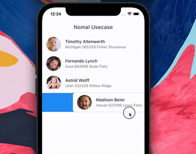
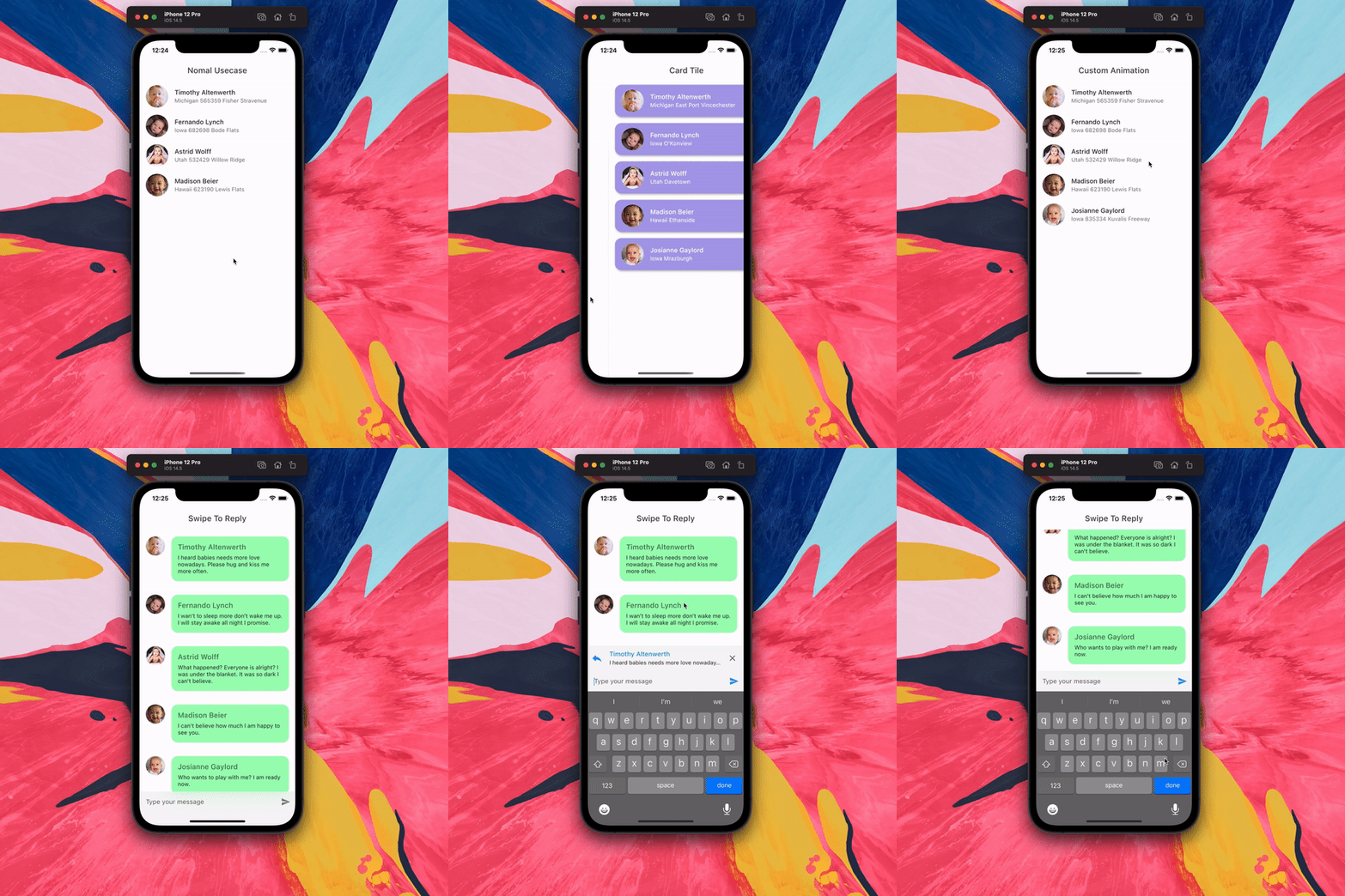
Animated tile and backgound while swiping. Add padding to tile. Swipe to trigger action.
The package is fork of Dismissible. Without any vertical, up and down swipe.
Problems with dismissible
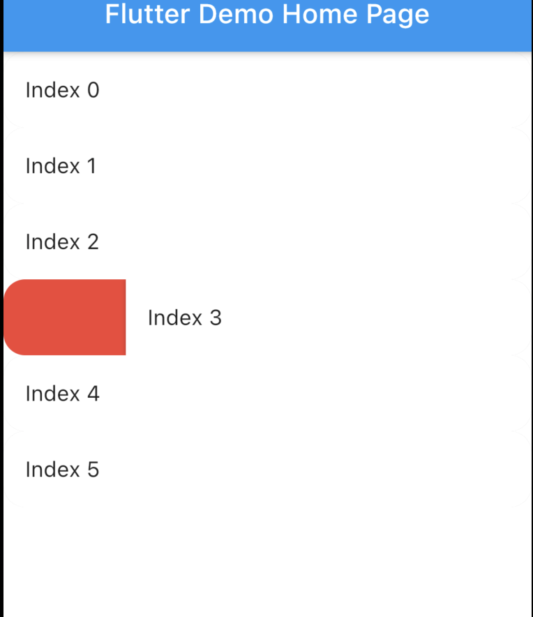
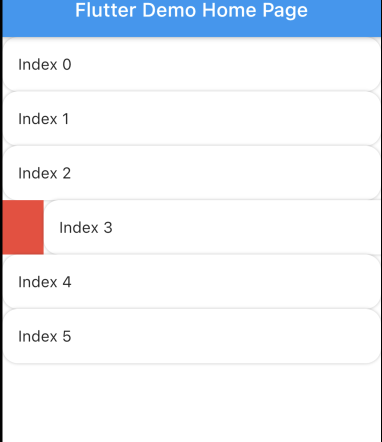
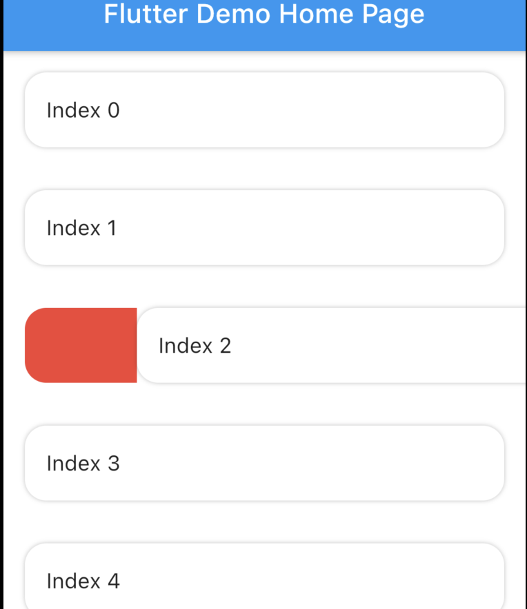
Dismissible doesn't allow animated rounded corner and elevation similar to google Gmail, Telegram, Messages (these are android apps) if you swipe you will notice. Here is the result with Dismissible.
Dismissible can't make rounded Card there is always some UI issue. Here is the result with Dismissible.
It's not possible to animated the background while swiping.
Swipe to trigger action function. Similar to telegram or instagram DM message reply.
How to use?
Installation
Add swipeable_tile to your pubspec.yaml dependencies then run flutter pub get
Set the Scaffold's (or whatever background widget you are using) backgroundColor and SwipeableTile or SwipeableTile.swipeToTrigger's color same.
There are four named constructors:
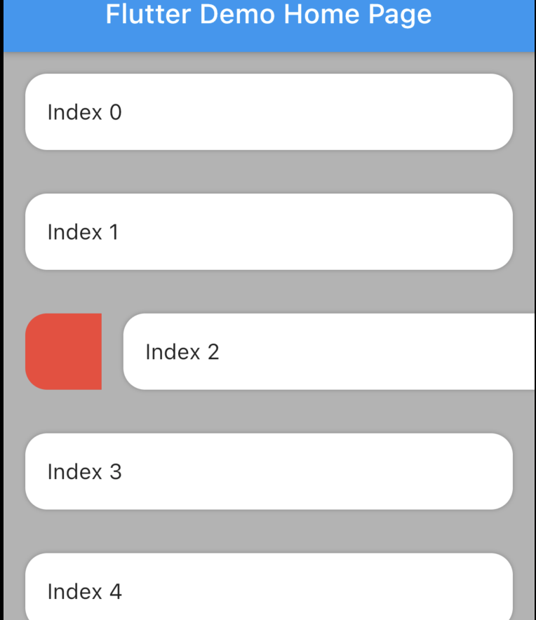
SwipeableTile When the tile is swiped there will be an elevation (remove elevation by setting isElevated to false) and rounded corner to the tile (set borderRadius to 0 if you don't want rounded corner).
SwipeableTile(
color: Colors.white,
swipeThreshold: 0.2,
direction: SwipeDirection.horizontal,
onSwiped: (direction) {// Here call setState to update state
},
backgroundBuilder: (context, direction, progress) {
if (direction == SwipeDirection.endToStart) {
// return your widget
} elseif (direction == SwipeDirection.startToEnd) {
// return your widget
}
returnContainer();
},
key: UniqueKey(),
child: // Here Tile which will be shown at the top
),
SwipeableTile.card This will make the tile look like card with constant rounded corner, unlike SwipeableTile. You also have to set the padding which will wrap around the tile as well background.
SwipeableTile.card(
color: Color(0xFFab9ee8),
shadow: BoxShadow(
color: Colors.black.withOpacity(0.35),
blurRadius: 4,
offset: Offset(2, 2),
),
horizontalPadding: 16,
verticalPadding: 8,
direction: SwipeDirection.horizontal,
onSwiped: (direction) {
// Here call setState to update state
},
backgroundBuilder: (context, direction, progress) {
// You can animate background using the progressreturnAnimatedBuilder(
animation: progress,
builder: (context, child) {
returnAnimatedContainer(
duration: constDuration(milliseconds: 400),
color: progress.value > 0.4
? Color(0xFFed7474)
: Color(0xFFeded98),
);
},
);
},
key: UniqueKey(),
child: Padding(
padding: constEdgeInsets.symmetric(vertical: 4.0),
child: // Here Tile which will be shown at the top
),
),
SwipeableTile.swipeToTrigger This is exactly the same as SwipeableTile but instead of dismiss it, it will trigger an action. The tile will return back to initial position when maximum drag reaches swipeThreshold
SwipeableTile.swipeToTriggerCard This is exactly the same as SwipeableTile.card but instead of dismiss it, it will trigger an action. The tile will return back to initial position when maximum drag reaches swipeThreshold
You can build the background dynamically and animate them using backgroundBuilder. Use direction parameter to check swipe direction and show different widget.
The progress is basically the same animation controller responsible for tile slide animation. You can use this controller to animate the background.
To trigger vibration you have to check when tile is dragged certain animation controller value. And I used vibration package for vibration and worked batter than HapticFeedback
swipeThreshold defines how far you can drag and will consider as dismiss. In case of swipe to trigger this will define maximun drag limit.
How to swipe to trigger action?
It's possible to do from backgroundBuilder using progress parameter but to select exact message (or tile) requires calling setState() which is not possible from backgroundBuilder however you can call setState() from onSwiped callback which will invoke when the tile return to initial position.
Vibrate & animate the icon when it's dragged maximum by checking progress.isCompleted or you can check animation value. Then call setState() from onSwiped User will not notice unless you set movementDuration to longer time and swipeThreshold to 0.4 (which is default). Check the example app how it's implemented.