
 v0.1.3
user_profile_avatar
A simple widget that display round profile picture and display native circular progress indicator whilst image is being fetched.
37Likes 4630-day downloads140Pub points
AndroidiOSmacOSWindowsLinux
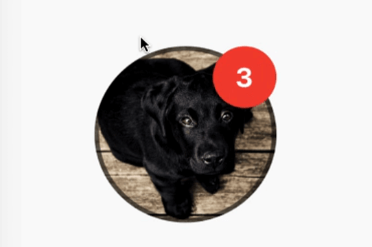
A simple widget that display round profile picture where the picture is fetched from network and displays circular progress indicator whilst the image is being loaded. Also, has the ability to display notification bubble.

{"sdk":"flutter"}^3.4.0{"sdk":"flutter"}English project snapshot. Visit GitHub for the latest content.
A simple widget that display round profile picture where the picture is fetched from network and displays circular progress indicator whilst the image is being loaded. Also, has the ability to display notification bubble.
https://raw.githubusercontent.com/zeshanghayoomi/flutter_user_profile_avatar/master/repo_assets/simulator.gif
UserProfileAvatar(
        avatarUrl: 'https://picsum.photos/id/237/5000/5000',
        onAvatarTap: () {
          print('Avatar Tapped..');
        },
        notificationCount: 10,
        notificationBubbleTextStyle: TextStyle(
          fontSize: 30,
          color: Colors.white,
          fontWeight: FontWeight.bold,
        ),
        avatarSplashColor: Colors.purple,
        radius: 100,
        isActivityIndicatorSmall: false,
        avatarBorderData: AvatarBorderData(
          borderColor: Colors.white,
          borderWidth: 5.0,
        ),
      )
onAvatarTap
Use this to perform any action when the avatar gets tapped.
notificationCount
Pass an int to display the notification bubble. 99+ gets displayed if notification count was larger than 100.
notificationBubbleTextStyle
Used to style the notification count, if null then the default one will be applied.
avatarSplashColor
Splash color when user taps on the avatar.
radius
Use this to size the avatar.
isActivityIndicatorSmall
use this to display small/large circular progress indicator (native) when image is loading, default is true.