Search packages, repositories and app categories

user_profile_avatar cover
Package detailsv0.1.3

user_profile_avatar

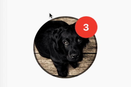
A simple widget that display round profile picture and display native circular progress indicator whilst image is being fetched.

AndroidiOSmacOSWindowsLinux
30-day downloads
77
Likes
37
Pub points
140

Install package

flutter pub add user_profile_avatar

Package Overview

Package selection guidance compiled from public package information, community data, and project usage.

A Flutter widget designed to display a circular profile picture with a native-looking circular progress indicator during image loading. It simplifies the implementation of user avatars in apps by handling image fetching and visual feedback seamlessly. The widget ensures consistent appearance across platforms, supporting Android, iOS, macOS, Windows, and Linux. Ideal for chat interfaces, user profiles, and any UI requiring round avatars with smooth loading states.

Use cases

  • User profile displays
  • Chat interfaces
  • Social media app avatars
  • Authentication screens
  • Dashboard user cards

Key features

  • Circular profile image rendering
  • Native circular progress indicator
  • Cross-platform compatibility
  • Simple API integration
  • Automatic image loading state management

Suitable for

  • Developers building chat apps
  • UI designers needing clean avatars
  • Apps with user authentication
  • Cross-platform mobile and desktop apps
  • Projects requiring minimal boilerplate for profile images

Considerations

  • Requires internet access for remote images
  • Limited customization beyond basic styling
  • Depends on external image loading logic
  • Not suitable for non-circular avatar designs
  • May need additional caching for performance in high-traffic apps

Original README

Original README snapshot from the linked source repository. Visit the repository for the latest content.

Flutter User Profile Avatar

A simple widget that display round profile picture where the picture is fetched from network and displays circular progress indicator whilst the image is being loaded. Also, has the ability to display notification bubble.


How to use


UserProfileAvatar(
        avatarUrl: 'https://picsum.photos/id/237/5000/5000',
        onAvatarTap: () {
          print('Avatar Tapped..');
        },
        notificationCount: 10,
        notificationBubbleTextStyle: TextStyle(
          fontSize: 30,
          color: Colors.white,
          fontWeight: FontWeight.bold,
        ),
        avatarSplashColor: Colors.purple,
        radius: 100,
        isActivityIndicatorSmall: false,
        avatarBorderData: AvatarBorderData(
          borderColor: Colors.white,
          borderWidth: 5.0,
        ),
      )

Properties

  • avatarUrl
    The url for the image, if this set to null or empty then an empty user avatar gets displayed by default.


  • onAvatarTap
    Use this to perform any action when the avatar gets tapped.

  • notificationCount
    Pass an int to display the notification bubble. 99+ gets displayed if notification count was larger than 100.

  • notificationBubbleTextStyle
    Used to style the notification count, if null then the default one will be applied.

  • avatarSplashColor
    Splash color when user taps on the avatar.

  • radius
    Use this to size the avatar.

    • minimum default radius is 15
    • maximum default radius is 150
  • isActivityIndicatorSmall
    use this to display small/large circular progress indicator (native) when image is loading, default is true.


  • avatarBorderData
    Use this to apply border width and color of the avatar.

Categories

Dependencies

Dependency list 1 items

Source repository

Projects using this package

No data available yet.