
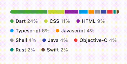
Overview
A Flutter package that provides an unofficial implementation of the progress bar component from GitHub's Primer Design System. It offers a clean, modern UI consistent with Primer's visual language, suitable for displaying task completion or loading states across multiple platforms. The progress bar supports customizable colors, animations, and smooth transitions, making it ideal for applications aiming to align with GitHub’s design aesthetics. Built with Flutter’s widget system, it integrates seamlessly into existing projects.
Use cases
- Displaying task completion in apps
- Visualizing loading progress
- Enhancing UI consistency with GitHub-style design
- Showing file upload/download progress
- Creating intuitive user feedback for long-running operations
Key features
- GitHub Primer Design System compliance
- Customizable color schemes
- Smooth animation transitions
- Cross-platform support (Android, iOS, Web, macOS, Windows, Linux)
- Lightweight and easy to integrate
Suitable for
- Developers building GitHub-integrated tools
- UI-focused Flutter applications
- Projects requiring consistent design language
- Teams using Primer design system components
- Apps needing elegant progress visualization
Considerations
- Unofficial implementation (may not reflect latest Primer updates)
- Limited customization beyond basic styling
- Requires manual updates for major Primer changes
- Not maintained by GitHub directly
- Depends on external repository for bug fixes and enhancements