
 v1.1.0
sliding_switch
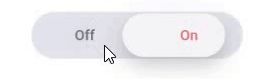
滑动开关 - 一个简单的开关小部件。它可以完全自定义宽度、颜色、文本等。它还保持选中状态。
33喜欢 472近 30 天下载130Pub 分数
AndroidiOSWebmacOSWindowsLinux
CodeAppRun/sliding_switch open-source repository details.

{"sdk":"flutter"}{"sdk":"flutter"}以下为英文项目原文快照,最新内容请访问 GitHub。
Sliding Switch - A simple switch widget. It can be fully customized with desired width, colors, text etc. It also maintains selection state.
In the pubspec.yaml of your flutter project, add the following dependency:
dependencies:
  ...
  sliding_switch: "latest"
Import it:
import 'package:sliding_switch/sliding_switch.dart';
SlidingSwitch(
 value: false,
 width: 250,
 onChanged: (bool value) {
   print(value);
 },
)
sliding switch
SlidingSwitch(
 value: false,
 width: 250,
 onChanged: (bool value) {
   print(value);
 },
 height : 55,
 animationDuration : const Duration(milliseconds: 400),
 onTap:(){},
 onDoubleTap:(){},
 onSwipe:(){},
 textOff : "Female",
 textOn : "Male",
 iconOff: Icons.human-female,
 iconOn: Icons.human-male,
 contentSize: 17,
 colorOn : const Color(0xffdc6c73),
 colorOff : const Color(0xff6682c0),
 background : const Color(0xffe4e5eb),
 buttonColor : const Color(0xfff7f5f7),
 inactiveColor : const Color(0xff636f7b),
),
If iconOn or iconOff are not null, they will be displayed in lieu of the respective textOn and textOff. The values for textOn and textOff are used as semantic labels for the icons for accessibility. The icons in the example are not in the default material icon set, but are from [Material Design Icons] (https://materialdesignicons.com/), available on pub.dev here.
contentSize drives the height of the text or icons.
Licensed Under the MIT License.