
 v2.0.0
swipable_stack
一个用于堆叠卡片的组件,用户可以像 Tinder 一样水平和垂直滑动,并带有精美的动画效果。
325喜欢 4530近 30 天下载150Pub 分数
AndroidiOSWebmacOSWindowsLinux
一个用于堆叠卡片的控件,用户可以通过水平和垂直滑动来操作,具有类似 Tinder 的精美动画效果。

{"sdk":"flutter"}^3.0.0{"sdk":"flutter"}—以下为英文项目原文快照,最新内容请访问 GitHub。
pub.dev github likes popularity pub points license
A widget for stacking cards, which users can swipe horizontally and vertically with beautiful animations like Tinder UI.
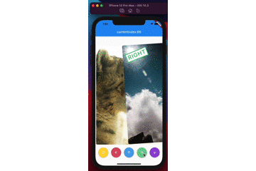
demo
(Sorry, the package name swipable_stack is typo of swipeable stack)
builderA SwipableStack uses a builder to display widgets.
SwipableStack(
  builder: (context, properties) {
    return Image.asset(imagePath);
  },
),
onSwipeCompletedYou can get completion event with onSwipeCompleted.
SwipableStack(
  onSwipeCompleted: (index, direction) {
    print('$index, $direction');
  },
)
overlayBuilderYou can show overlay on the front card with overlayBuilder.
SwipableStack(
  overlayBuilder: (context, properties) {
    final opacity = min(properties.swipeProgress, 1.0);
    final isRight = properties.direction == SwipeDirection.right;
    return Opacity(
      opacity: isRight ? opacity : 0,
      child: CardLabel.right(),
    );
  },
)
controllerSwipableStackController allows you to control swipe action & also rewind recent action.
final controller = SwipableStackController();

SwipableStack(
  controller:controller,
  builder: (context, properties) {
    return Image.asset(imagePath);
  },
);
controller.next(
  swipeDirection: SwipeDirection.right,
);
controller.rewind();
SwipableStackController provides to access currentIndex of SwipableStack.
final controller = SwipableStackController();
controller.addListener(() {
  print('${_controller.currentIndex}');
});
onWillMoveNextYou can also restrict user actions according to index or action with onWillMoveNext.
SwipableStack(
  onWillMoveNext: (index, direction) {
    final allowedActions = [
      SwipeDirection.right,
      SwipeDirection.left,
    ];
    return allowedActions.contains(direction);
  },
);
swipeAssistDurationYou can set the speed the user is able to swipe through Widgets with the swipeAssistDuration.
SwipableStack(
  swipeAssistDuration: Duration(milliseconds: 100),
)
The default is 650ms.
stackClipBehaviourYou can set the clipBehaviour of the stack with the stackClipBehaviour.
Change it to Clip.none to exceed the boundaries of parent widget size.
SwipableStack(
  stackClipBehaviour: Clip.none,
)
The default is Clip.hardEdge.
allowVerticalSwipeDisable vertical swipe with allowVerticalSwipe.
Changing to false disable vertical swipe capabilities
SwipableStack(
  allowVerticalSwipe: false,
)
The default is true.
swipeTopAnchorSet the swipe anchor with swipeAnchor with the following enum
SwipeAnchor.top : card rotation on bottom and anchored on top
SwipeAnchor.bottom : card rotation on top and anchored on bottom
SwipableStack(
  swipeAnchor: SwipeAnchor.top,
)
The default is SwipeAnchor.top.