
 v2.0.0
timeline_tile
一个用于帮助您使用 Flutter 构建高度可定制时间线的包。
1920喜欢 4.7万近 30 天下载150Pub 分数
AndroidiOSWebmacOSWindowsLinux
一个用于帮助在 Flutter 中构建可自定义时间线的包。

{"sdk":"flutter"}{"sdk":"flutter"}以下为英文项目原文快照,最新内容请访问 GitHub。
A package to help build customisable timelines in Flutter.
Some use cases:
|
https://raw.githubusercontent.com/JHBitencourt/timeline_tile/master/screenshots/gifs/showcase_timeline.gif
Timeline Showcase |
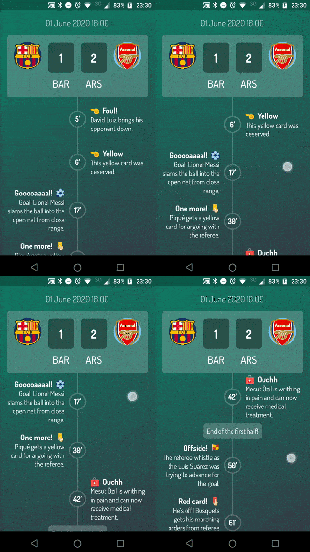
https://raw.githubusercontent.com/JHBitencourt/timeline_tile/master/screenshots/gifs/football_timeline.gif
Football Timeline |
https://raw.githubusercontent.com/JHBitencourt/timeline_tile/master/screenshots/gifs/activity_timeline.gif
Activity Timeline |
|
https://raw.githubusercontent.com/JHBitencourt/timeline_tile/master/screenshots/gifs/success_timeline.gif
Success Timeline |
https://raw.githubusercontent.com/JHBitencourt/timeline_tile/master/screenshots/delivery_timeline.png
Delivery Timeline |
https://raw.githubusercontent.com/JHBitencourt/timeline_tile/master/screenshots/weather_timeline.png
Weather Timeline |
|
https://raw.githubusercontent.com/JHBitencourt/timeline_tile/master/screenshots/gifs/horizontal_timeline.gif
Horizontal Timelines |
A Timeline consists in a group of TimelineTiles. To build a tile you can simply use:
TimelineTile()
Which will build a default tile with a vertical axis, that aligns to the start, with a height of 100:
Simple Timeline
The axis can be switched to render an horizontal tile, aligned to the start, with a default width of 100:
TimelineTile(axis: TimelineAxis.horizontal)
Horizontal Simple Timeline
There are 4 types of alignment.
TimelineAlign.startTimelineAlign.endTimelineAlign.centerTimelineAlign.manualThe start and end alignment allows a child in their opposite sides. On the other hand, both center and manual allows children on both sides. For example, one tile with alignment to the center:
TimelineTile(
  alignment: TimelineAlign.center,
  endChild: Container(
    constraints: const BoxConstraints(
      minHeight: 120,
    ),
    color: Colors.lightGreenAccent,
  ),
  startChild: Container(
    color: Colors.amberAccent,
  ),
);
When providing children to the vertical tile, the height will be as minimum as possible, so you can control it with a height constraint (at least minHeight). This way the tile knows how to size it properly.
Centered Tile
If the axis is horizontal, the things are the opposite. The width will be as minimum as possible, so you can control it with a width constraint (at least minWidth). This way the tile knows how to size it properly.
TimelineTile(
  axis: TimelineAxis.horizontal,
  alignment: TimelineAlign.center,
  endChild: Container(
    constraints: const BoxConstraints(
      minWidth: 120,
    ),
    color: Colors.lightGreenAccent,
  ),
  startChild: Container(
    color: Colors.amberAccent,
  ),
);
Horizontal Centered Tile
With TimelineAlign.manual you can provide the lineXY, which allows you to specify a value from 0.0 to 1.0, that represents a size percentage. For example, aligning at 30% of the width or height:
TimelineTile(
  alignment: TimelineAlign.manual,
  lineXY: 0.3,
  endChild: Container(
    constraints: const BoxConstraints(
      minHeight: 120,
    ),
    color: Colors.lightGreenAccent,
  ),
  startChild: Container(
    color: Colors.amberAccent,
  ),
);
Manual align indicator
TimelineTile(
  axis: TimelineAxis.horizontal,
  alignment: TimelineAlign.manual,
  lineXY: 0.3,
  endChild: Container(
    constraints: const BoxConstraints(
      minWidth: 120,
    ),
    color: Colors.lightGreenAccent,
  ),
  startChild: Container(
    color: Colors.amberAccent,
  ),
);
Horizontal manual align indicator
You can decide if a tile is the first os the last in a timeline. This way you control whether a before or after line must be rendered.
First and last
Horizontal first and last
See the implementation here
You can finally start to combine some tiles to make a Timeline. The flag hasIndicator can control whether an indicator should or shouldn't be rendered.
Timeline
Horizontal timeline
See the implementation here
The default indicator is a circle, and you can customize it as you wish. With IndicatorStyle you can change the color, the X/Y position based on values from 0.0 to 1.0 or give it a padding. You must explicitly provide its width (vertical) or height (horizontal) though.
Custom indicator
Horizontal custom indicator
See the implementation here
With IconStyle you can provide an Icon to be rendered inside the default indicator.
Icon indicator
Horizontal icon indicator
See the implementation here
With the indicator parameter you can customize the tile with your own indicator. However, you must control its size through both width and height parameters.
Custom indicator
Horizontal custom indicator
See the implementation here
With LineStyle you can customize both beforeLine and afterLine.
Custom line
Horizontal custom line
See the implementation here
The TimelineDivider widget allows you to connect tiles that are aligned in different X/Y axis, when combined with TimelineAlign.manual.
Timeline divider
Timeline divider
See the implementation here