搜索插件、代码仓与 APP 分类

timeline_tile 封面
插件详情v2.0.0

timeline_tile

一个用于帮助您使用 Flutter 构建高度可定制时间线的包。

AndroidiOSWebmacOSWindowsLinux
近 30 天下载
6.3万
喜欢数
1920
Pub 分数
150

安装插件

flutter pub add timeline_tile

插件介绍

基于插件公开信息、社区数据与项目使用情况整理的选型参考。

timeline_tile 是一个专为创建高度可定制时间轴而设计的 Flutter 包。它提供了灵活的组件,用于构建垂直或水平时间轴,支持多种样式、颜色和内容布局。开发者可以自定义时间轴指示器、连接线和时间轴项的外观,以匹配其应用的设计。该包轻量且能无缝集成到现有的 Flutter 项目中,非常适合以引人入胜的方式展示事件历史、项目进度或时间序列数据。

适合场景

  • 显示事件历史
  • 显示项目里程碑
  • 可视化逐步过程
  • 创建交互式时间线
  • 展示历史数据
  • 增强入职流程

主要特点

  • 高度可定制的时间线设计
  • 支持垂直和水平布局
  • 可配置的指示器和连接器
  • 灵活的瓷砖内容布局
  • 轻量级且易于集成
  • 可扩展的部件结构

适合对象

  • 开发时间顺序用户界面的开发者
  • 需要视觉进度跟踪的应用程序
  • 教育或入门界面
  • 项目管理工具
  • 内容丰富的应用程序

使用建议

  • 复杂设计需要手动布局配置
  • 有限的内置动画
  • 最适合静态或简单动态时间线
  • 可能需要额外的样式以实现响应式行为
  • 未针对极长的时间线进行优化,需性能调优

原始 README

以下为关联源码仓库的 README 原文快照,最新内容请访问源码仓库。

TimelineTile

A package to help build customisable timelines in Flutter.


Example

Some use cases:


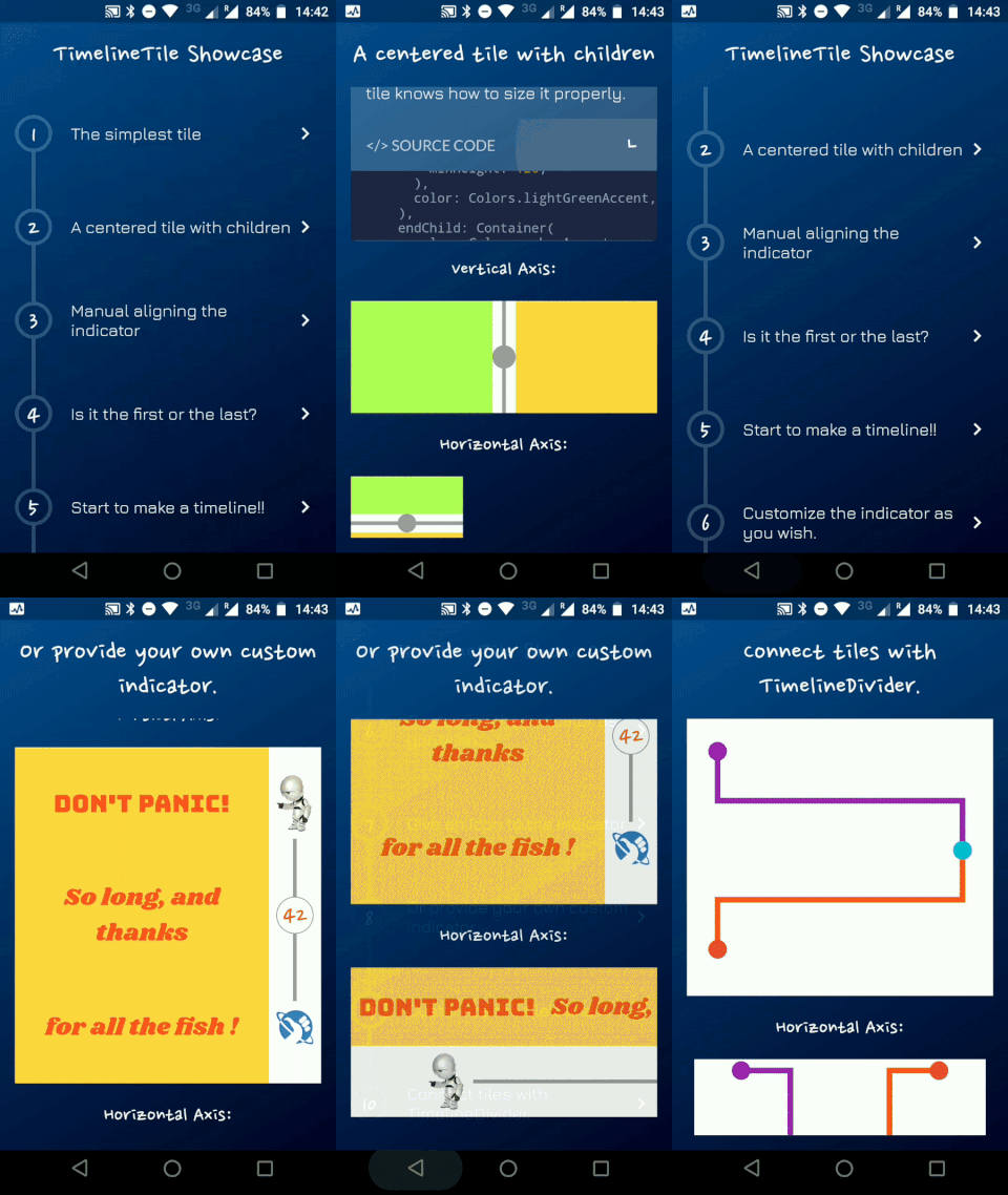
Timeline Showcase

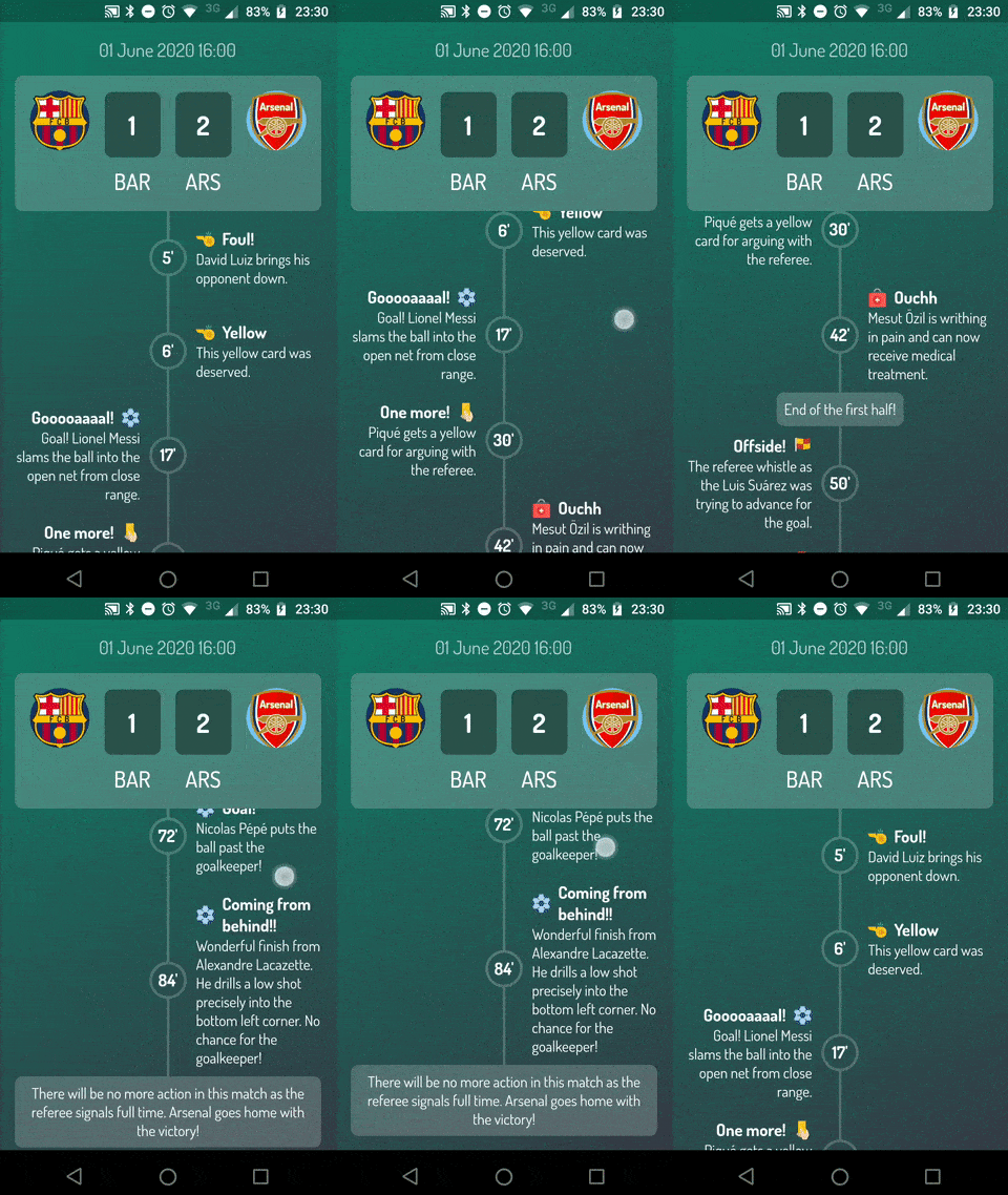
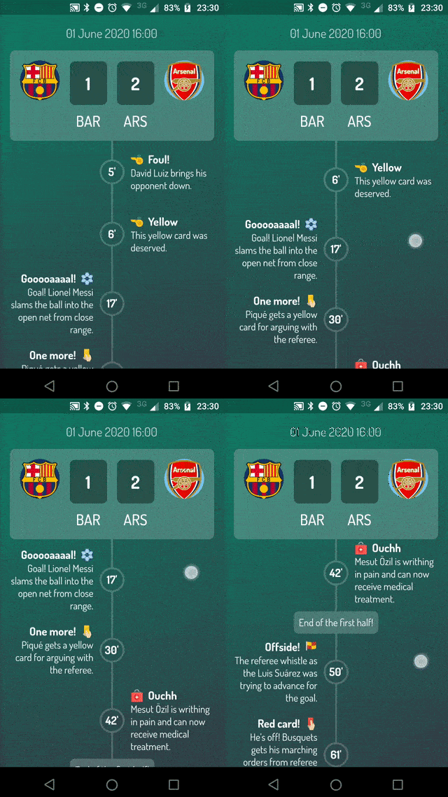
Football Timeline

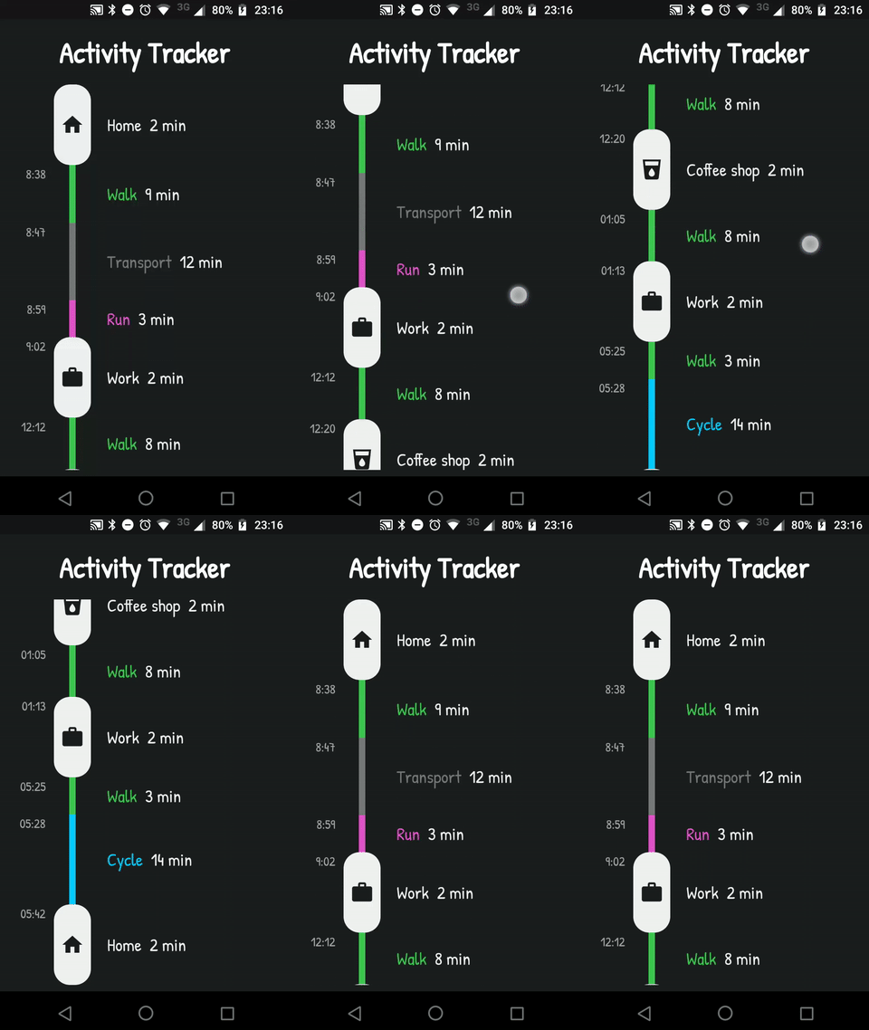
Activity Timeline

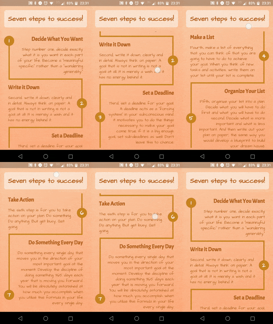
Success Timeline

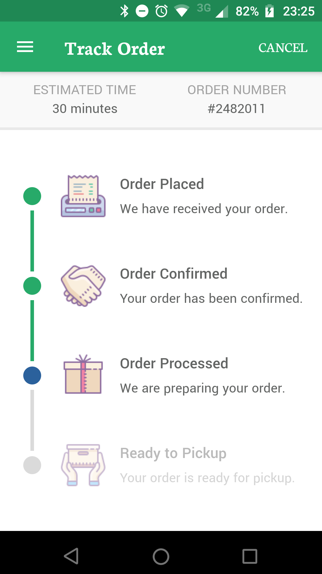
Delivery Timeline

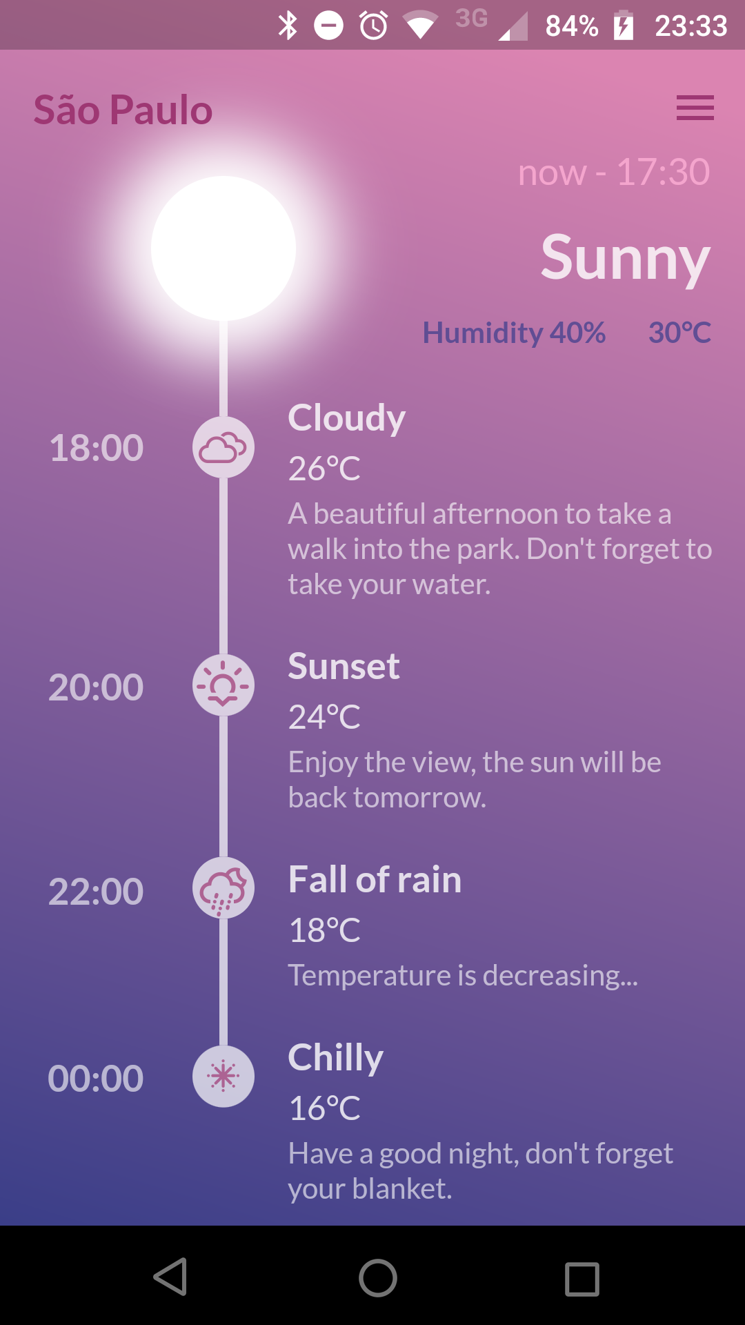
Weather Timeline

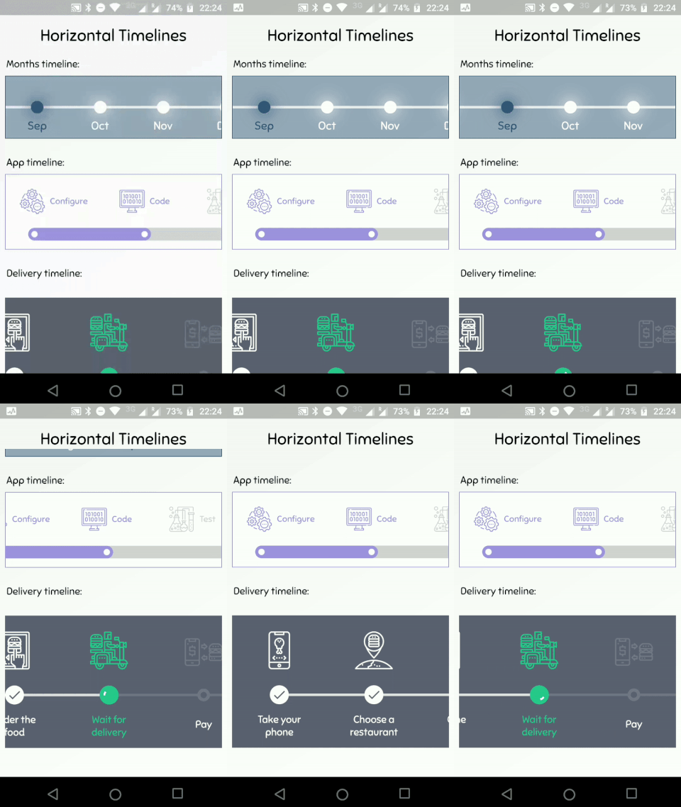
Horizontal Timelines

Getting Started

A Timeline consists in a group of TimelineTiles. To build a tile you can simply use:

TimelineTile()

Which will build a default tile with a vertical axis, that aligns to the start, with a height of 100:

Simple Timeline

The axis can be switched to render an horizontal tile, aligned to the start, with a default width of 100:

TimelineTile(axis: TimelineAxis.horizontal)

Horizontal Simple Timeline

There are 4 types of alignment.

  • TimelineAlign.start
  • TimelineAlign.end
  • TimelineAlign.center
  • TimelineAlign.manual

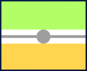
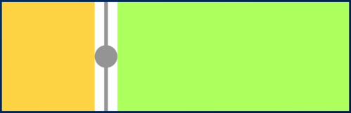
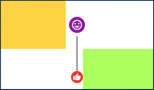
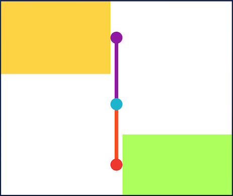
The start and end alignment allows a child in their opposite sides. On the other hand, both center and manual allows children on both sides. For example, one tile with alignment to the center:

TimelineTile(
  alignment: TimelineAlign.center,
  endChild: Container(
    constraints: const BoxConstraints(
      minHeight: 120,
    ),
    color: Colors.lightGreenAccent,
  ),
  startChild: Container(
    color: Colors.amberAccent,
  ),
);

When providing children to the vertical tile, the height will be as minimum as possible, so you can control it with a height constraint (at least minHeight). This way the tile knows how to size it properly.

Centered Tile

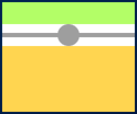
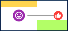
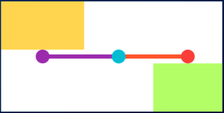
If the axis is horizontal, the things are the opposite. The width will be as minimum as possible, so you can control it with a width constraint (at least minWidth). This way the tile knows how to size it properly.

TimelineTile(
  axis: TimelineAxis.horizontal,
  alignment: TimelineAlign.center,
  endChild: Container(
    constraints: const BoxConstraints(
      minWidth: 120,
    ),
    color: Colors.lightGreenAccent,
  ),
  startChild: Container(
    color: Colors.amberAccent,
  ),
);

Horizontal Centered Tile

Manual aligning the idicator

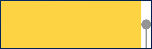
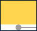
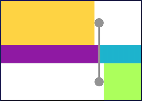
With TimelineAlign.manual you can provide the lineXY, which allows you to specify a value from 0.0 to 1.0, that represents a size percentage. For example, aligning at 30% of the width or height:

TimelineTile(
  alignment: TimelineAlign.manual,
  lineXY: 0.3,
  endChild: Container(
    constraints: const BoxConstraints(
      minHeight: 120,
    ),
    color: Colors.lightGreenAccent,
  ),
  startChild: Container(
    color: Colors.amberAccent,
  ),
);

Manual align indicator

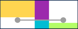
TimelineTile(
  axis: TimelineAxis.horizontal,
  alignment: TimelineAlign.manual,
  lineXY: 0.3,
  endChild: Container(
    constraints: const BoxConstraints(
      minWidth: 120,
    ),
    color: Colors.lightGreenAccent,
  ),
  startChild: Container(
    color: Colors.amberAccent,
  ),
);

Horizontal manual align indicator

Is it the first or the last?

You can decide if a tile is the first os the last in a timeline. This way you control whether a before or after line must be rendered.

First and last

Horizontal first and last

See the implementation here

Start to make a timeline

You can finally start to combine some tiles to make a Timeline. The flag hasIndicator can control whether an indicator should or shouldn't be rendered.

Timeline

Horizontal timeline

See the implementation here

Customize the indicator as you wish

The default indicator is a circle, and you can customize it as you wish. With IndicatorStyle you can change the color, the X/Y position based on values from 0.0 to 1.0 or give it a padding. You must explicitly provide its width (vertical) or height (horizontal) though.

Custom indicator

Horizontal custom indicator

See the implementation here

Give an icon to the indicator

With IconStyle you can provide an Icon to be rendered inside the default indicator.

Icon indicator

Horizontal icon indicator

See the implementation here

Or provide your custom indicator

With the indicator parameter you can customize the tile with your own indicator. However, you must control its size through both width and height parameters.

Custom indicator

Horizontal custom indicator

See the implementation here

Customize the tile's line

With LineStyle you can customize both beforeLine and afterLine.

Custom line

Horizontal custom line

See the implementation here

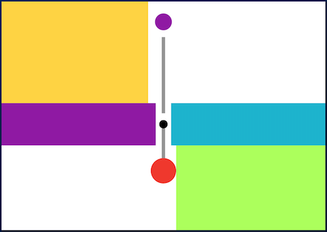
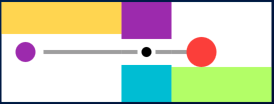
Connect tiles with TimelineDivider

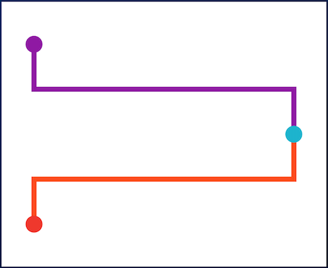
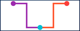
The TimelineDivider widget allows you to connect tiles that are aligned in different X/Y axis, when combined with TimelineAlign.manual.

Timeline divider

Timeline divider

See the implementation here

所属分类

源码仓库

使用此插件的项目