


 v2.1.1
drop_down_list
一个可自定义的下拉选择控件,支持单选/多选,集成底部弹窗搜索功能,对自定义数据提供通用支持,实现灵活且类型安全的处理。
350喜欢 3200近 30 天下载150Pub 分数
AndroidiOSWebmacOSWindowsLinux
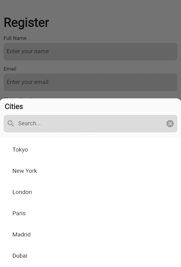
一个功能强大的小部件,可在对话框或菜单中的底部表单列表中搜索单个或多个选项。

以下为英文项目原文快照,最新内容请访问 GitHub。








A customizable dropdown widget supporting single/multiple selection, integrated search in a bottom sheet, generic support for flexible, type-safe handling of custom data.


Import it to your project file
import 'package:drop_down_list/drop_down_list.dart';
And add it in its most basic form like it:
DropDownState<String>(
  dropDown: DropDown<String>(
    data: <SelectedListItem<String>>[
      SelectedListItem<String>(data: 'Tokyo'),
      SelectedListItem<String>(data: 'New York'),
      SelectedListItem<String>(data: 'London'),
    ],
    onSelected: (selectedItems) {
      List<String> list = [];
      for (var item in selectedItems) {
        list.add(item.data);
      }
      ScaffoldMessenger.of(context).showSnackBar(
        SnackBar(
          content: Text(
            list.toString(),
          ),
        ),
      );
    },
  ),
).showModal(context);
| Parameter | Description |
|---|---|
List<SelectedListItem<T>> data |
The list of generic data items to be displayed in the dropdown |
| Parameter | Description |
|---|---|
ItemSelectionCallBack<T>? onSelected |
A callback function triggered when items are selected from the list |
ListItemBuilder<T>? listItemBuilder |
A function that takes an [index] and [dataItem] as a parameter and returns a custom widget to display for the list item at that index |
int? maxSelectedItems |
The maximum number of items that can be selected when [enableMultipleSelection] is true |
VoidCallback? onMaxSelectionReached |
A callback function triggered when the maximum selection limit is reached |
EdgeInsets? listViewPadding |
The padding applied to the ListView that contains the dropdown items |
Widget? listViewSeparatorWidget |
The widget used as a separator between items in the dropdown list |
EdgeInsets? listTileContentPadding |
The padding applied to the content of each ListTile in the dropdown list |
BottomSheetListener? bottomSheetListener |
A listener that monitors events bubbling up from the BottomSheet |
EdgeInsets? dropDownPadding |
The padding applied to the dropdown container |
EdgeInsets? dropDownHeaderPadding |
The padding applied to the dropdown header |
Widget? bottomSheetTitle |
The widget displayed as the title of the bottom sheet |
ButtonStyle? submitButtonStyle |
Defines a button style to display as the style of the submit button when [enableMultipleSelection] is true |
ButtonStyle? clearButtonStyle |
Defines a button style to display as the style of the clear button when [enableMultipleSelection] is true |
EdgeInsets? searchTextFieldPadding |
The padding applied to the search text field |
TextFormField? searchWidget |
Defines a custom widget to display the text box for searching |
EdgeInsets? selectAllTextButtonPadding |
The padding applied to the "select all" and "deselect all" TextButtons |
Widget? selectAllTextButtonChild |
Defines a custom widget to display as the child of the selectAll text button when [enableMultipleSelection] and [isSelectAllVisible] is true |
Widget? deSelectAllTextButtonChild |
Defines a custom widget to display as the child of the deSelectAll text button when [enableMultipleSelection] and [isSelectAllVisible] is true |
SearchDelegate<T>? searchDelegate |
A delegate used to configure the custom search functionality in the dropdown |
| Parameter | Default | Description |
|---|---|---|
bool enableMultipleSelection |
false | Enables single or multiple selection for the drop down list items |
Color listTileColor |
Colors.transparent | Defines the background color of each ListTile in the dropdown list |
Widget selectedListTileTrailingWidget |
Icon(Icons.check_box) | The widget displayed as a trailing icon when a list item is selected |
Widget deSelectedListTileTrailingWidget |
Icon(Icons.check_box_outline_blank) | The widget displayed as a trailing icon when a list item is not selected |
bool useRootNavigator |
false | Specifies whether a modal bottom sheet should be displayed using the root navigator |
bool enableDrag |
true | Specifies whether the bottom sheet can be dragged up and down and dismissed by swiping downwards |
bool isDismissible |
true | Specifies whether the bottom sheet will be dismissed when the user taps on the scrim |
double initialChildSize |
0.7 | The initial fractional value of DraggableScrollableSheet |
double minChildSize |
0.3 | The minimum fractional value of DraggableScrollableSheet |
double maxChildSize |
0.9 | The maximum fractional value of DraggableScrollableSheet |
Color dropDownBackgroundColor |
Colors.transparent | Sets the background color of the dropdown |
String submitButtonText |
'Submit' | Specifies the text displayed on the submit button when [enableMultipleSelection] is true |
String clearButtonText |
'Clear' | Specifies the text displayed on the clear button when [enableMultipleSelection] is true |
bool isSearchVisible |
true | Controls the visibility of the search widget |
String searchHintText |
'Search' | Specifies the text displayed on the search widget as hint text |
Color searchFillColor |
Colors.black12 | This is the fill color for the input field |
Color searchCursorColor |
Colors.black | This is the cursor color for the input field |
bool isSelectAllVisible |
true | Controls the visibility of the "select all" widget when [enableMultipleSelection] is true |
String selectAllButtonText |
'Select All' | Specifies the text displayed on the selectAll text button when [enableMultipleSelection] and [isSelectAllVisible] is true |
String deSelectAllButtonText |
'Deselect All' | Specifies the text displayed on the deSelectAll text button when [enableMultipleSelection] and [isSelectAllVisible] is true |
| Parameter | Description |
|---|---|
DropDown<T> dropDown |
The DropDown configuration object that defines the behavior, appearance, and other properties of the dropdown menu |
| Parameter | Description |
|---|---|
ShapeBorder? shapeBorder |
The shape of the bottom sheet |
| Method | Description |
|---|---|
void showModal(BuildContext context) |
Displays the dropdown menu as a modal bottom sheet |
To help us better understand and resolve the issue, please include the following details when reporting:
drop_down_list is MIT-licensed.
We’d be really happy if you send us links to your projects where you use our open-source libraries. Just send an email to [sales@mindinventory.com](mailto:sales@mindinventory.com) And do let us know if you have any questions or suggestion regarding our work.
Visit our website mindinventory.com
Let us know if you are interested to building Apps or Designing Products.

依赖清单 3 项
{"sdk":"flutter"}{"sdk":"flutter"}^5.0.0先按使用场景筛选,再比较项目活跃情况,最后到原始仓库核对使用要求。
“A repository is the most basic element of GitHub.”
GitHub Docs — About repositories ↗