
 v1.0.2
simple_circular_progress_bar
开源的 Flutter 包,简单的圆形进度指示器。
194喜欢 8280近 30 天下载160Pub 分数
AndroidiOSWebmacOSWindowsLinux
开源 Flutter 包,简单的圆形进度条。

{"sdk":"flutter"}{"sdk":"flutter"}{"sdk":"flutter"}以下为英文项目原文快照,最新内容请访问 GitHub。
https://img.shields.io/github/license/Nulllix/simple_circular_progress_bar?logo=github https://img.shields.io/badge/version-1.0.2-blueviolet https://img.shields.io/badge/flutter-3.0.1-blue https://img.shields.io/badge/dart-2.17.1-blue
Open source Flutter package, simple circular progress bar.
Add in pubspec.yaml:
dependencies:
  flutter:
    sdk: flutter
  simple_circular_progress_bar: ^1.0.2
Now in your code, you can import:
import 'package:simple_circular_progress_bar/simple_circular_progress_bar.dart';
See the full example here. Most of the examples are in the rows_in_progress_bar_example folder.
Example numbers correspond to their numbers in the code. To quickly find examples in the repository, look in the code: 'EXAMPLE CODE'.
Example 01, 02, 03
// Example 1
SimpleCircularProgressBar(
    progressColors: const [Colors.cyan],
)

// Example 2
SimpleCircularProgressBar(
    progressColors: const [Colors.cyan, Colors.purple],
),

// Example 3
SimpleCircularProgressBar(
    progressColors: const [
        Colors.cyan,
        Colors.green,
        Colors.amberAccent,
        Colors.redAccent,
        Colors.purpleAccent
    ],
    backColor: Colors.blueGrey,
),
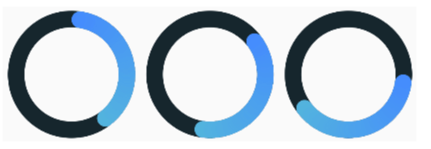
Example 04, 05, 06
// Example 4
SimpleCircularProgressBar(
    startAngle: 45,
),

// Example 5
SimpleCircularProgressBar(
    startAngle: 90,
),

// Example 6
SimpleCircularProgressBar(
    startAngle: -180,
),
Example 07, 08, 09
// Example 7
SimpleCircularProgressBar(
    size: 80,
    progressStrokeWidth: 25,
    backStrokeWidth: 25,
),

// Example 8
SimpleCircularProgressBar(
    progressStrokeWidth: 20,
    backStrokeWidth: 10,
),

// Example 9
SimpleCircularProgressBar(
    backStrokeWidth: 0,
),
Example 10, 11, 12
// Example 10
SimpleCircularProgressBar(
    progressColors: const [Colors.cyan],
    mergeMode: true,
),

// Example 11
SimpleCircularProgressBar(
    progressColors: const [Colors.cyan],
    fullProgressColor: Colors.deepOrangeAccent,
    mergeMode: true,
),

// Example 12
SimpleCircularProgressBar(
    progressColors: const [Colors.cyan, Colors.purpleAccent],
    mergeMode: true,
),
Example 13, 14, 15
If you don't need animation, set animationDuration = 0.
// Example 13
SimpleCircularProgressBar(
    mergeMode: true,
    animationDuration: const Duration(milliseconds: 500),
),

// Example 14
SimpleCircularProgressBar(
    mergeMode: true,
    animationDuration: const Duration(seconds: 3),
),

// Example 15
SimpleCircularProgressBar(
    mergeMode: true,
    animationDuration: const Duration(minutes: 1),
),
Example 16, 17, 18
// Example 16
SimpleCircularProgressBar(
    mergeMode: true,
    onGetText: (double value) {
        return Text('${value.toInt()}%');
    },
),

// Example 17
SimpleCircularProgressBar(
    valueNotifier: valueNotifier,
    mergeMode: true,
    onGetText: (double value) {
        return Text(
            '${value.toInt()}',
            style: const TextStyle(
                fontSize: 30,
                fontWeight: FontWeight.bold,
                color: Colors.white,
            ),
        );
    },
),

// Example 18
SimpleCircularProgressBar(
    valueNotifier: valueNotifier,
    mergeMode: true,
    onGetText: (double value) {
        TextStyle centerTextStyle = TextStyle(
            fontSize: 30,
            fontWeight: FontWeight.bold,
            color: Colors.greenAccent.withOpacity(value * 0.01),
        );

        return Text(
            '${value.toInt()}',
            style: centerTextStyle,
        );
    },
),
Example value notifier
You can read about how ValueNotifier works here.
The source code of the example can be found here.
| Parameter | Default | Description |
|---|---|---|
| size double |
100 | Widget size. |
| maxValue double |
100 | The maximum value of the progress bar. The values will vary from 0 to [maxValue]. |
| startAngle double |
0 | The angle from which the countdown of progress begins. |
| progressStrokeWidth double |
15 | Thickness of the progress line. |
| backStrokeWidth double |
15 | Line thickness of the background circle. If you don't need a background circle, set this parameter to 0. |
| progressColors List |
Progress bar can be either with or without a gradient. For a gradient, specify more than one color in the [progressColors] field and if a gradient is not needed specify only one color. | |
| fullProgressColor Color |
The color of the circle at 100% value. It only works when [mergeMode] equal to true. | |
| backColor Color |
The color of the background circle. | |
| animationDuration int |
Duration(seconds: 6) | Animation duration. If you don't need animation, set this parameter to zero Duration. |
| mergeMode bool |
false | When this mode is enabled the progress bar with a 100% value forms a full circle with [fullProgressColor]. If no [fullProgressColor] is specified, the last color from [progressColors] is taken. |
| valueNotifier ValueNotifier |
The object designed to update the value of the progress bar. By default, creates a ValueNotifier with the maximum value. | |
| onGetText Text Function(double) |
Callback to generate a new Text widget located in the center of the progress bar. The callback input is the current value of the progress bar. |
You can see how the application works from the example in this video.