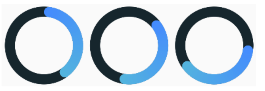
The maximum value of the progress bar. The values will vary from 0 to [maxValue].
startAngle double
0
The angle from which the countdown of progress begins.
progressStrokeWidth double
15
Thickness of the progress line.
backStrokeWidth double
15
Line thickness of the background circle. If you don't need a background circle, set this parameter to 0.
progressColors List
Progress bar can be either with or without a gradient. For a gradient, specify more than one color in the [progressColors] field and if a gradient is not needed specify only one color.
fullProgressColor Color
The color of the circle at 100% value. It only works when [mergeMode] equal to true.
backColor Color
The color of the background circle.
animationDuration int
Duration(seconds: 6)
Animation duration. If you don't need animation, set this parameter to zero Duration.
mergeMode bool
false
When this mode is enabled the progress bar with a 100% value forms a full circle with [fullProgressColor]. If no [fullProgressColor] is specified, the last color from [progressColors] is taken.
valueNotifier ValueNotifier
The object designed to update the value of the progress bar. By default, creates a ValueNotifier with the maximum value.
onGetText Text Function(double)
Callback to generate a new Text widget located in the center of the progress bar. The callback input is the current value of the progress bar.
YouTube video
You can see how the application works from the example in this video.