
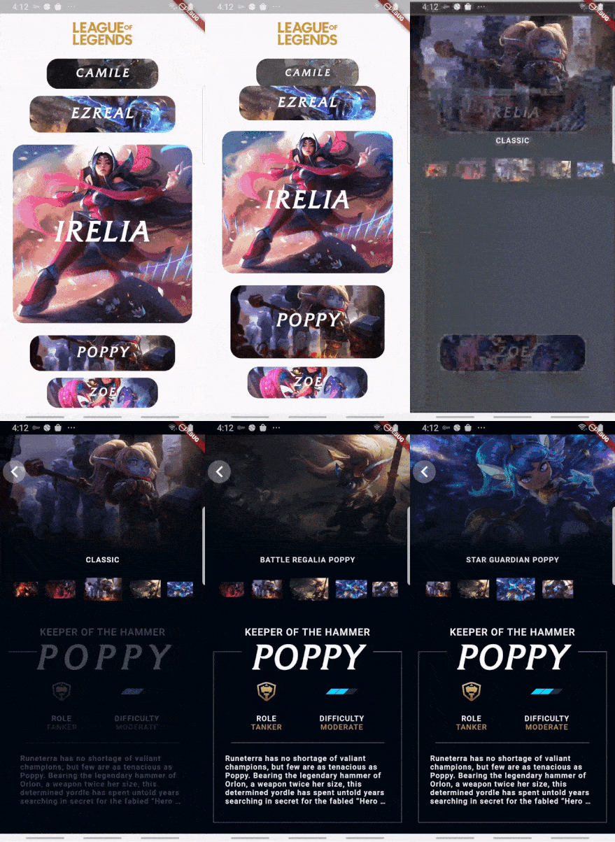
 v1.1.1
horizontal_card_pager
使用动态且美观的卡片视图轮播(水平方向)来帮助您创建出色的应用程序。
173喜欢 47近 30 天下载140Pub 分数
AndroidiOSWebmacOSWindowsLinux
使用动态且美观的卡片视图轮播(水平方向)来帮助您创建出色的应用程序。

{"sdk":"flutter"}{"sdk":"flutter"}以下为英文项目原文快照,最新内容请访问 GitHub。
Use dynamic and beautiful card view pagers (horizontal direction) to help you create great apps.
Add dependency to pubspec.yaml
Get the latest version in the 'Installing' tab on pub.dartlang.org
dependencies:
    horizontal_card_pager: ^1.1.1
import 'package:horizontal_card_pager/horizontal_card_pager.dart';
import 'package:horizontal_card_pager/card_item.dart';
HorizontalCardPagerWith optional parameters
HorizontalCardPager(
    initialPage : 2 // default value is 2
    onPageChanged: (page) => print("page : $page"),
    onSelectedItem: (page) => print("selected : $page"),
    items: { ... },  // set ImageCardItem or IconTitleCardItem class
))
CardItem object in items parameter in HorizontalCardPagerIf the contents of the card contain only images, use the ImageCardItem class. and If the contents of the card include an icon and a title, use the IconTitleCardItem class.
| Image | Icon & Text |
|---|---|
| imagetype | icontitletype |
ImageCardItem
class ImageCarditem extends CardItem {
  final Widget image;

  ImageCarditem({this.image});
}
IconTitleCardItemclass IconTitleCardItem extends CardItem {
final IconData iconData;
final String text;
final Color selectedBgColor;
final Color noSelectedBgColor;
final Color selectedIconTextColor;
final Color noSelectedIconTextColor;
IconTitleCardItem(
{this.iconData,
this.text,
this.selectedIconTextColor = Colors.white,
this.noSelectedIconTextColor = Colors.grey,
this.selectedBgColor = Colors.blue,
this.noSelectedBgColor = Colors.white});
}
Check out the example app in the example directory or the 'Example' tab on pub.dartlang.org for a more complete example.
This package's animation is inspired from from this Dribbble art.