

 v1.2.0
flutter_material_color_picker
适用于 Flutter 应用的 Material 颜色选择器,支持一些自定义选项
126喜欢 4060近 30 天下载150Pub 分数
AndroidiOSWebmacOSWindowsLinux
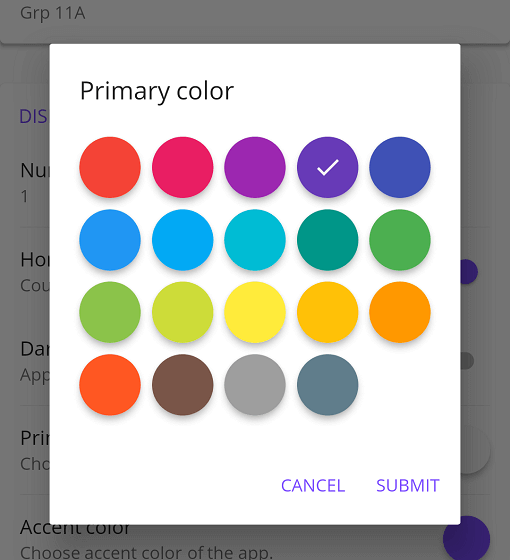
Material 颜色选择器,您可以自定义颜色。分两步选择,先选择主色调,再选择明暗变化。

以下为英文项目原文快照,最新内容请访问 GitHub。

Material Color picker is a Flutter widget, that can be customizable.
By default, it's Material Colors, but you can define your own colors.
You can also use CircleColor widget to display color in your app. Example, you can set the color picker in a dialog and display the selected color in a ListTile, for settings.
These examples use a static color for 'selectedColor', but you can use a variable (state)
You just need to add flutter_material_color_picker as a dependency in your pubspec.yaml file.
flutter_material_color_picker: ^1.2.0
import 'package:flutter_material_color_picker/flutter_material_color_picker.dart';
MaterialColorPicker(
    onColorChange: (Color color) {
        // Handle color changes
    },
    selectedColor: Colors.red
)
MaterialColorPicker(
    onColorChange: (Color color) {
        // Handle color changes
    },
    onMainColorChange: (ColorSwatch color) {
        // Handle main color changes
    },
    selectedColor: Colors.red
)
MaterialColorPicker(
    allowShades: false, // default true
    onMainColorChange: (ColorSwatch color) {
        // Handle main color changes
    },
    selectedColor: Colors.red
)
If allowShades is set to false then only main colors will be shown and allowed to be selected.
onColorChange will not be called, use onMainColorChange instead.
In this example, custom colors are a list of Material Colors (class who extend of ColorSwatch). But you can create your own list of ColorSwatch.
MaterialColorPicker(
    onColorChange: (Color color) {
        // Handle color changes
    },
    selectedColor: Colors.red,
    colors: [
        Colors.red,
        Colors.deepOrange,
        Colors.yellow,
        Colors.lightGreen
    ],
)
There is two step, first choose the main color, and when you press it, you have to choose a shade of the main color. By default it's all Material Colors, but you can define custom colors, a list of ColorSwatch.


You can insert the color picker into a Dialog


You can use CircleColor widget, to display the selected color into your settings for example.

依赖清单 2 项
{"sdk":"flutter"}^2.0.0先按使用场景筛选,再比较项目活跃情况,最后到原始仓库核对使用要求。
“A repository is the most basic element of GitHub.”
GitHub Docs — About repositories ↗