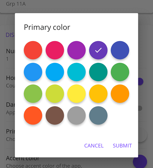
一个 Flutter 包,提供具有可定制选项的 Material 风格颜色选择器,适用于 Flutter 应用程序。它使用户能够从视觉上吸引人的、Material 设计的界面中选择颜色,支持在 Android、iOS、Web、macOS、Windows 和 Linux 等多个平台上集成。该选择器通过各种自定义设置提供灵活性,适合需要直观颜色选择的应用程序。它基于 Flutter 的 Material 设计原则构建,以确保一致的用户体验。
适合场景
应用主题中的颜色选择
自定义 UI 元素颜色
设计工具集成
用户偏好设置
交互式配色方案
原型配色方案
主要特点
材料设计美学
跨平台兼容性
可自定义外观
与 Flutter 的轻松集成
支持颜色色块
响应式用户界面
适合对象
UI/UX 开发人员
应用设计师
主题自定义工具
交互式原型设计
颜色敏感的应用程序
使用建议
限制为材料设计风格
需要手动处理颜色状态
无内置颜色历史
可能需要为非 Material 主题添加额外的样式
依赖 Flutter 的 Material 库
未针对复杂色彩模型进行优化
原始 README
以下为关联源码仓库的 README 原文快照,最新内容请访问源码仓库。
Flutter Material Color Picker
Material Color picker is a Flutter widget, that can be customizable.
By default, it's Material Colors, but you can define your own colors.
You can also use CircleColor widget to display color in your app.
Example, you can set the color picker in a dialog and display the selected color in a ListTile, for settings.
How to use it
These examples use a static color for 'selectedColor', but you can use a variable (state)
MaterialColorPicker(
    onColorChange: (Color color) {
        // Handle color changes
    },
    onMainColorChange: (ColorSwatch color) {
        // Handle main color changes
    },
    selectedColor: Colors.red
)
Disallow Shades
MaterialColorPicker(
    allowShades: false, // default true
    onMainColorChange: (ColorSwatch color) {
        // Handle main color changes
    },
    selectedColor: Colors.red
)
If allowShades is set to false then only main colors will be shown and allowed to be selected.
onColorChange will not be called, use onMainColorChange instead.
Custom colors
In this example, custom colors are a list of Material Colors (class who extend of ColorSwatch).
But you can create your own list of ColorSwatch.
There is two step, first choose the main color, and when you press it, you have to choose a shade of the main color.
By default it's all Material Colors, but you can define custom colors, a list of ColorSwatch.
Example of usages
You can insert the color picker into a Dialog
Display color
You can use CircleColor widget, to display the selected color into your settings for example.